Designing with Grid
A presentation at An Event Apart DC in in Washington, DC, USA by Jen Simmons
Designing With Grid An Event Apart D.C @jenSimmons
CSS Grid
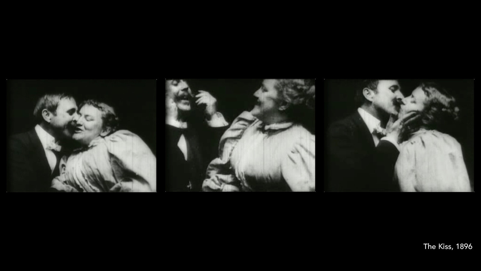
The Kiss, 1896
Ou r medium is not done
Layout on the web
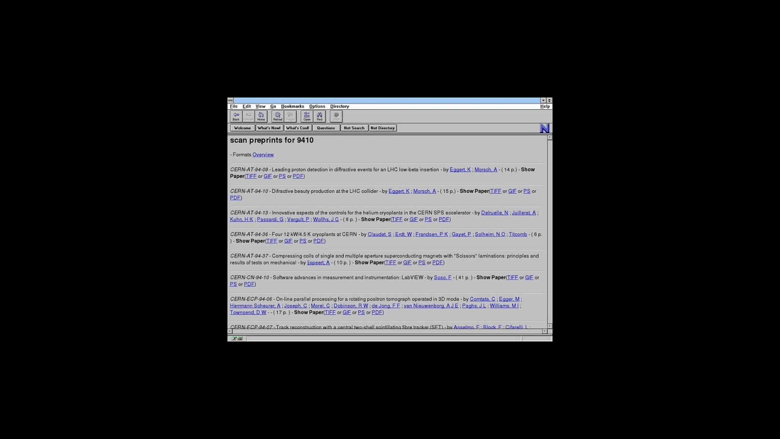
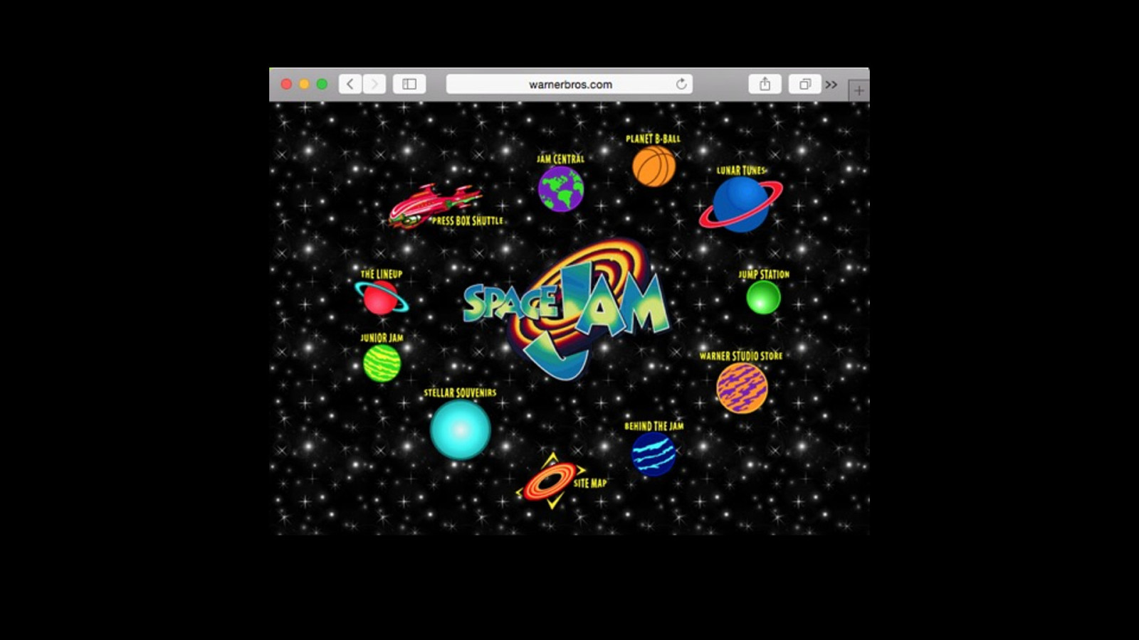
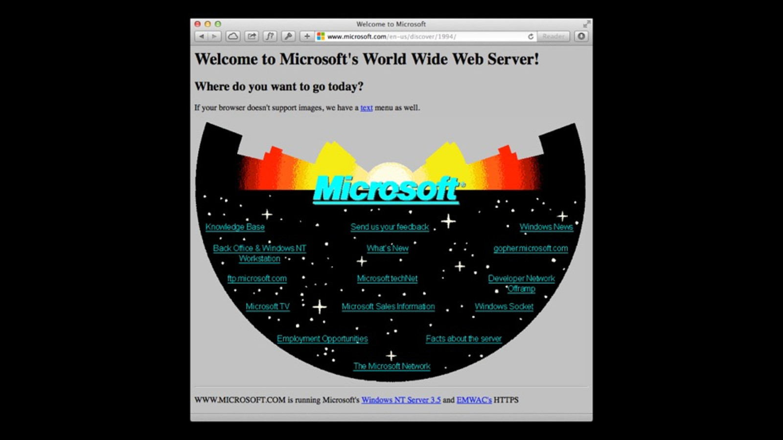
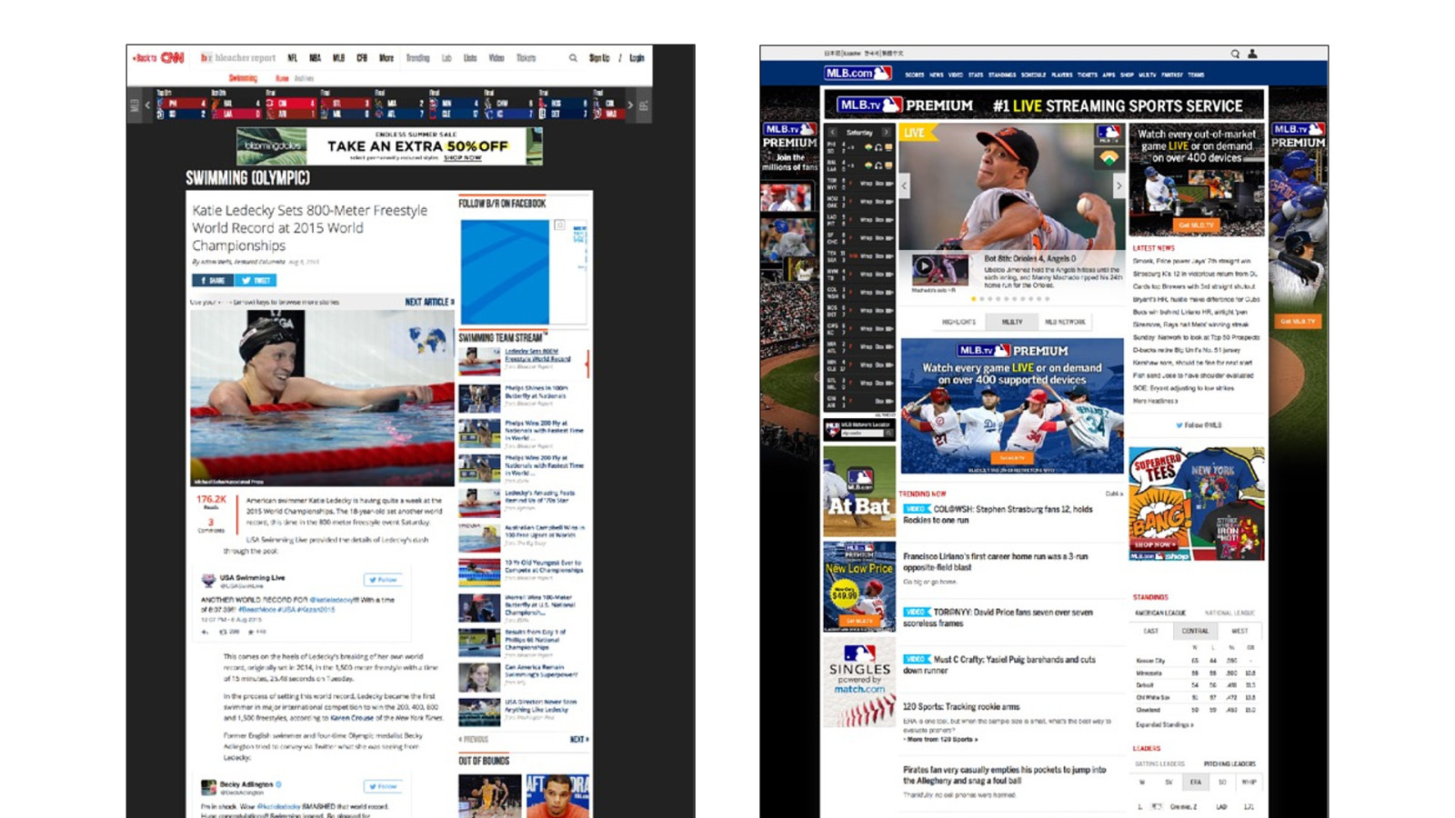
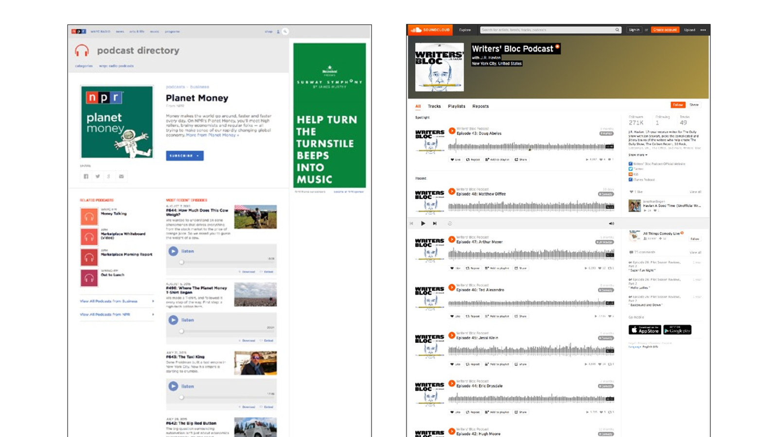
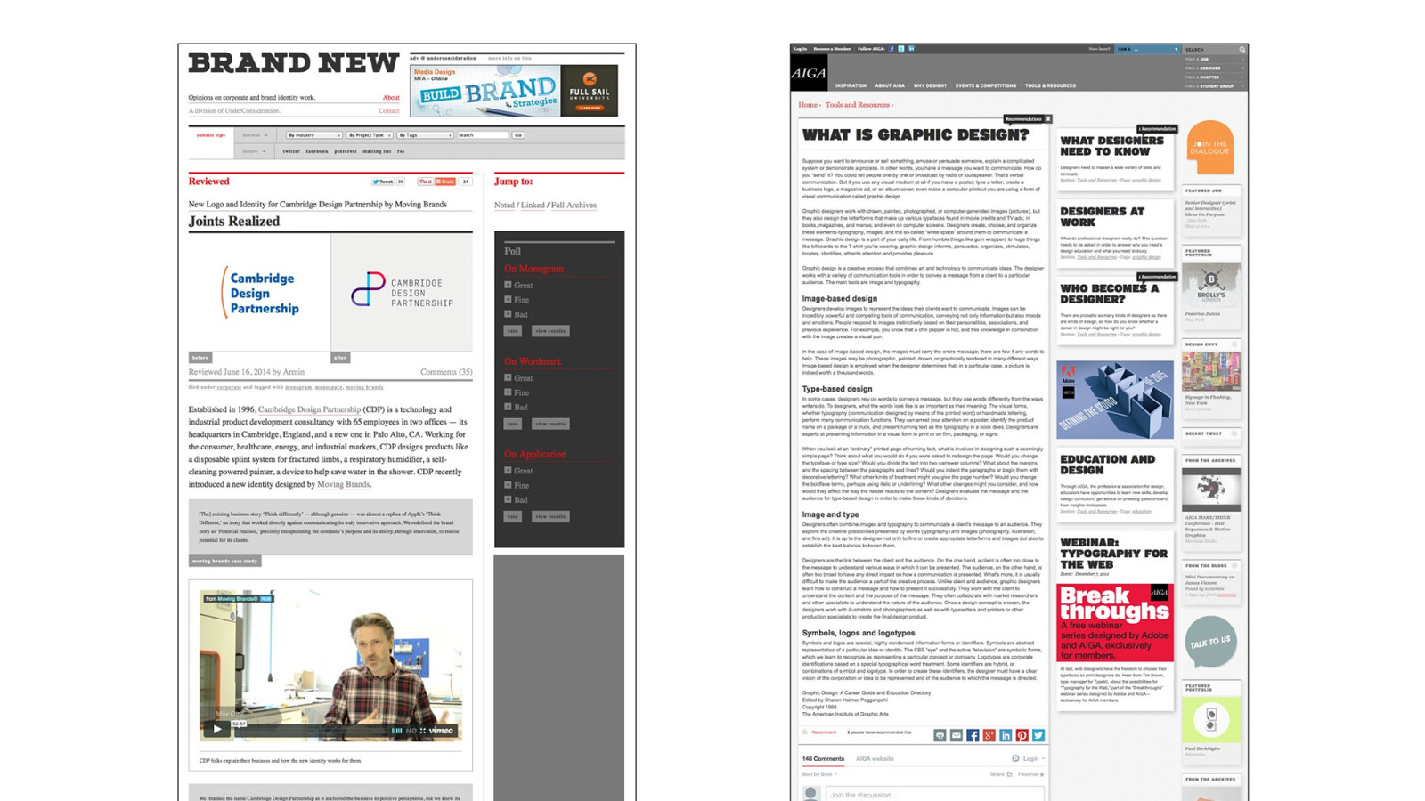
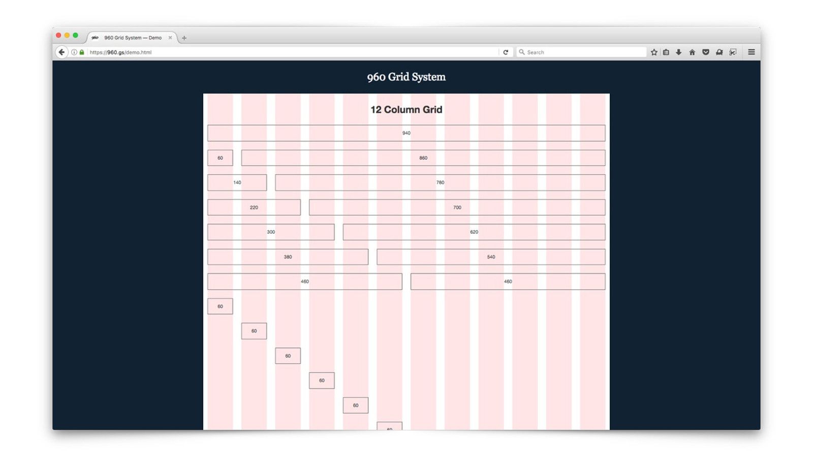
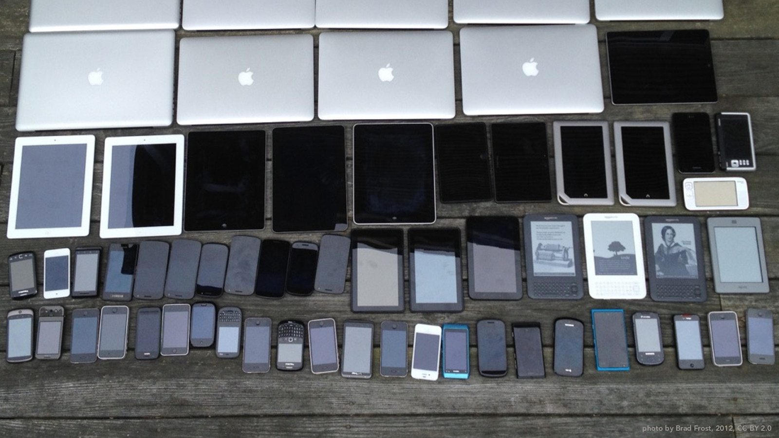
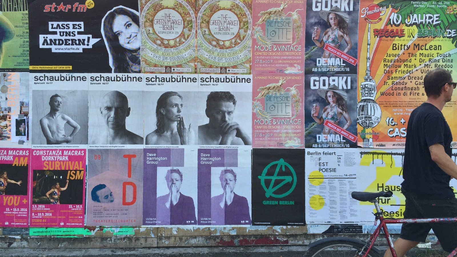
photo by Brad Frost, 2012, CC BY 2.0
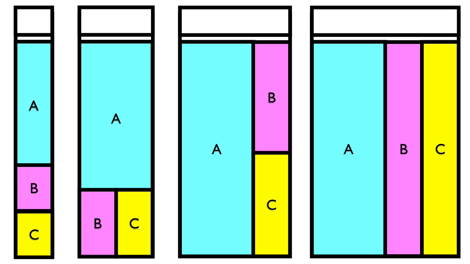
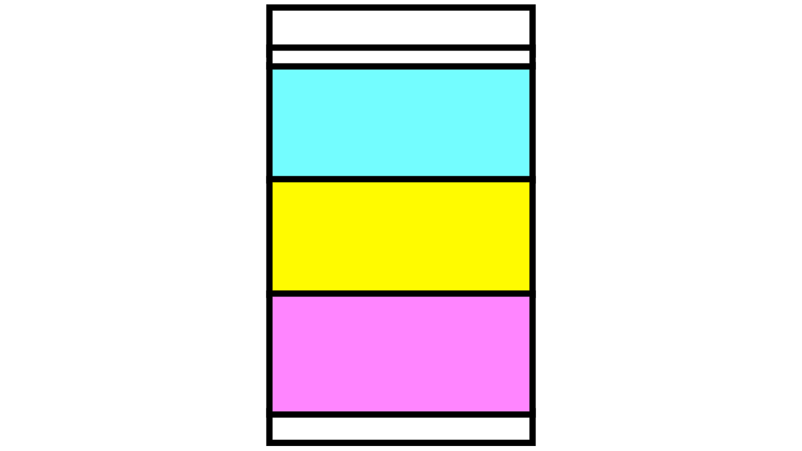
A C B A C B A C B A C B
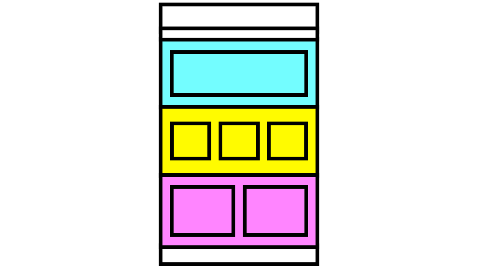
starter-kit framework
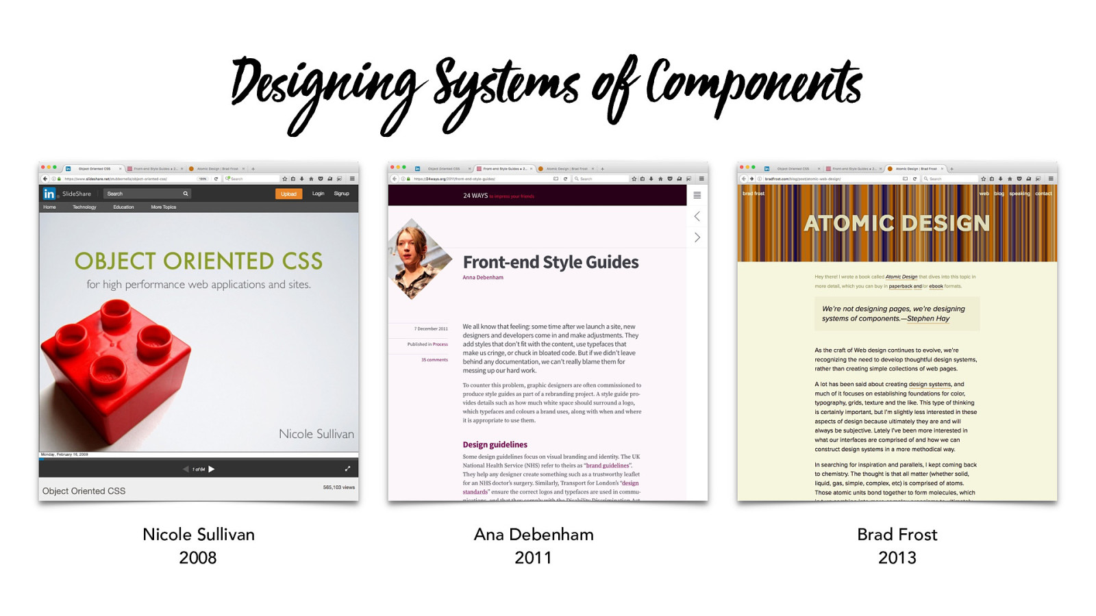
Nicole Sullivan 2008 Ana Debenham 2011 Brad Frost 2013 D ! igning Systems of Component s
BUTTON
Headline 1
Headline 2
This is a paragraph of text. Do we
like how this works? Yes, please. Ok.
Do all the text like this.
BUTTON
BUTTON
Headline 1
This is a paragraph of text. Do we
like how this works? Yes, please. Ok.
Do all the text like this.
BUTTON
Headline This is a paragraph of text. Do we like how this works? Yes, please. Ok. Do all the text like this. BUTTON Headline This is a paragraph of text. Do we like how this works? Yes, please. Ok. Do all the text like this. BUTTON Headline This is a paragraph of text. Do we like how this works? Yes, please. Ok. Do all the text like this. BUTTON Headline This is a paragraph of text. Do we Headline This is a paragraph of text. Do we Headline This is a paragraph of text. Do we
c olor palet te typography palet te layout palet te
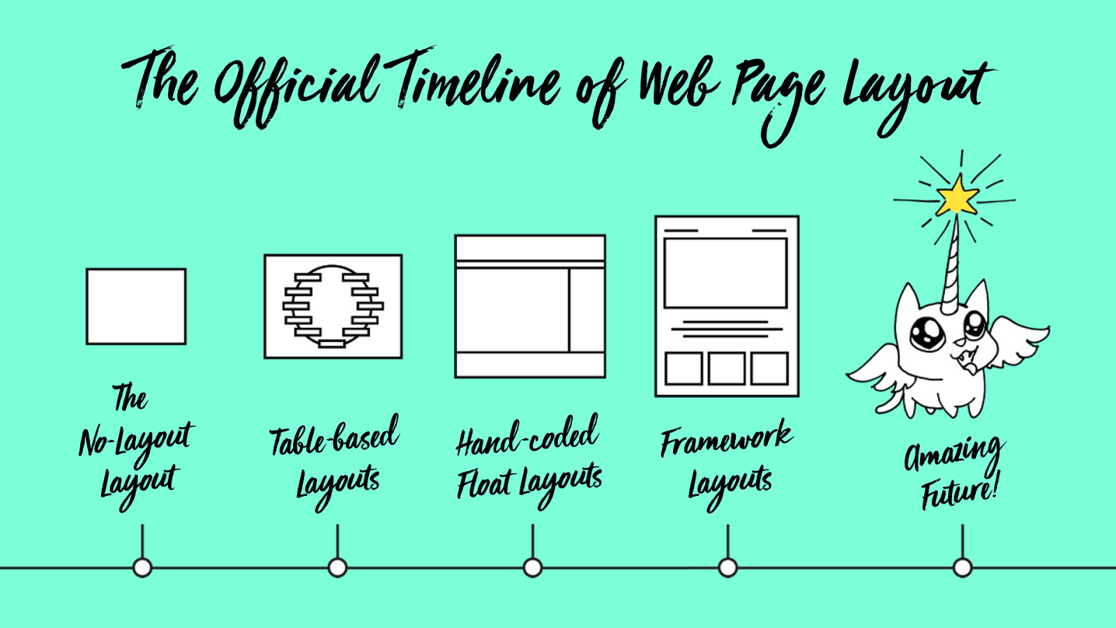
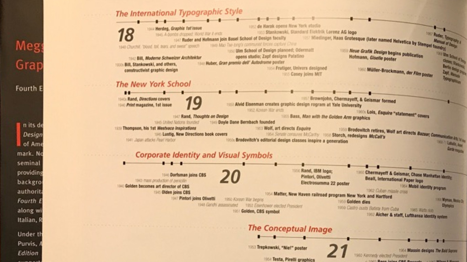
The Official Timeline of Web Page Layout
The
No-Layout
Layout
Table -based
Layouts
Hand -coded
Float Layouts
F ramework
Layouts
Amazing
Future!
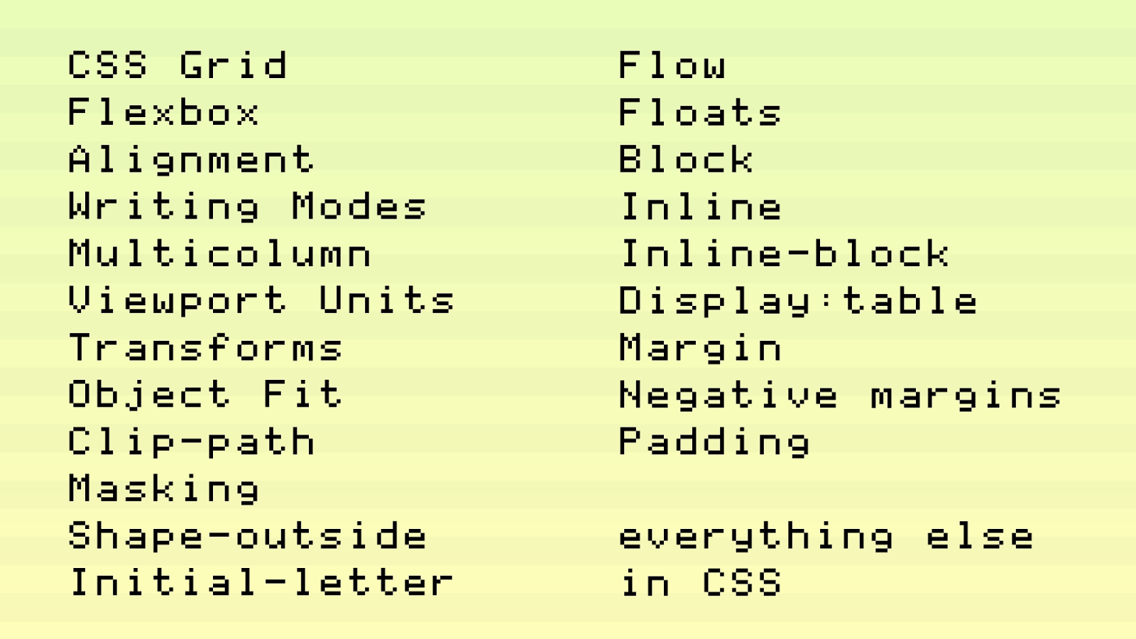
CSS Grid
Flexbox
Alignment
Writing Modes
Multicolumn
Viewport Units
Transforms
Object Fit
Clip-path
Masking
Shape-outside
Initial-letter
Flow
Floats
Block
Inline
Inline-block
Display:table
Margin
Negative margins
Padding
everything else
in CSS
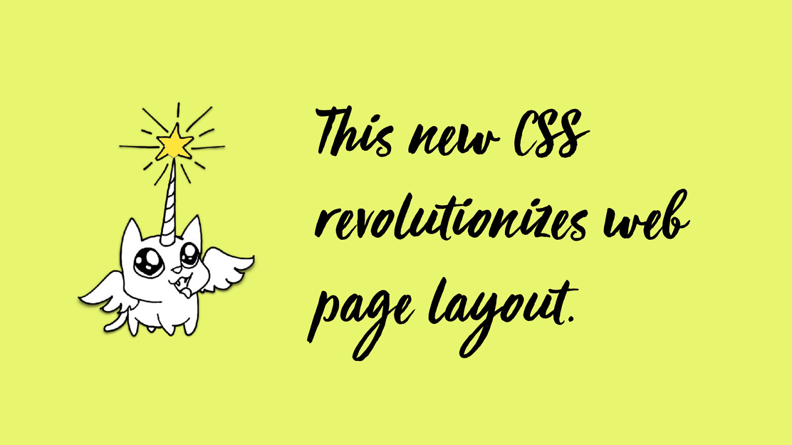
This ne w CSS
re volutionize s web
page layout.
Nature of CSS Grid
(Let
s bust some a ssumptions) ’
explicit vs. implicit
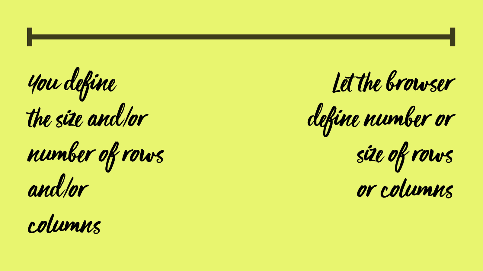
You define
"
e size and/or
number of rows
and/or
columns
Let
"
e browser
define number or
size of rows
or columns
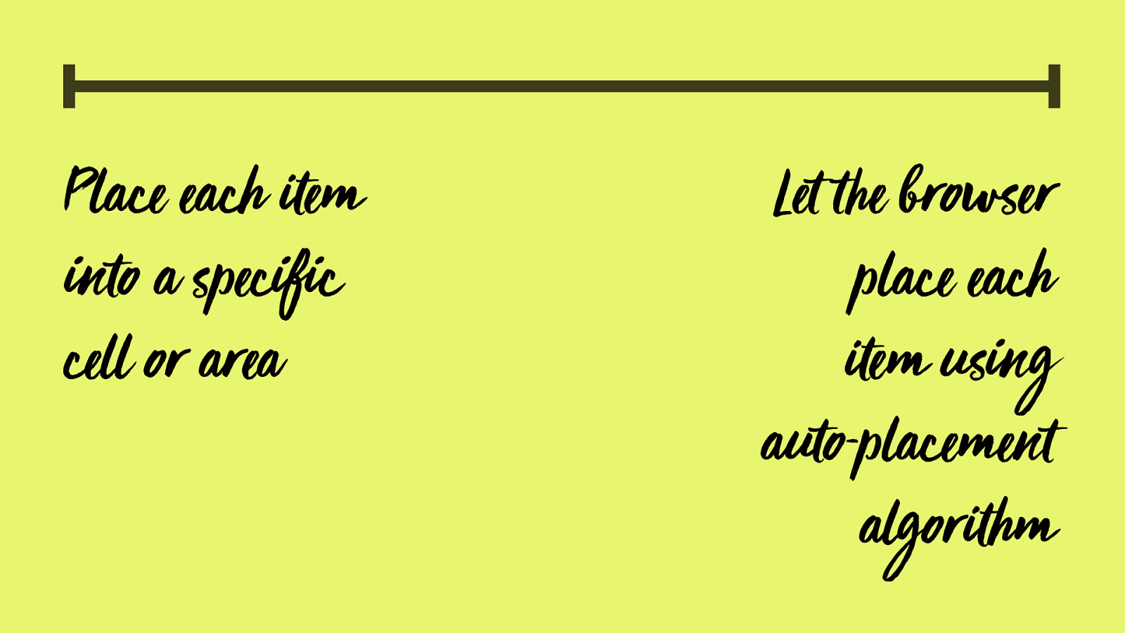
P lace each
em
into a specific
cell or area
Let
"
e browser
place each
em using
auto-placement
a
lgor
hm
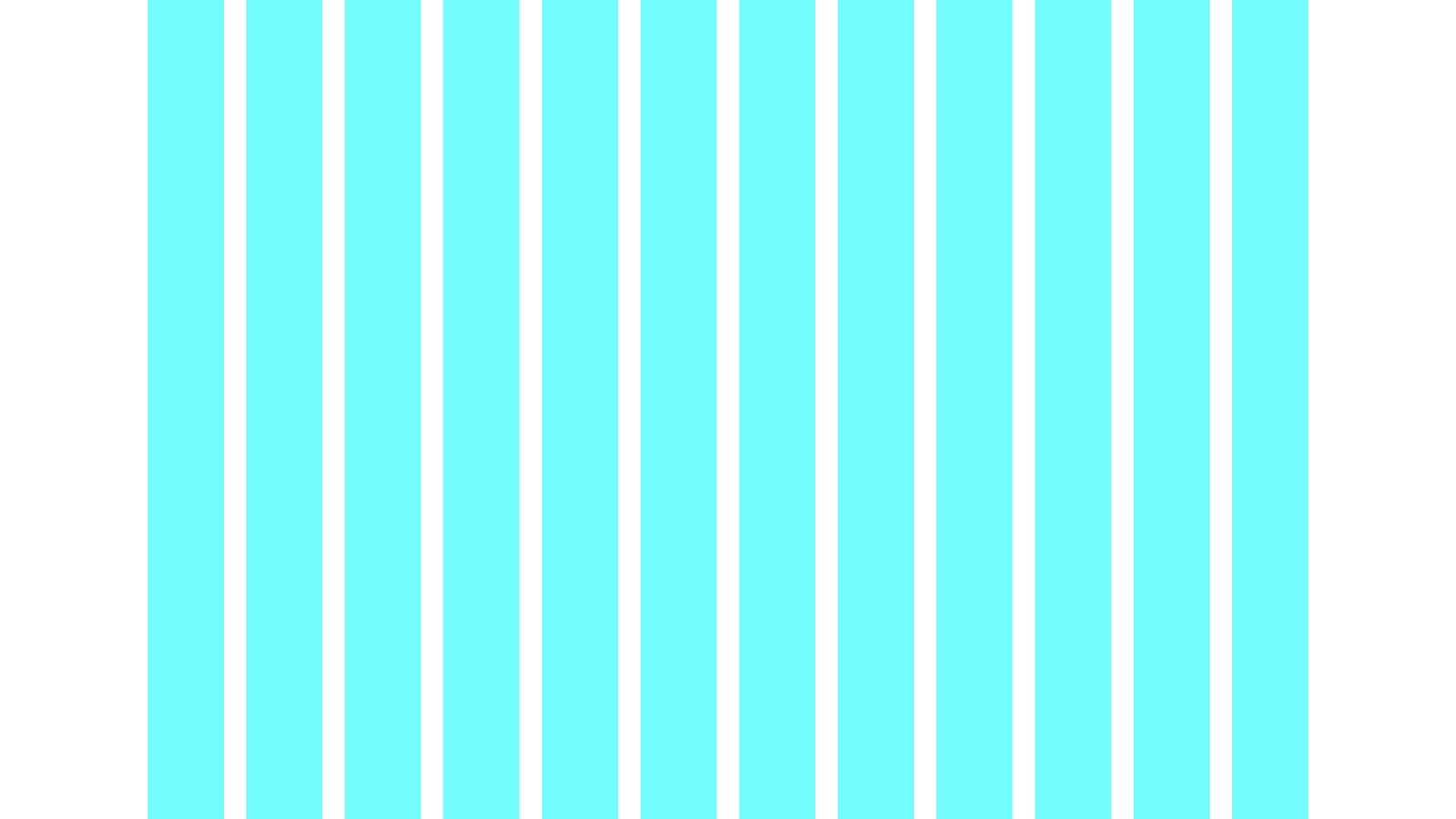
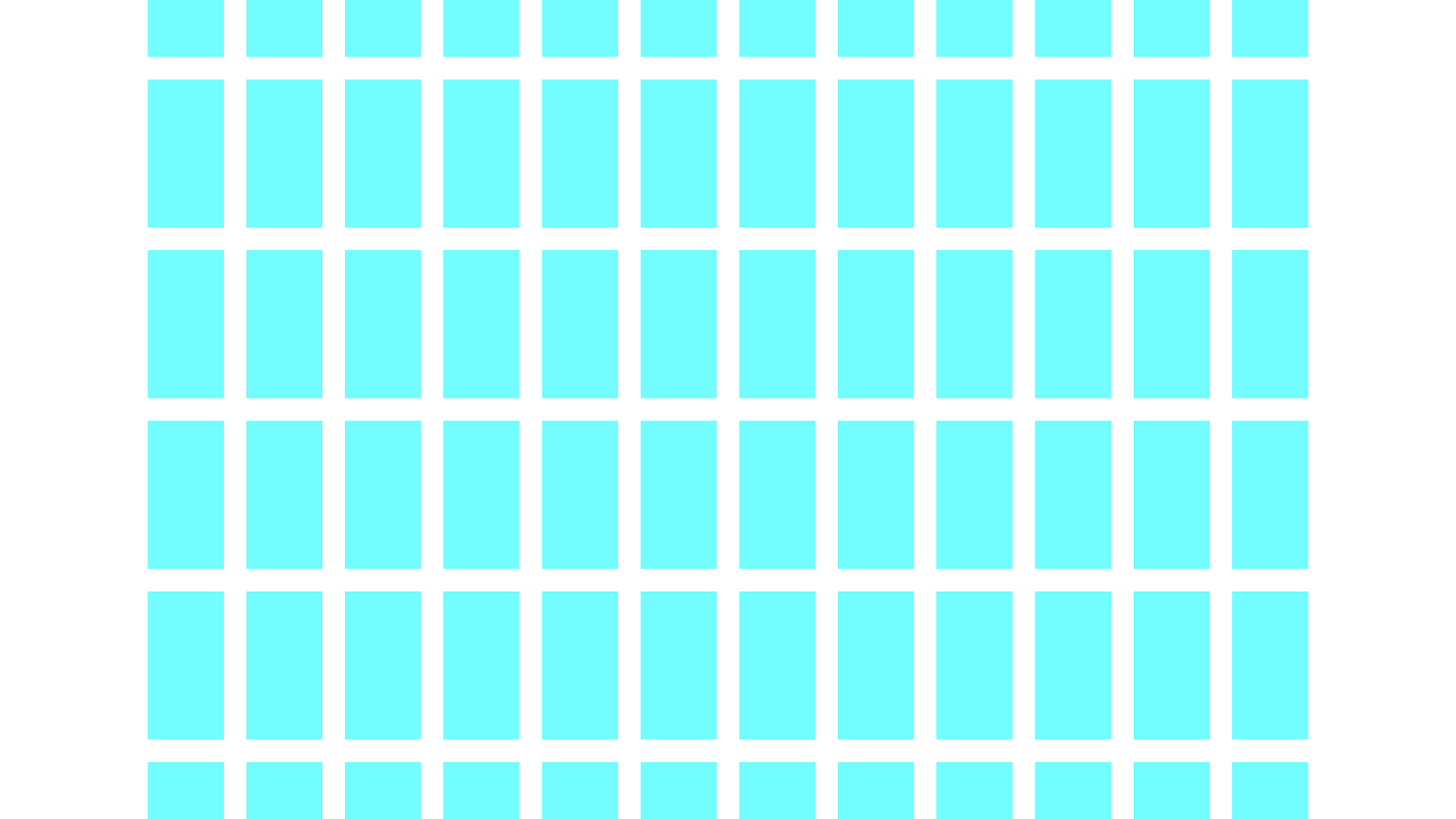
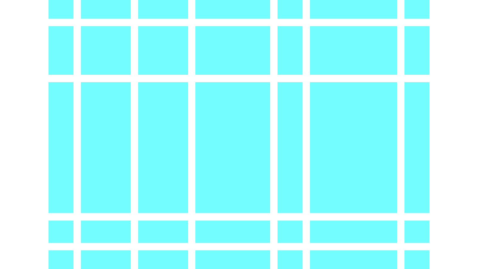
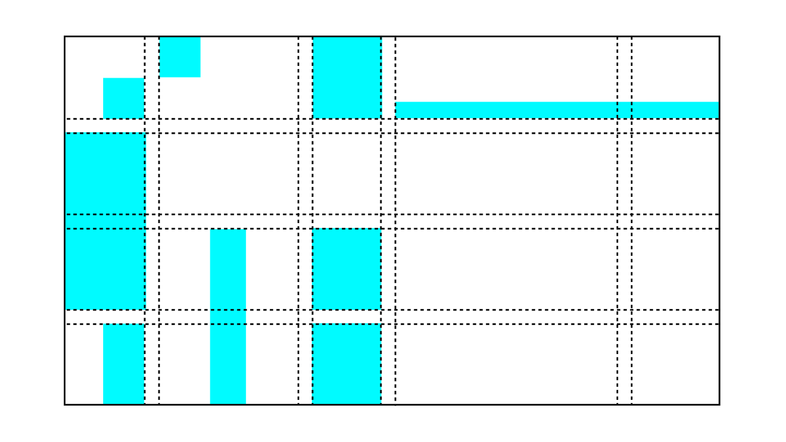
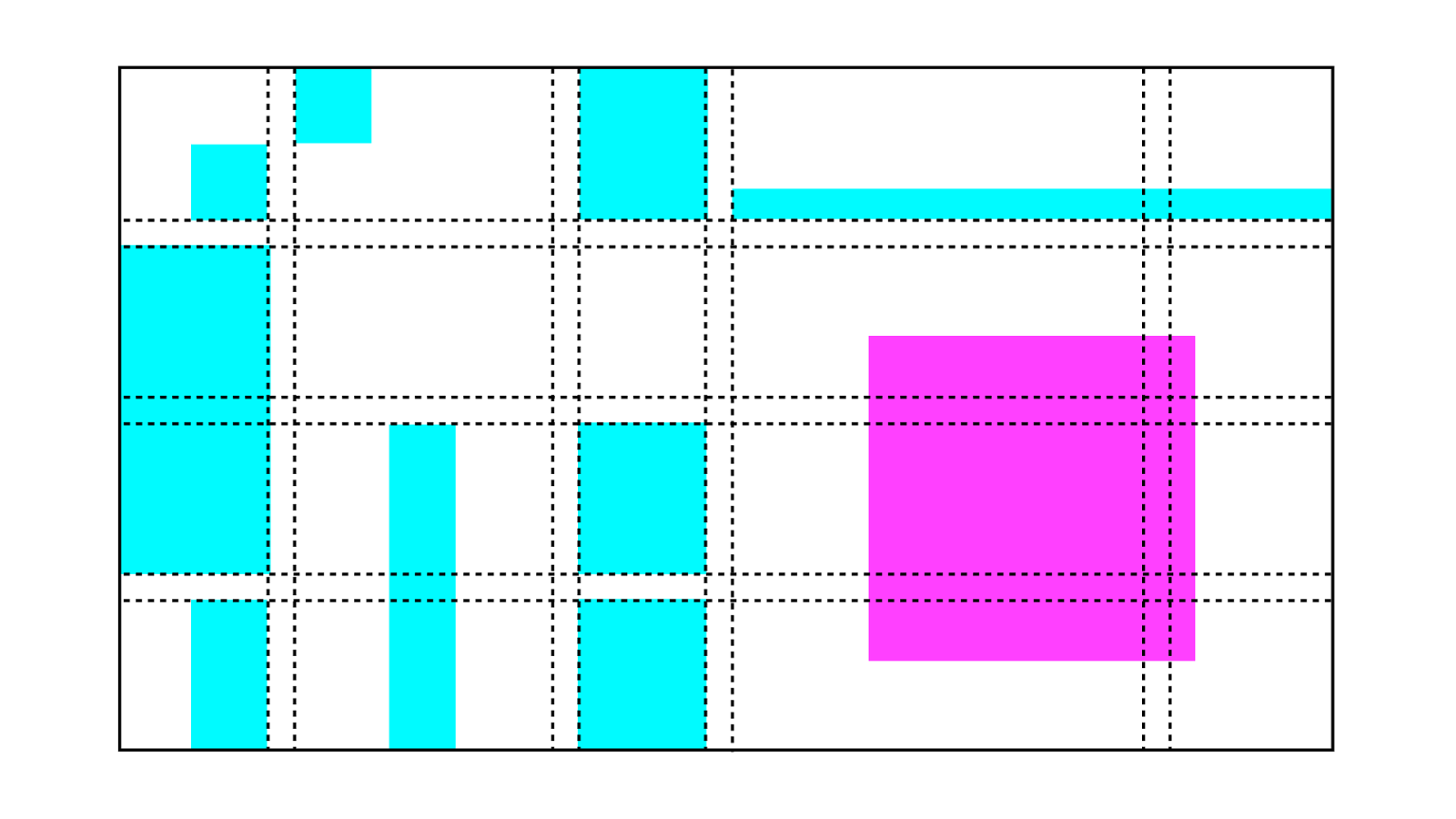
Row s and Columns
ROWS!!!!!!!!!!!
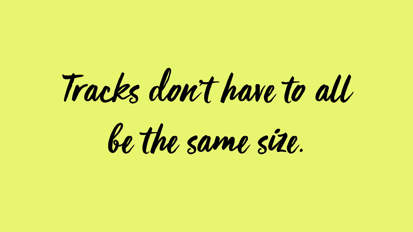
Tracks don’t have to all
be t he same size.

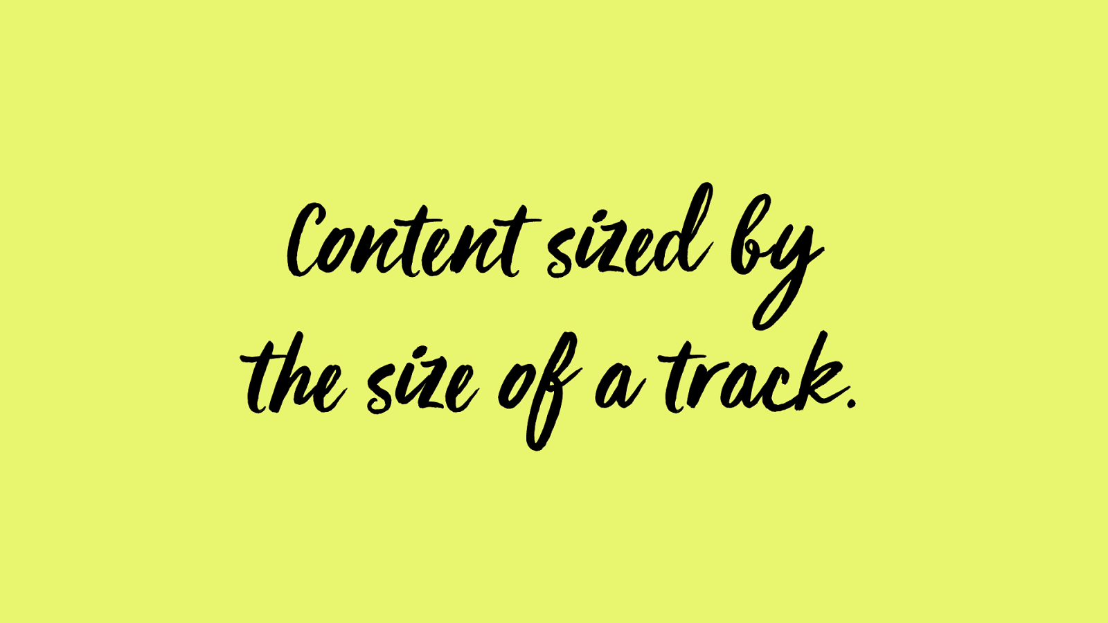
Conte nt sized by
t he size of a track.
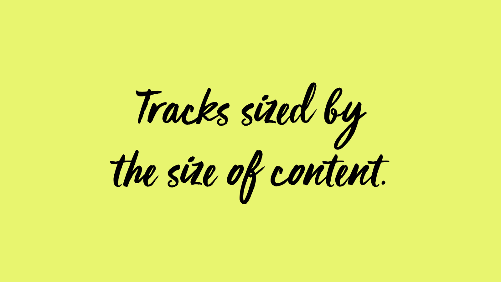
Tracks sized by
t he size of c onte nt.
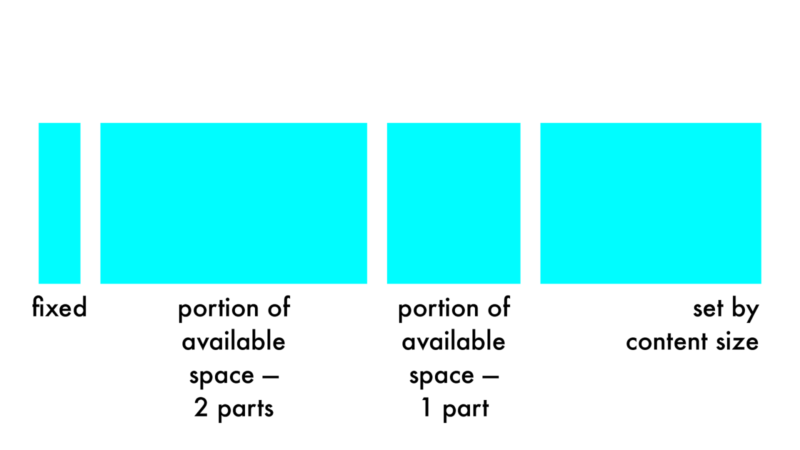
portion of
available
space —
2 parts
set by
content
size
fixed
portion of
available
space —
1 part
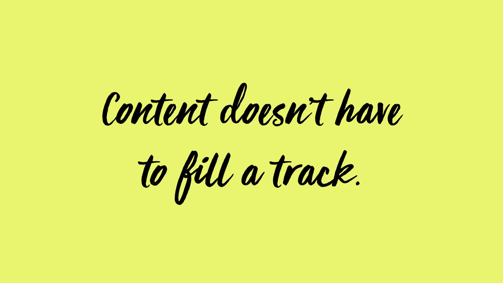
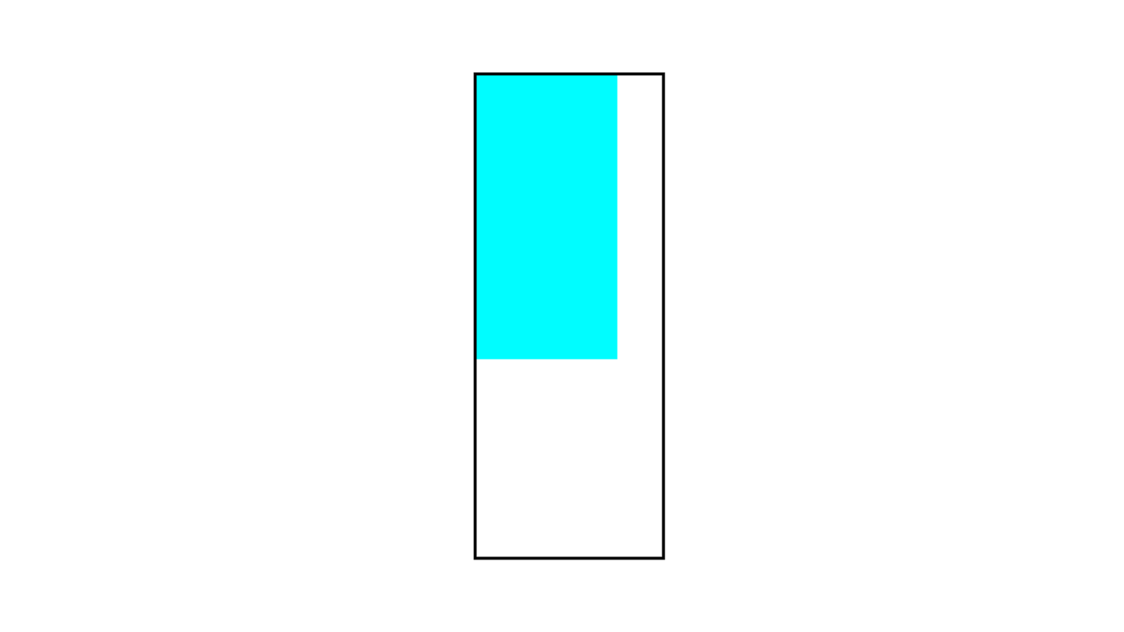
Content doesn’t have
to fill a track.
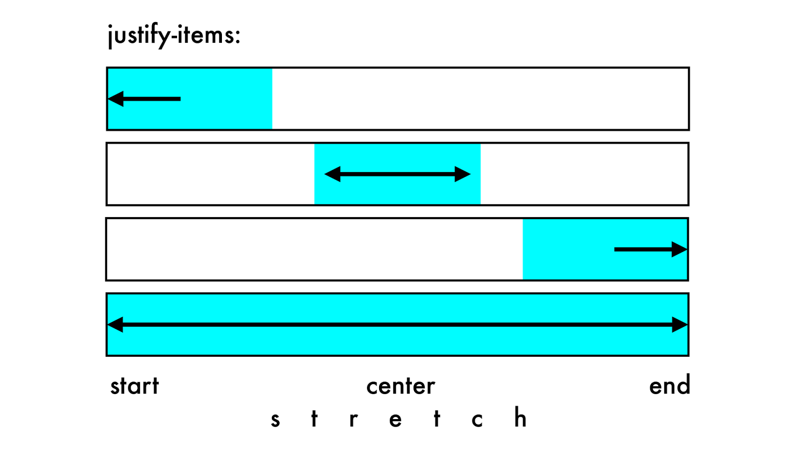
start
center
end
justify
-items:
s t r e t c
h
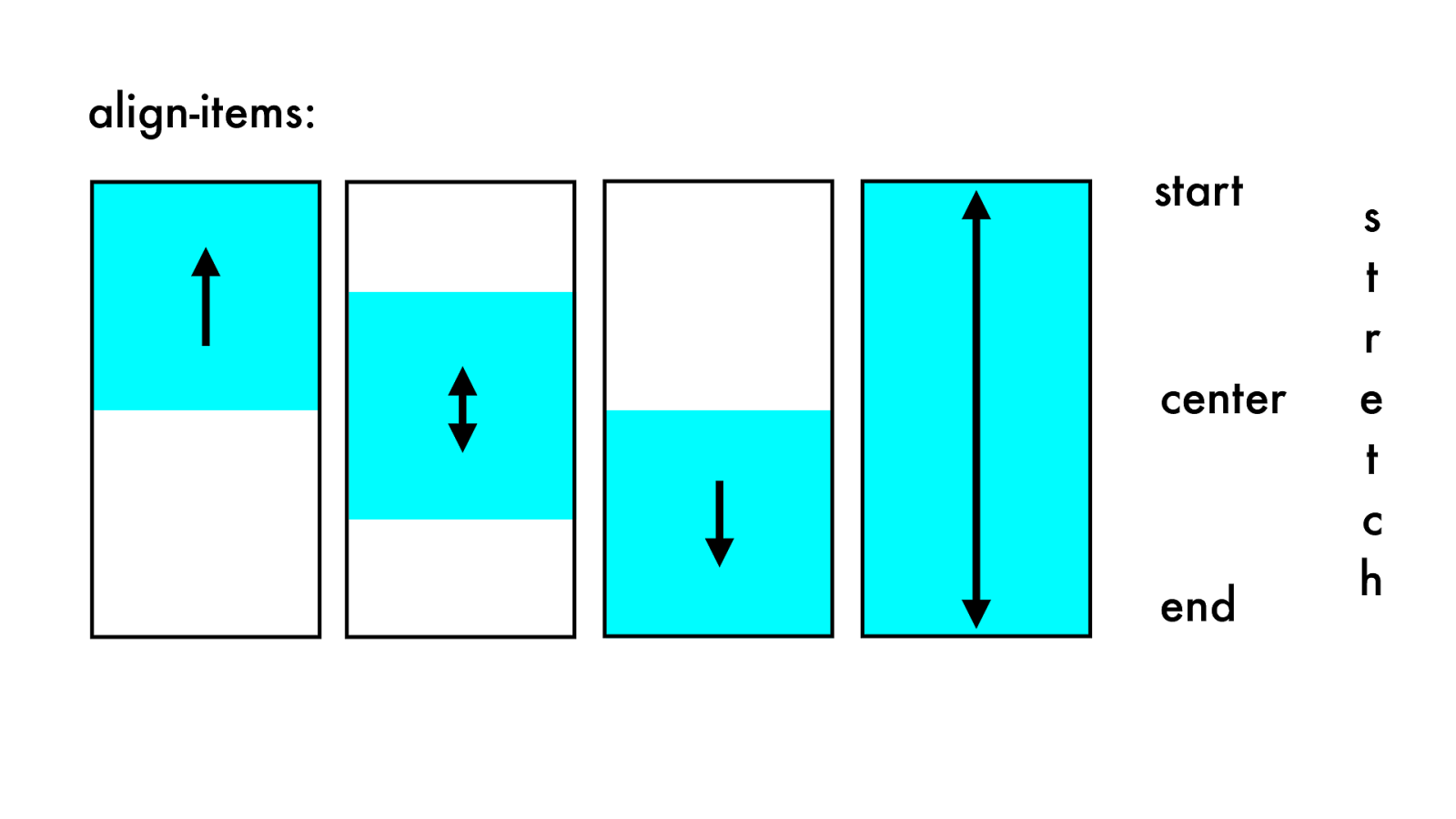
start center end align-items: s t r e t c h
Y
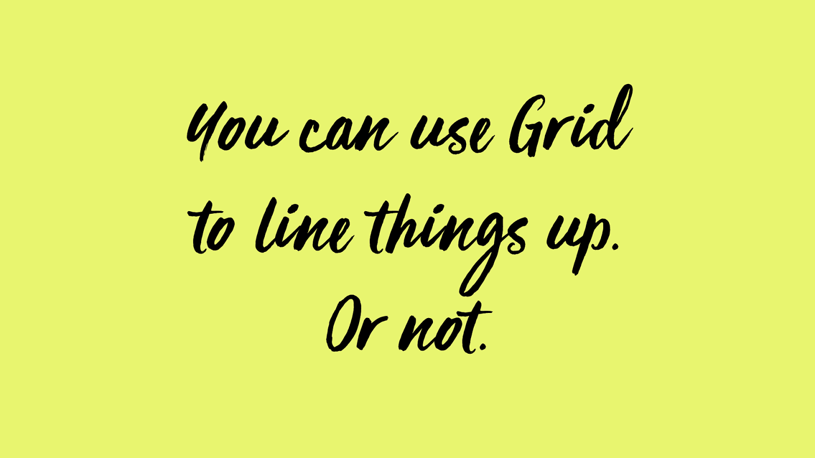
ou can use Grid
to line t hings up.
Or not.
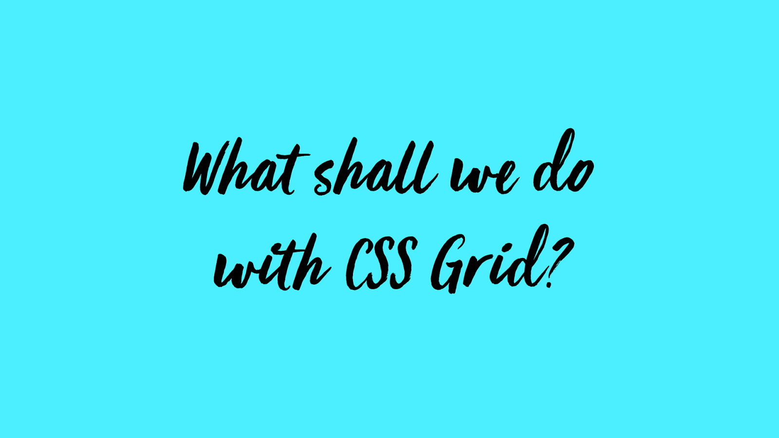
What shall we do
with C
SS
Grid?
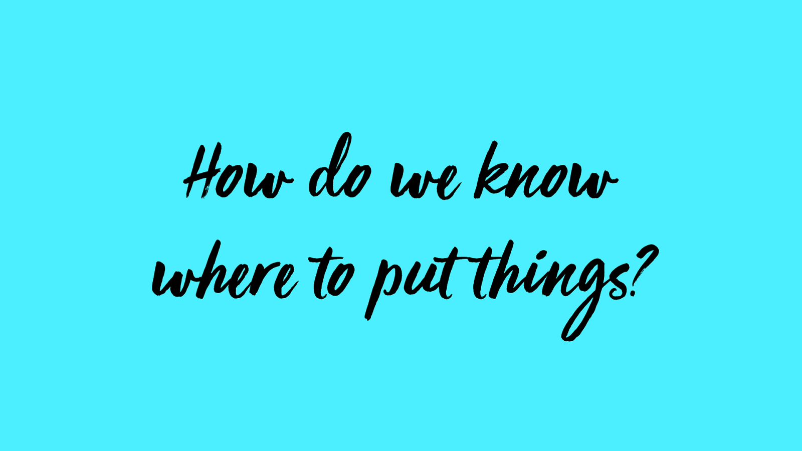
How do we know where to put things?

visual hierarchy
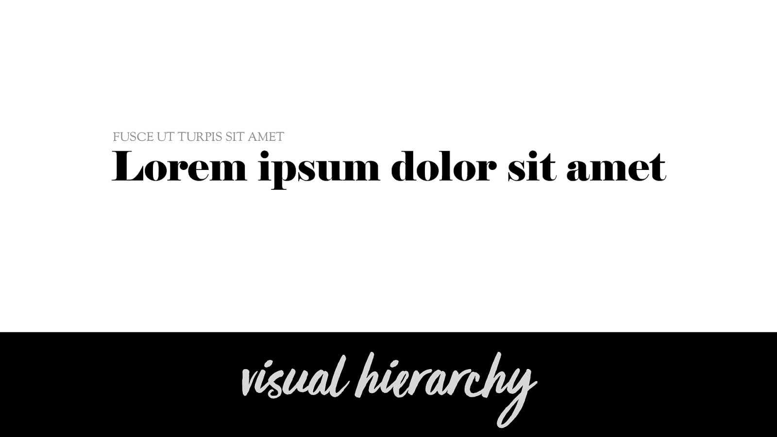
visual hierarchy Lorem ipsum dolor sit amet FUSCE UT TURPIS SIT AMET
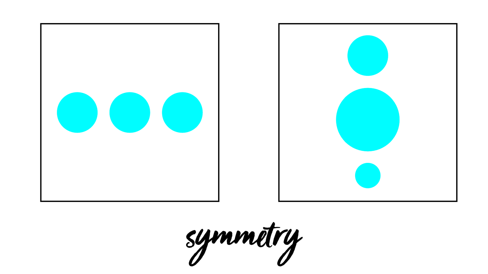
symmetry
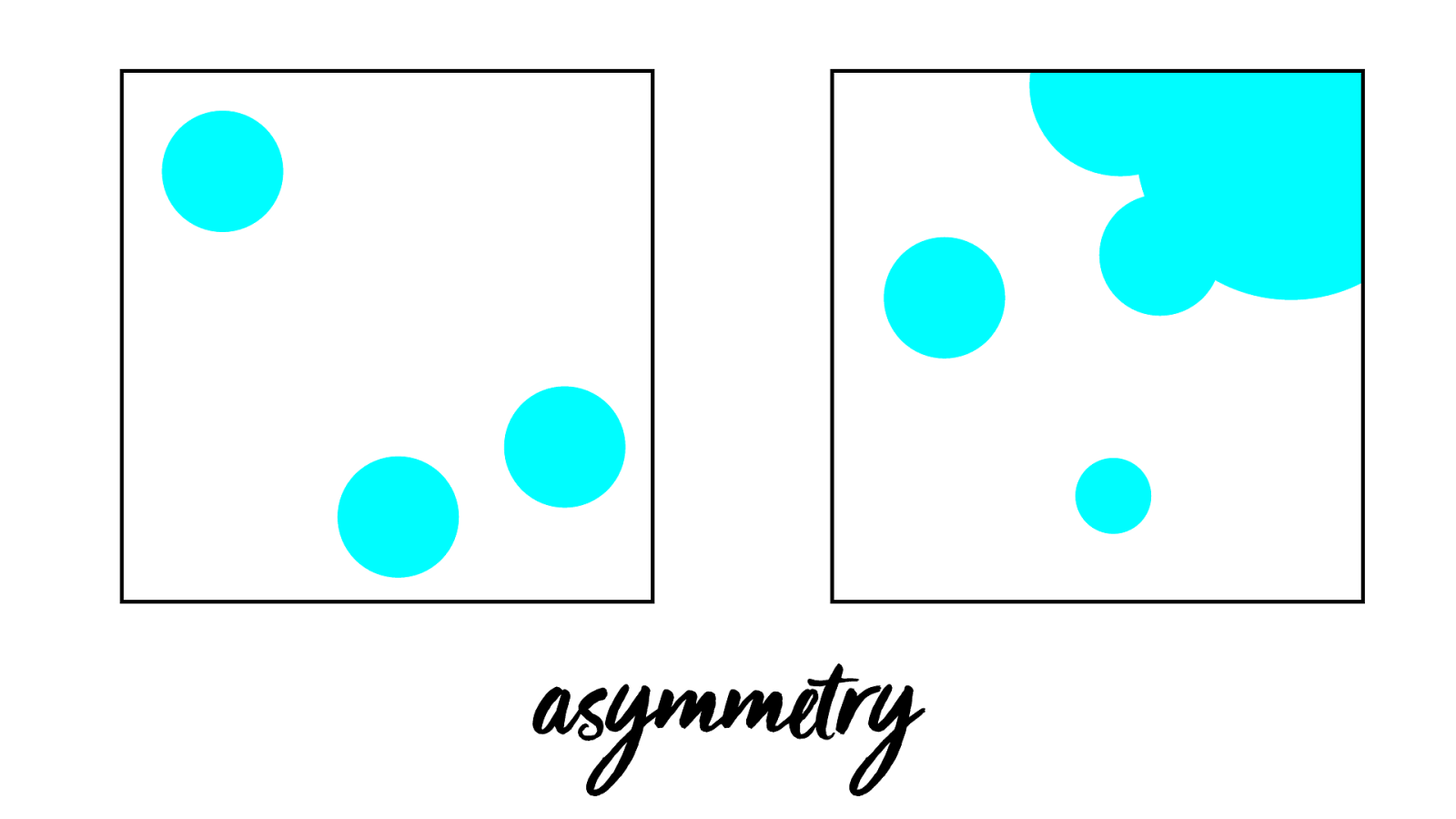
asymmetry
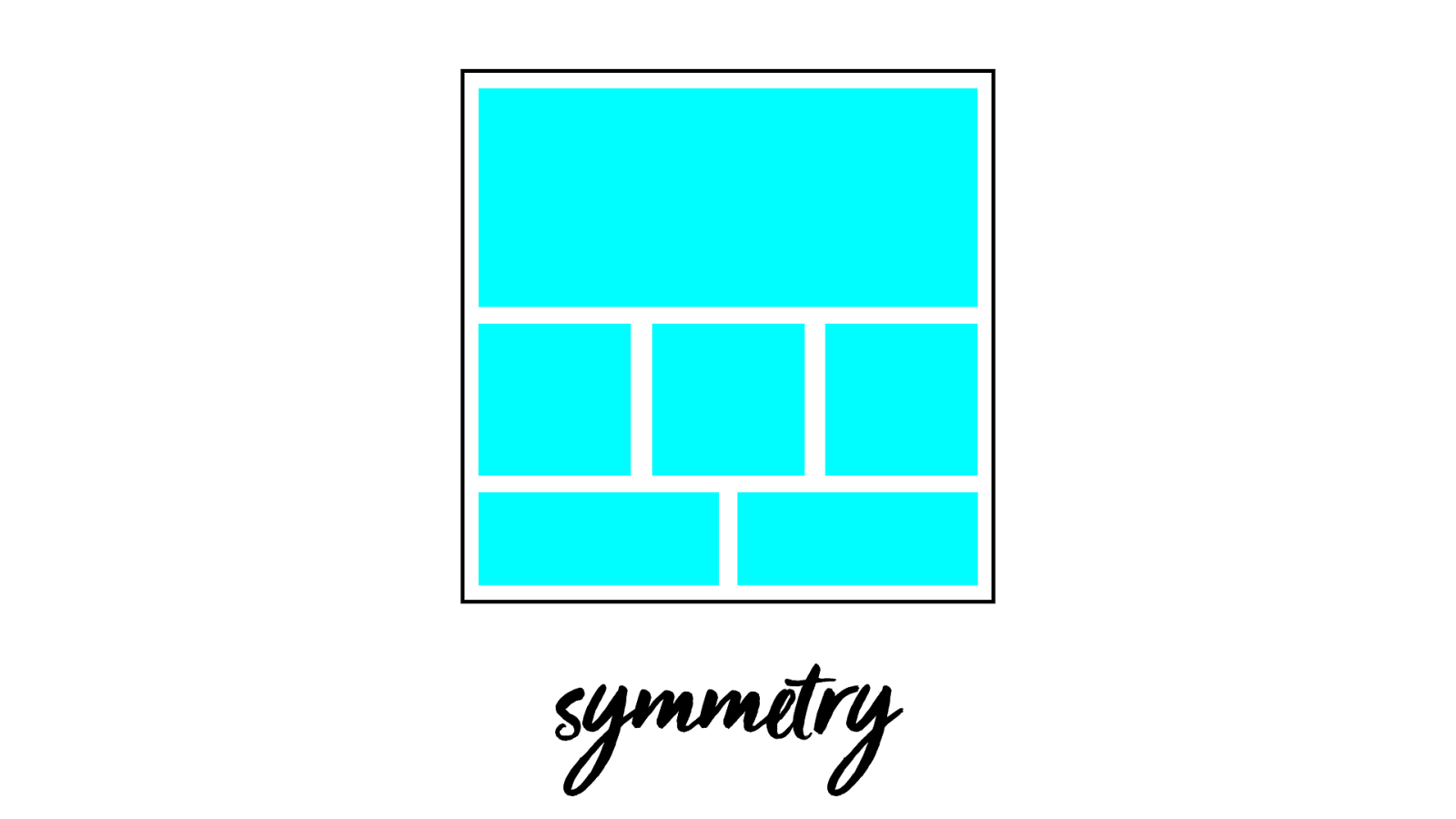
symmetry
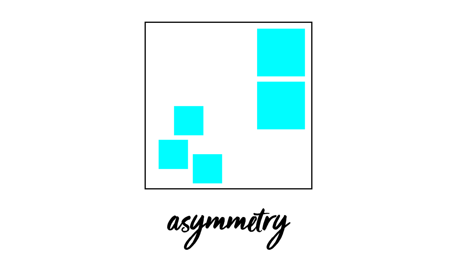
asymmetry
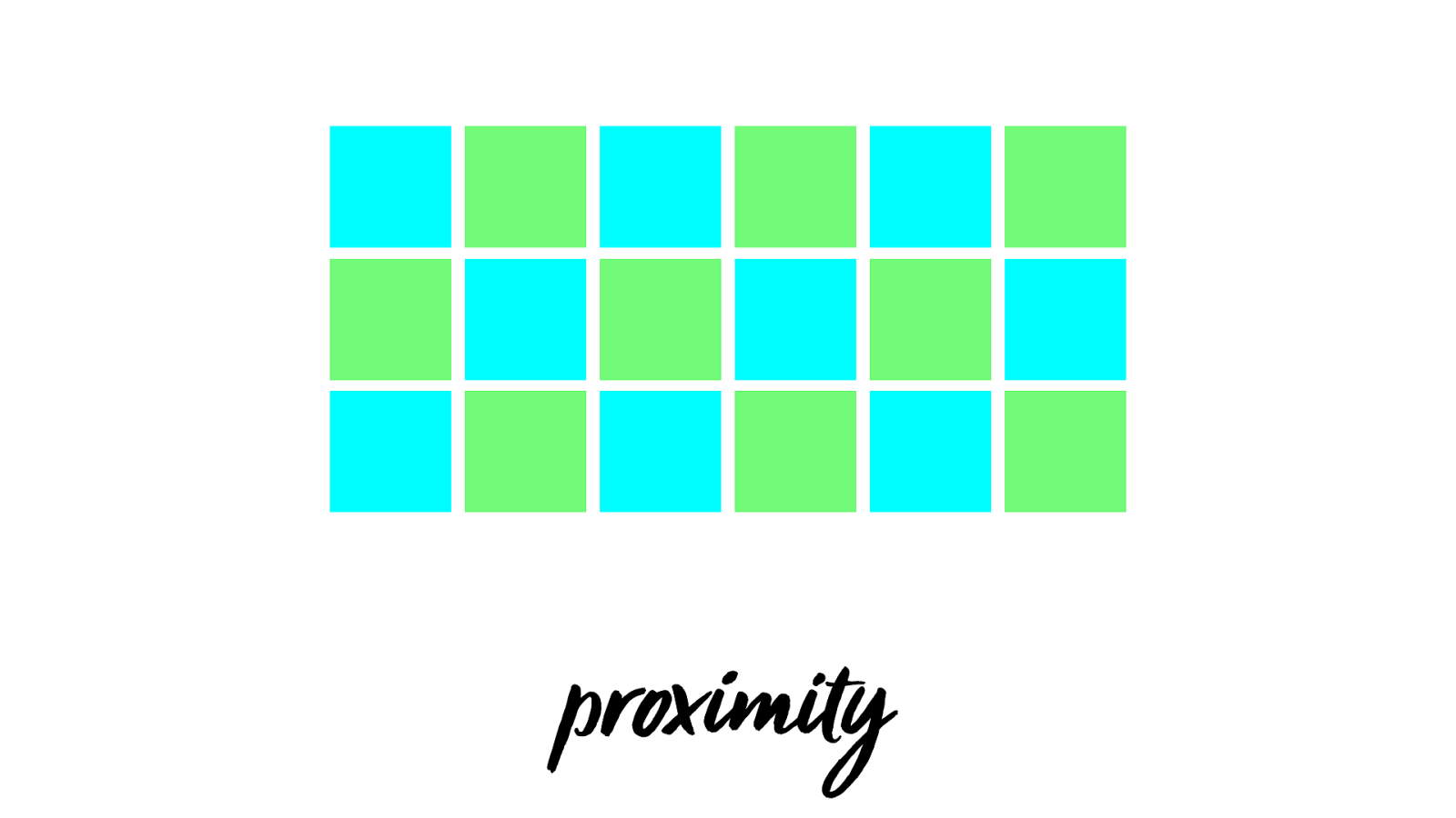
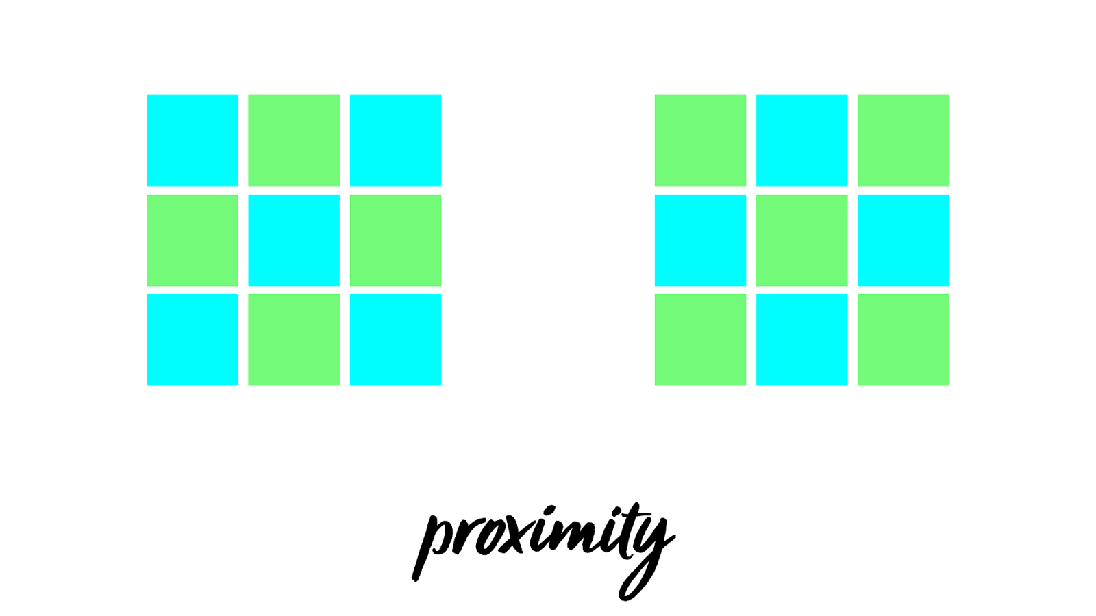
proxim
y
proxim
y

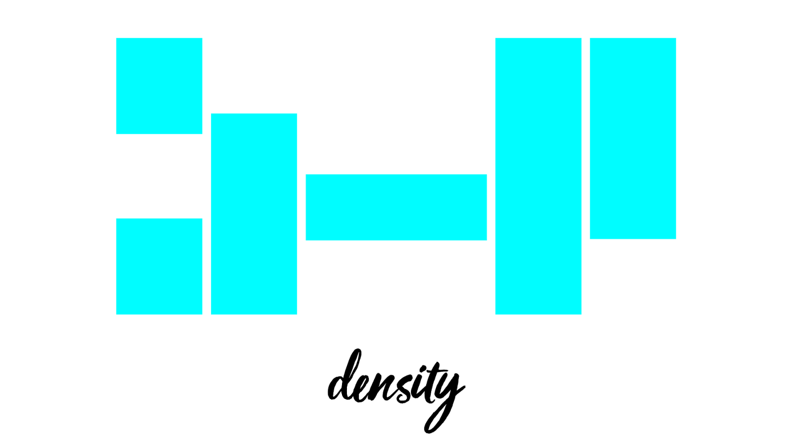
de n s
y
de n s
y
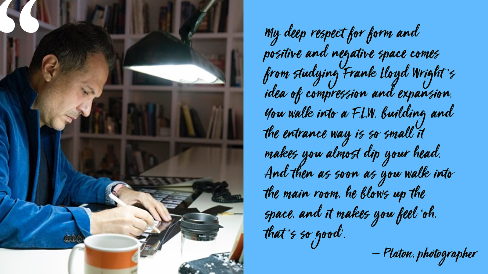
My dee p r espect for form and positive and negative space comes from studying Frank Lloyd Wright ’s idea of com pr ession and ex pansion. You walk into a F.L.W. building and the entrance way is so sm all it makes you almost dip your head. And then as soon as you walk into the m ain r oom, he blows up the space, and it m akes you fee l ‘oh, that ’s so good’. — P laton, photographer “
Graphic design for the web
Graphic design of the web
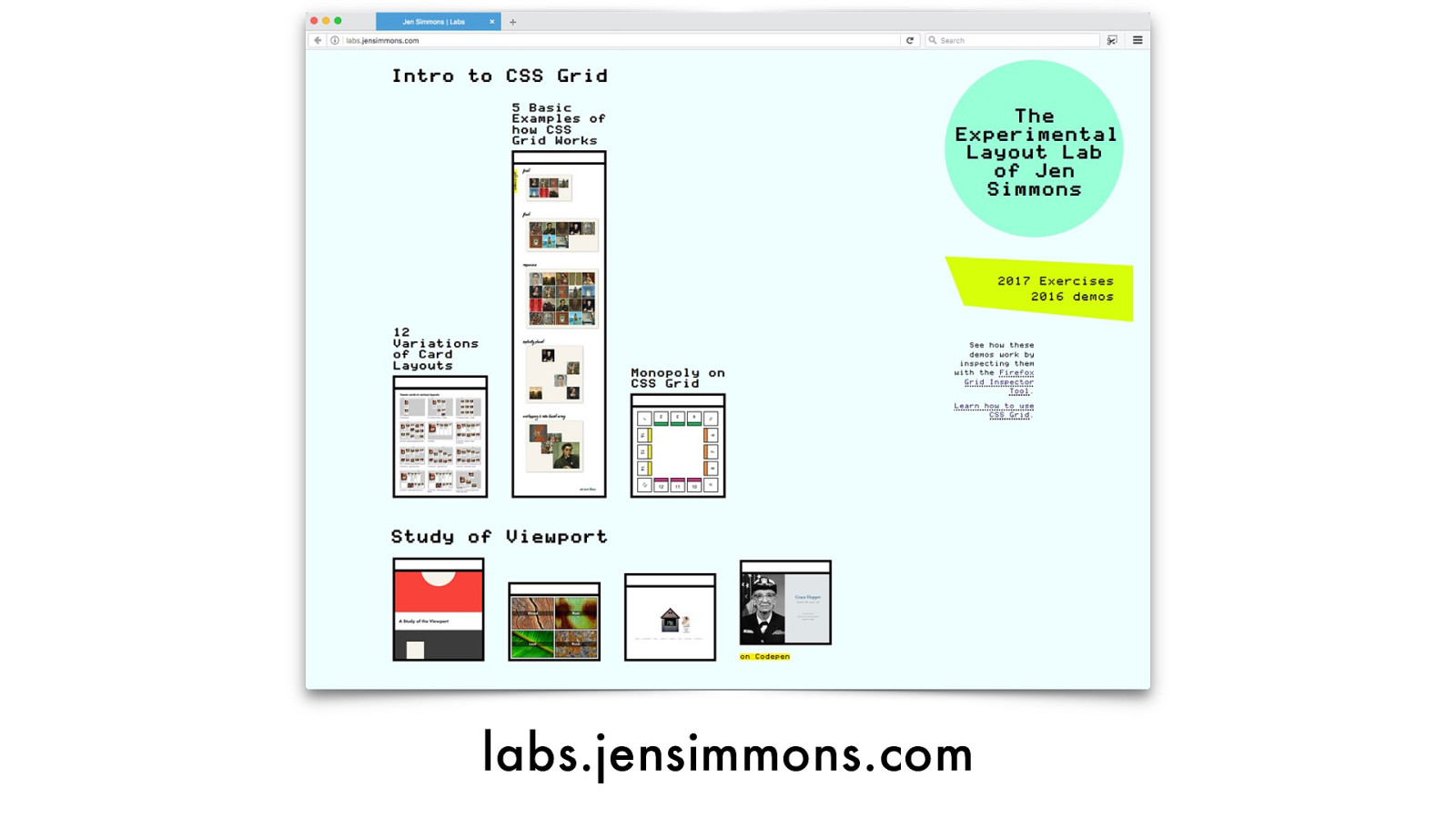
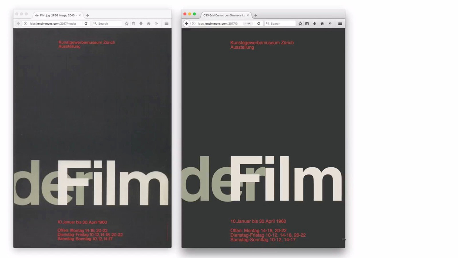
labs.jensimmons.com
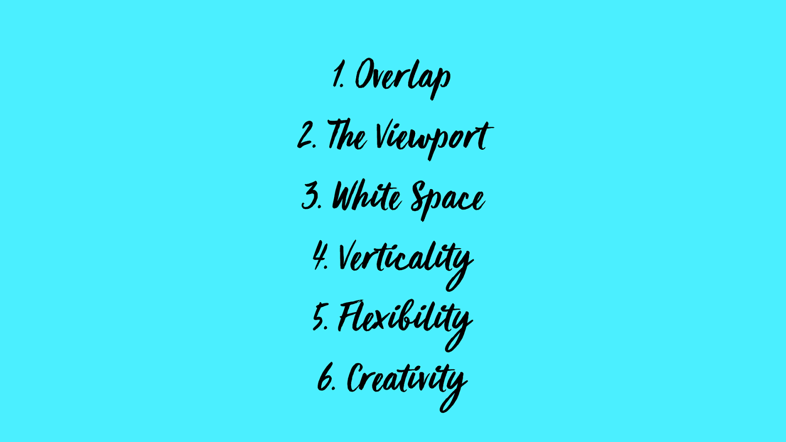
What I ’ve Discovered
in
Six
parts
- O v e r l a p
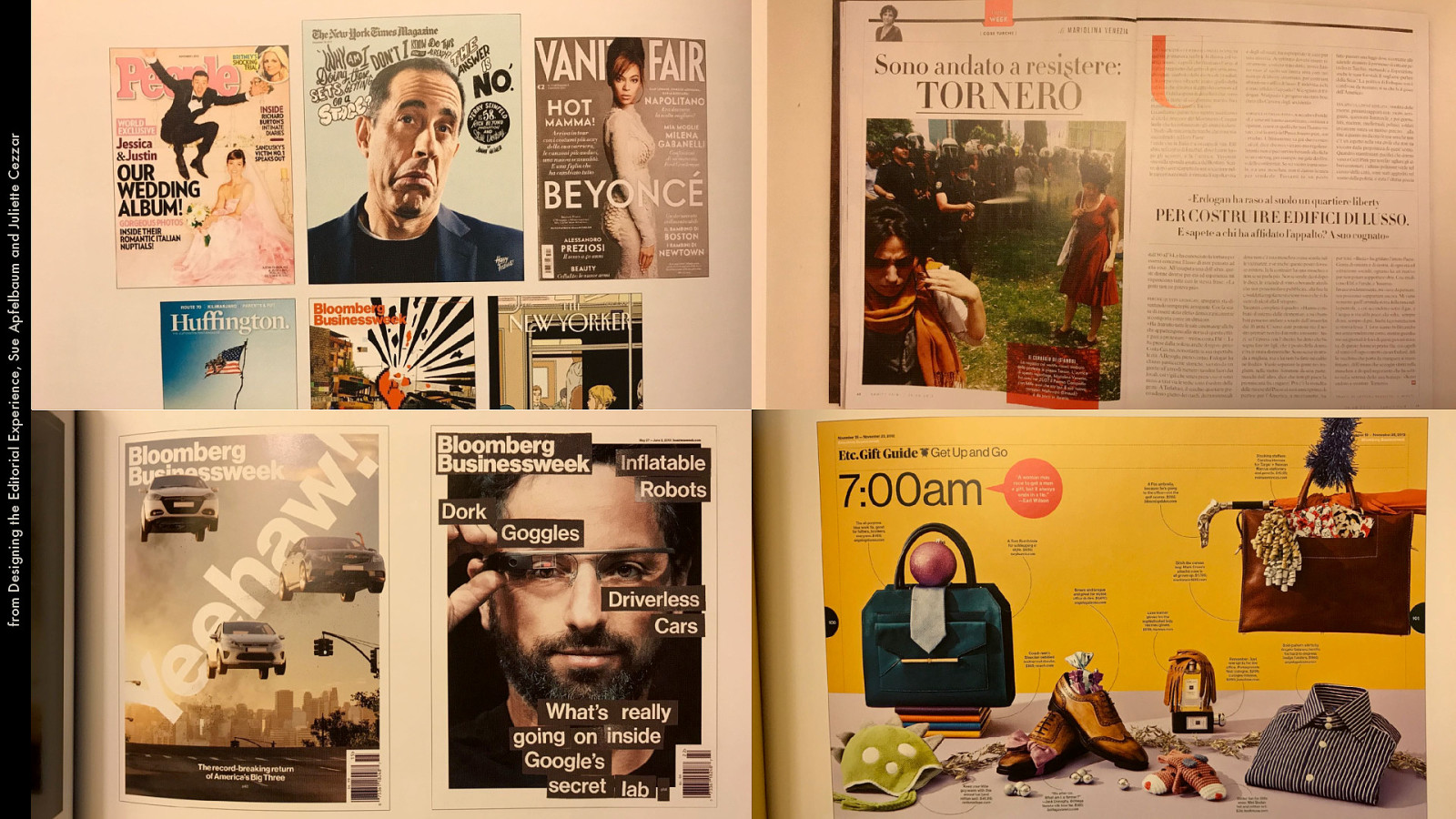
from Designing the Editorial Experience, Sue Apfelbaum and Juliette Cezzar
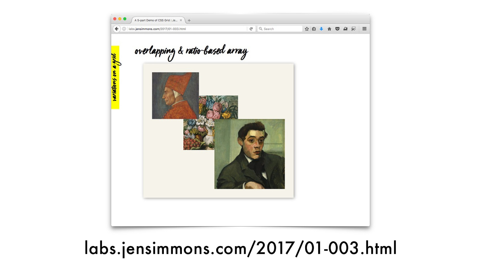
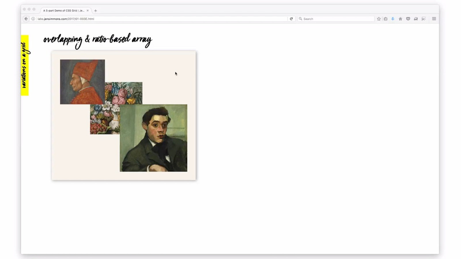
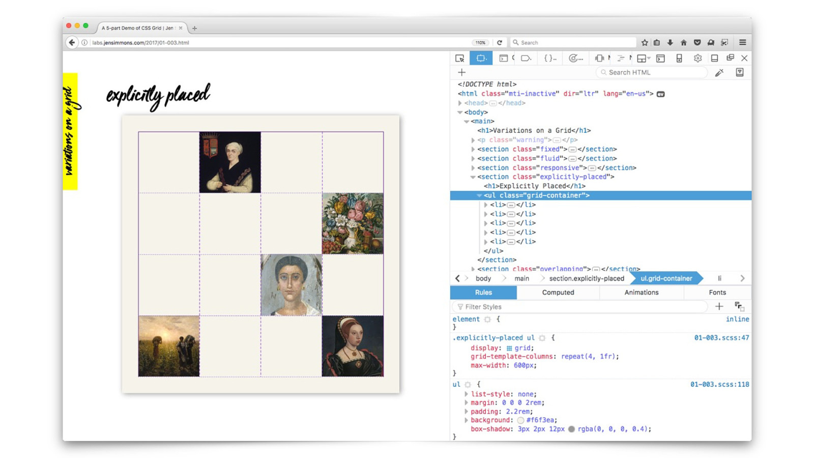
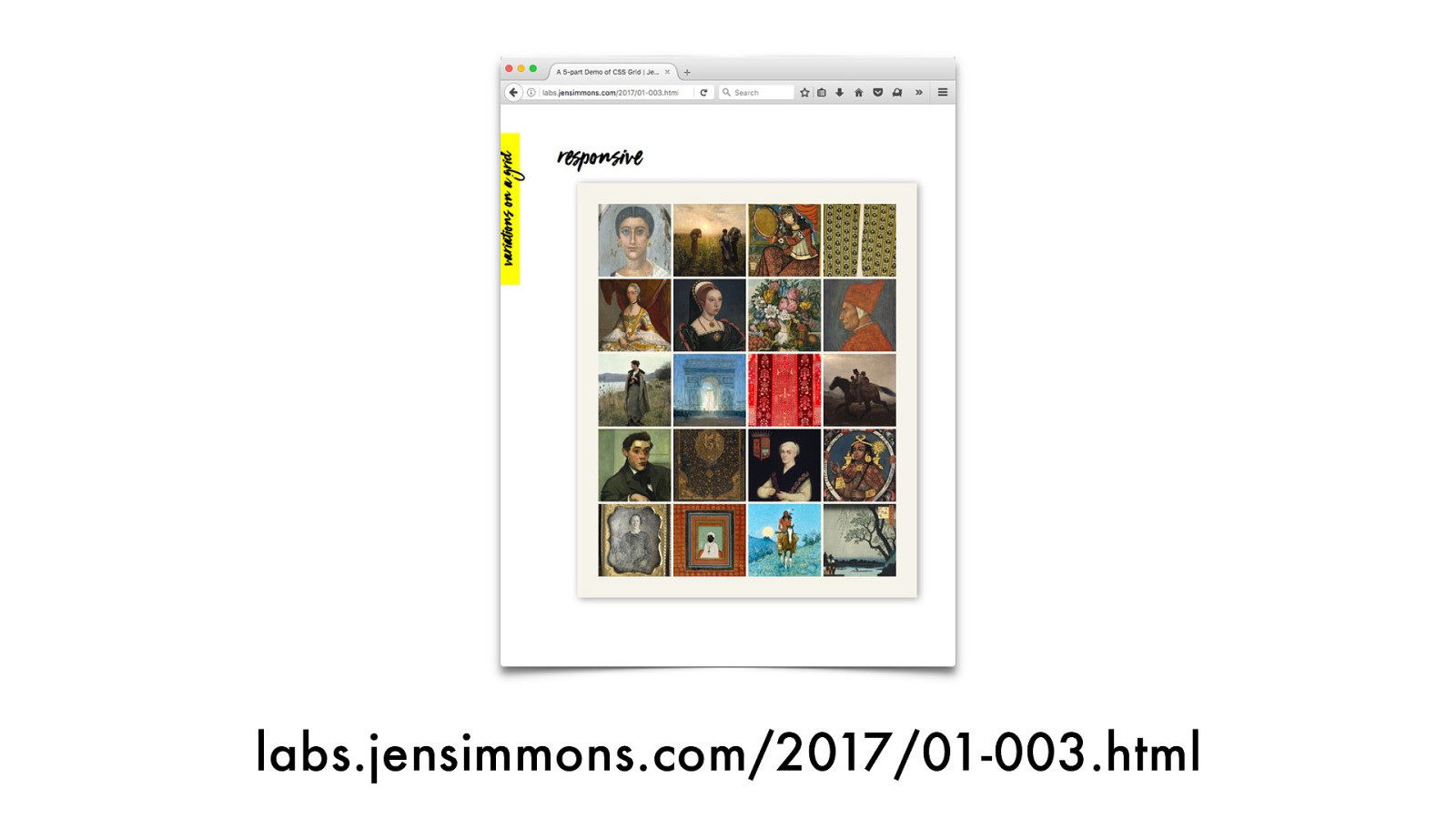
labs.jensimmons.com/2017/01-003.html
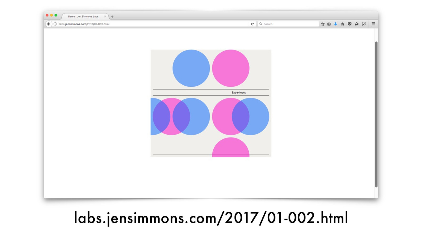
labs.jensimmons.com/2017/01-002 .html
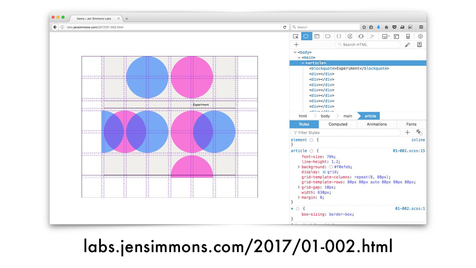
labs.jensimmons.com/2017/01-002 .html
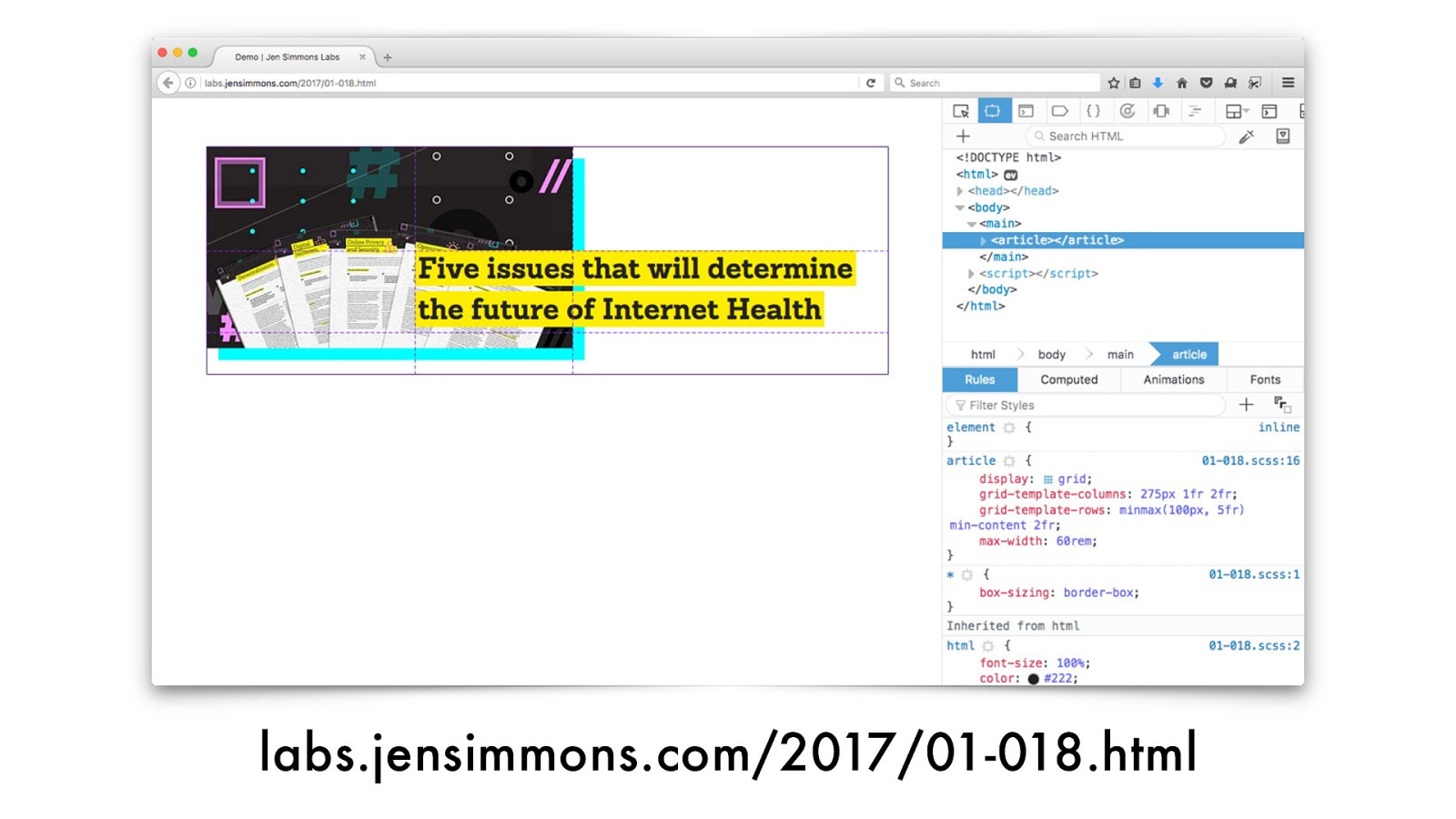
labs.jensimmons.com/2017/01-018.html
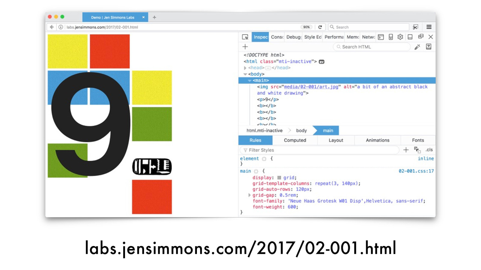
labs.jensimmons.com/2017/02-001 .html
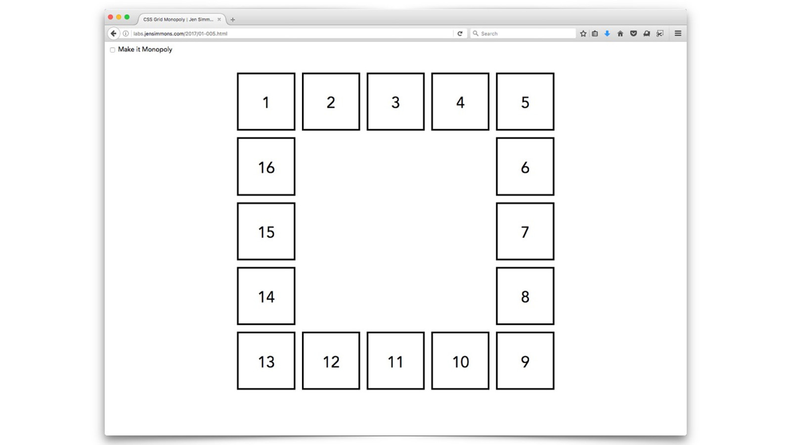
Overlap
2, The Vie wpor t

storyboards
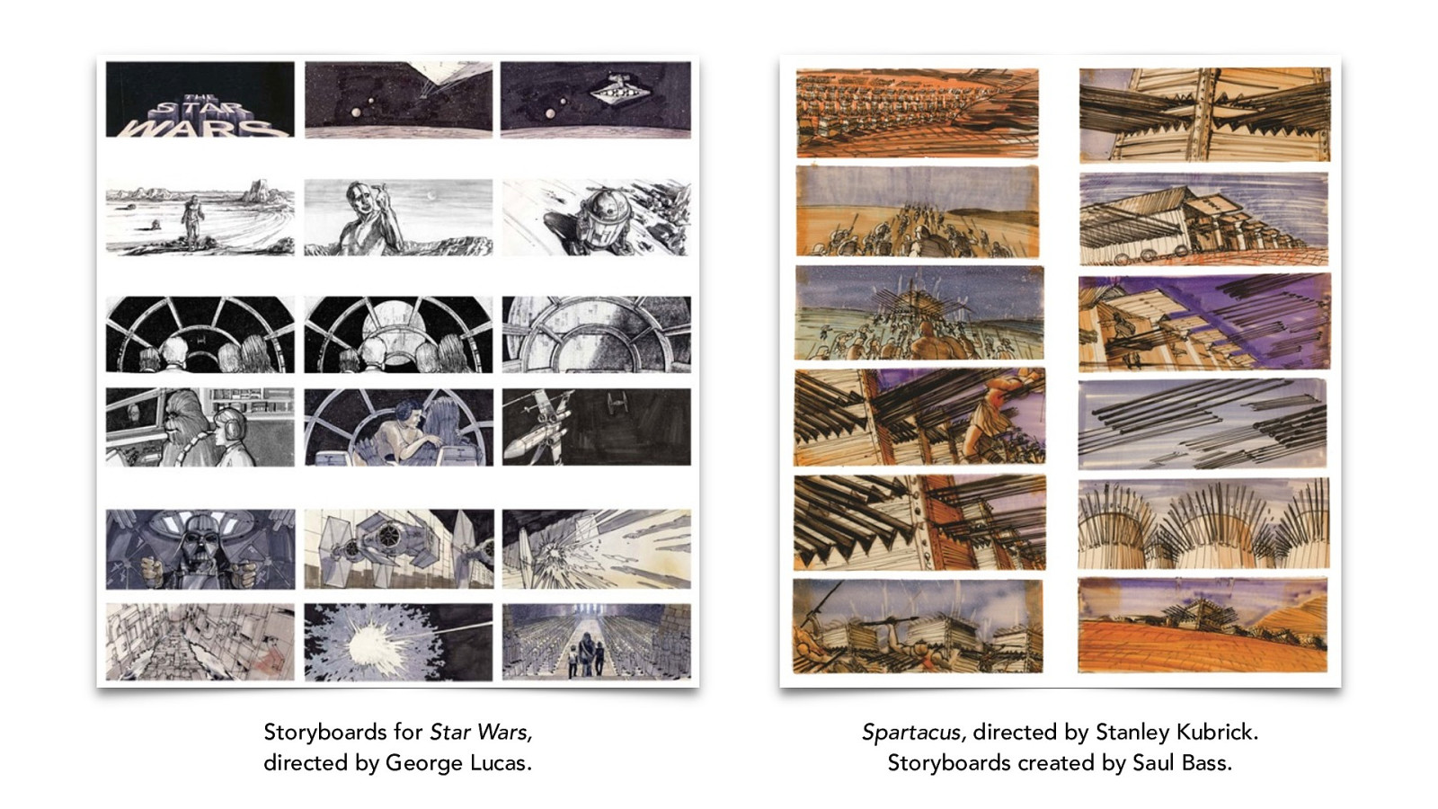
Storyboards for
Star Wars,
directed by George Lucas.
Spartacus,
directed by Stanley Kubrick.
Storyboards created by Saul Bass .
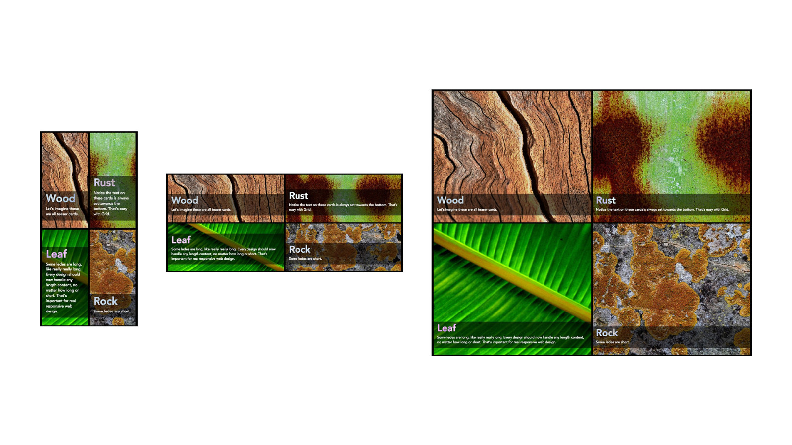

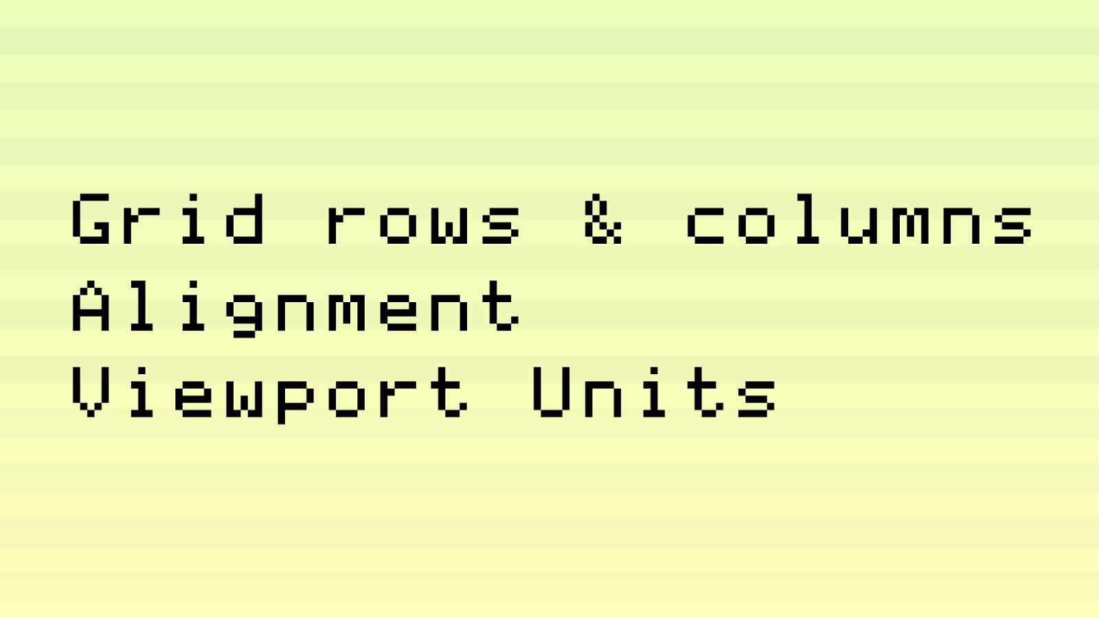
Grid rows & columns Alignment
Viewport Units
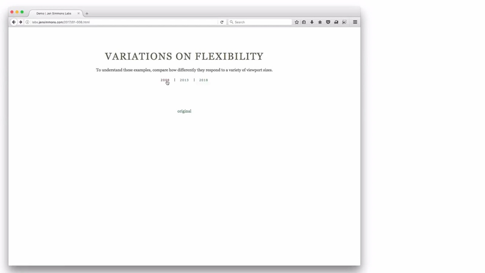
labs.jensimmons.com/2017/01-008.html
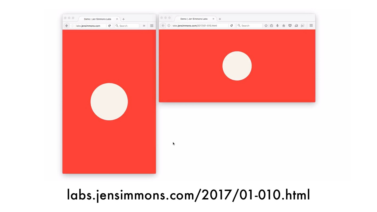
labs.jensimmons.com/2017/01-010.html
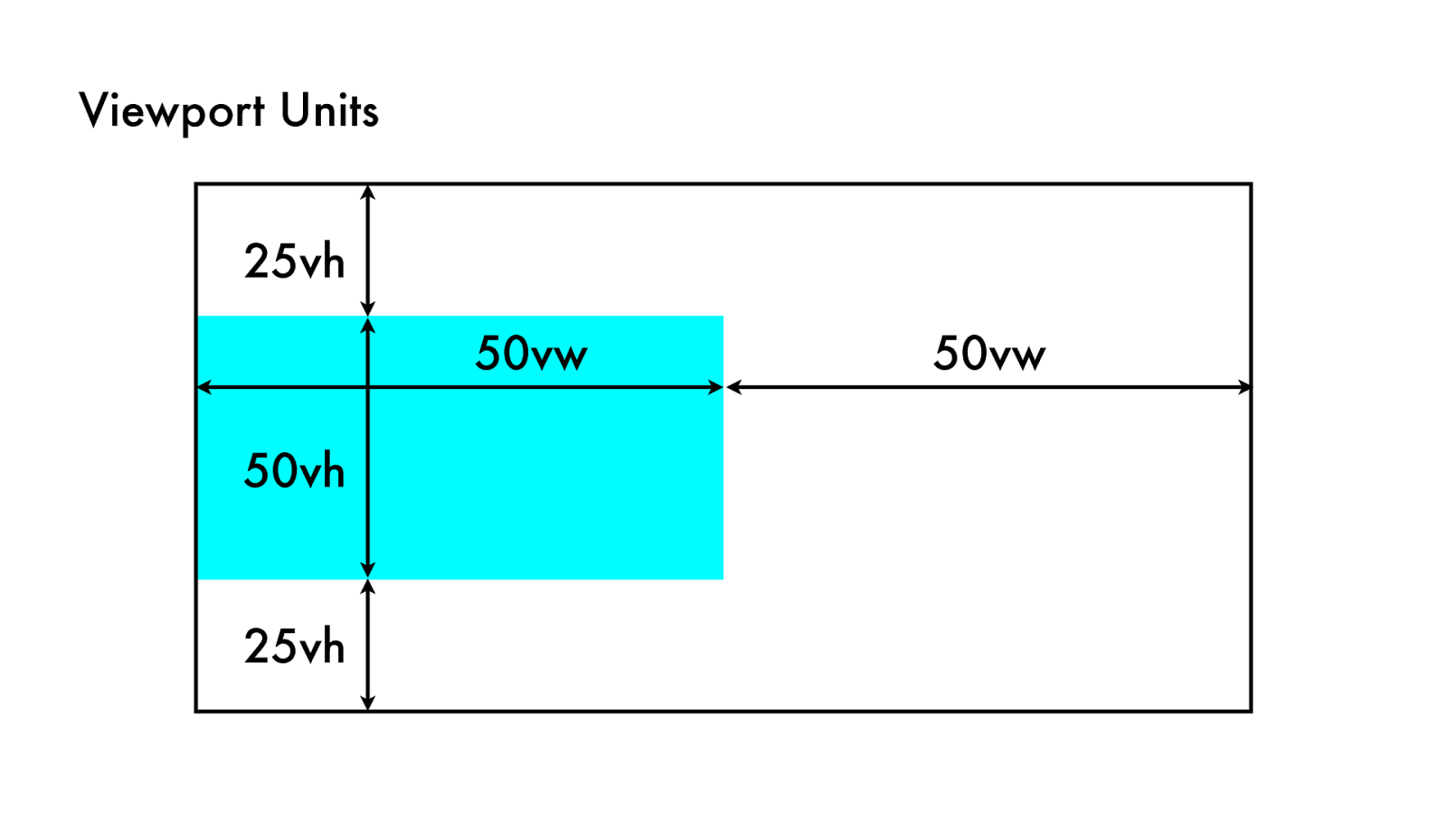
Viewport Units 50vh 25vh 50vw 25vh 50vw
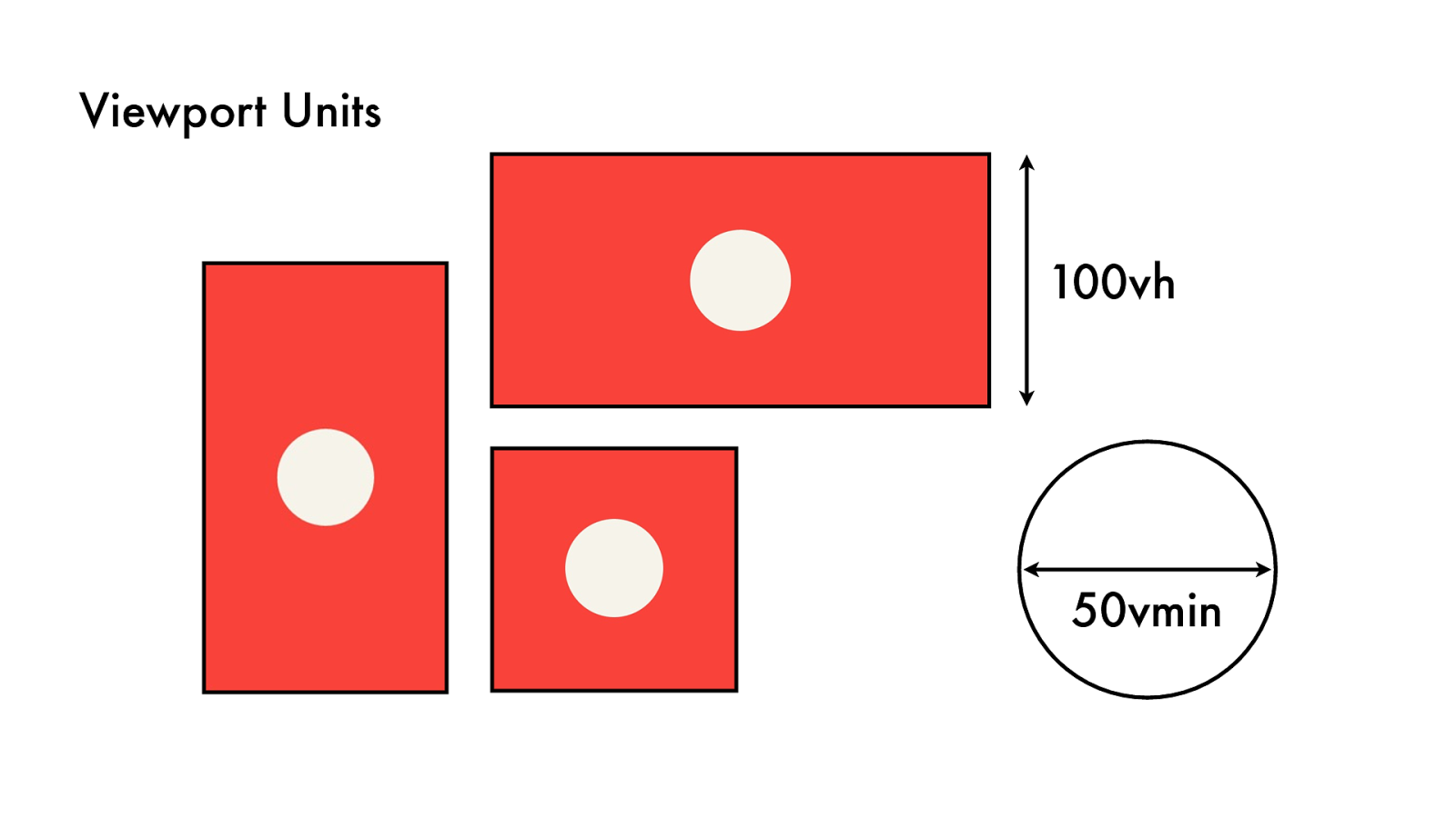
Viewport Units 50vmin 10 0 v h

Framing

Filmic Language
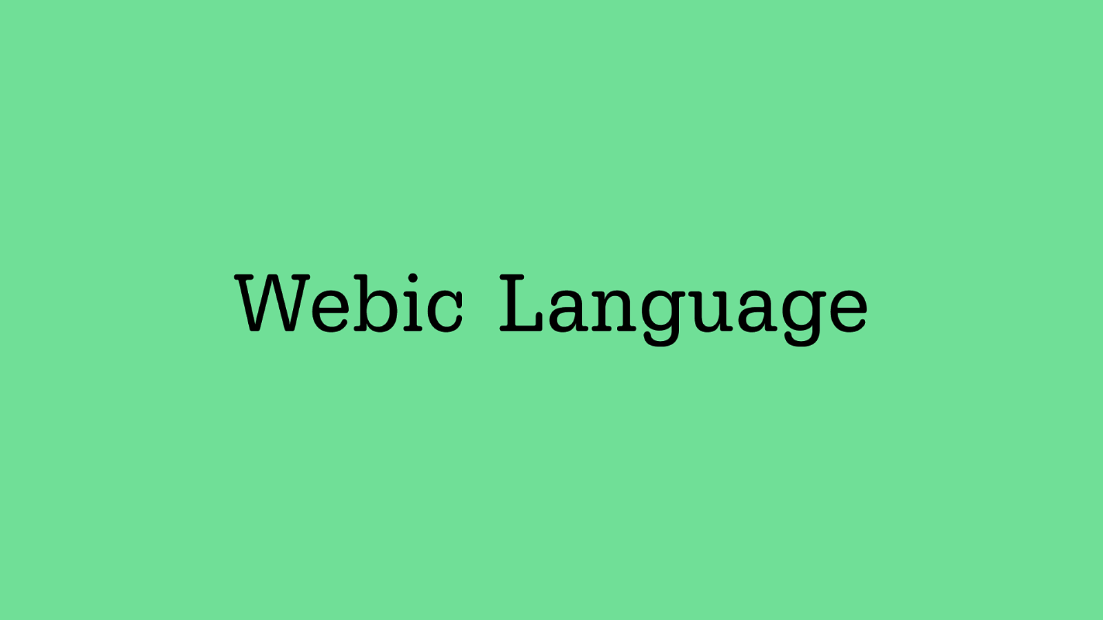
Webic Language
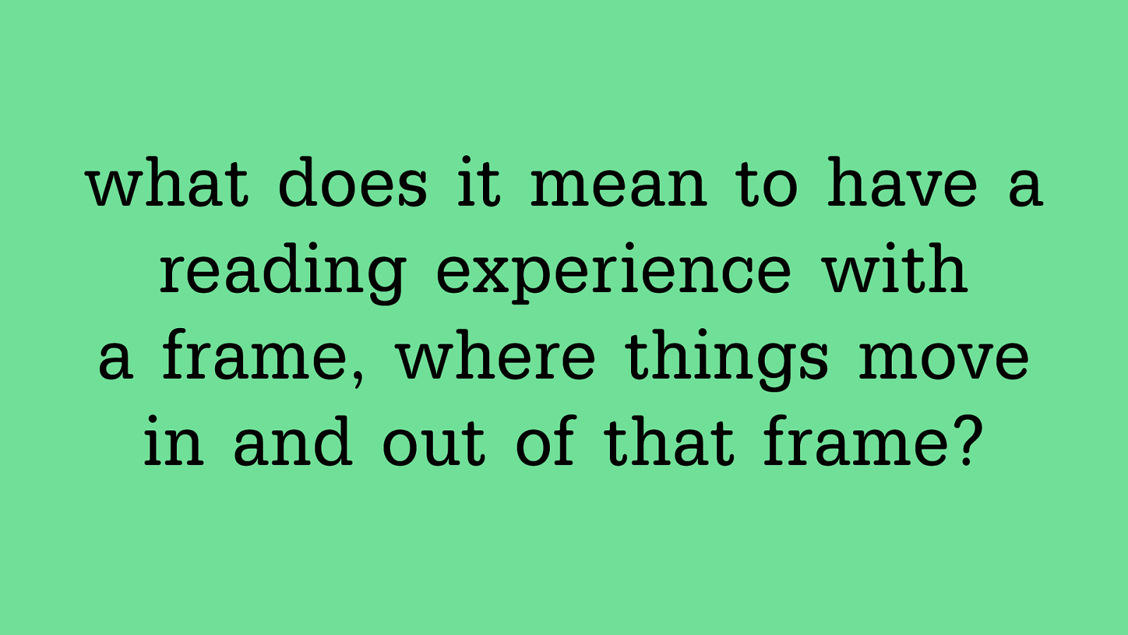
what does it mean to have a reading experience with a frame, where things move in and out of that frame?
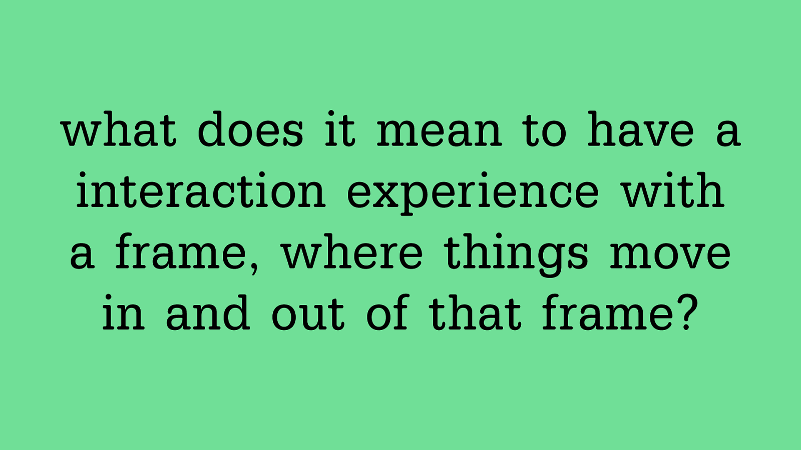
what does it mean to have a interaction experience with a frame, where things move in and out of that frame?
The Vie wpor t
- W h i t e S p a c e
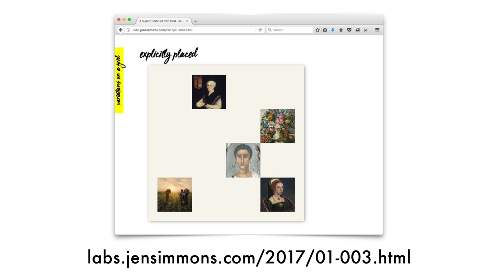
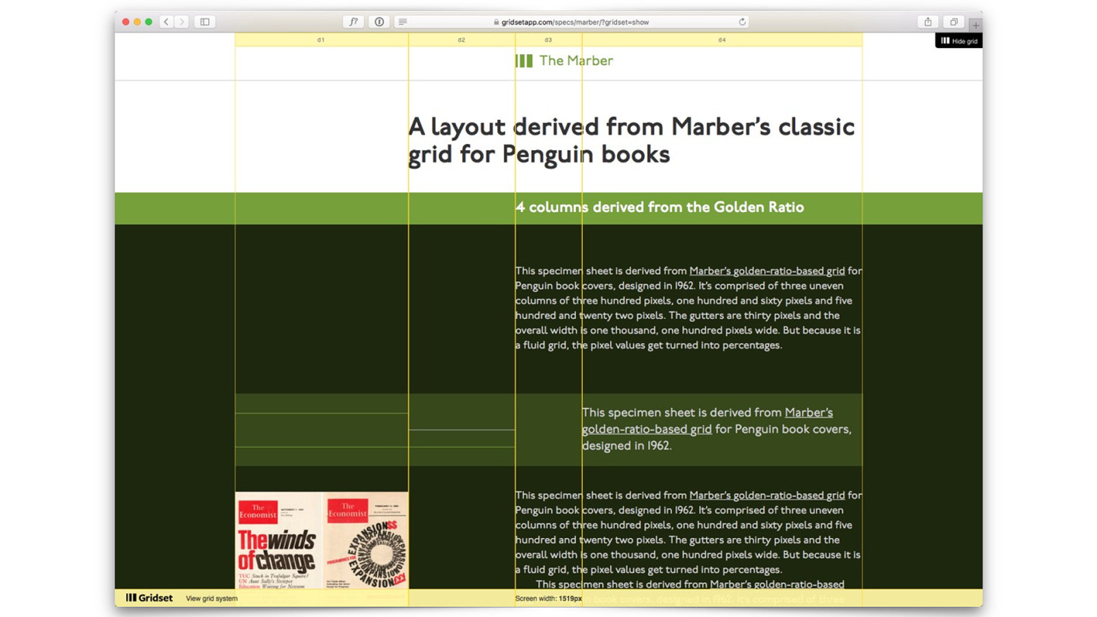
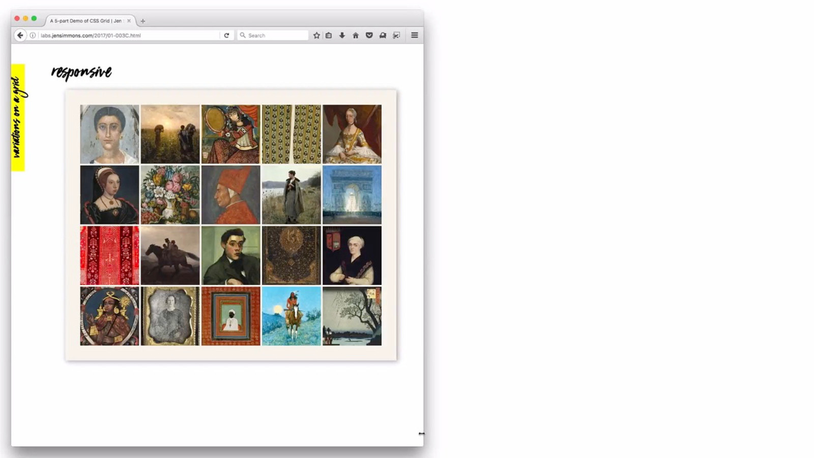
labs.jensimmons.com/2017/01-003.html
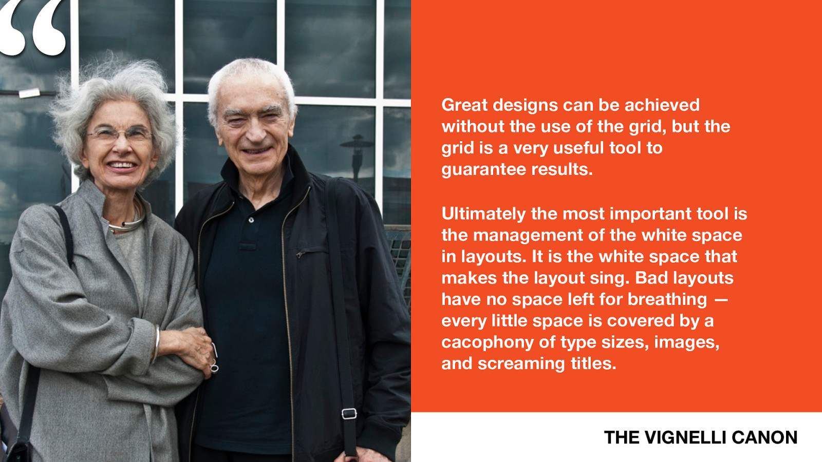
“
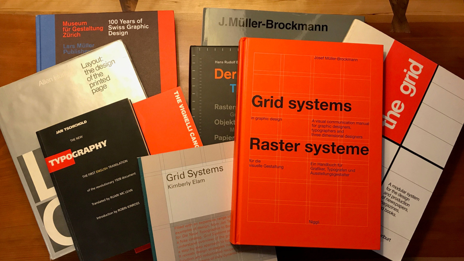
THE VIGNELLI CANON
Great designs can be achieved
without the use of the grid, but the
grid is a very useful tool to
guarantee results.
Ultimately the most important tool is
the management of the white space
in layouts. It is the white space that
makes the layout sing. Bad layouts
have no space left for breathing —
every little space is covered by a
cacophony of type sizes, images,
and screaming titles.
Control the size of the page? Nope. 2. Line things up? Yes. Easy. 3. Create white space? Yes, absolutely. 4. Maintain aspect ratios? Nope. Not yet.
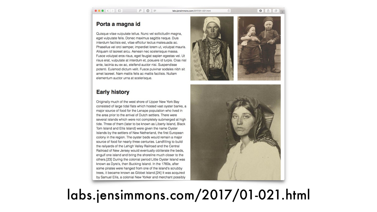
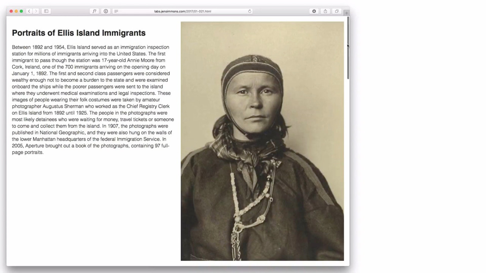
labs.jensimmons.com/2017/01-021.html
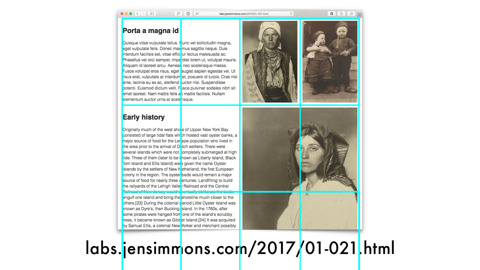
labs.jensimmons.com/2017/01-021.html
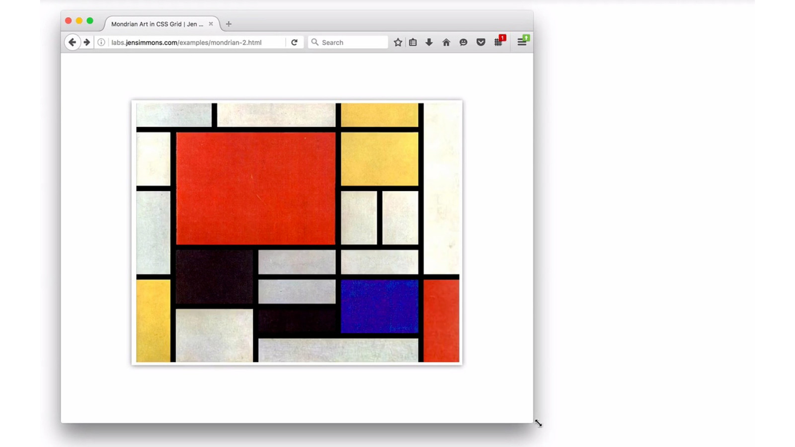
Grid like a Modernist?
White Space
- V e r t i c a l i t y

- V e r t i c a l i t y
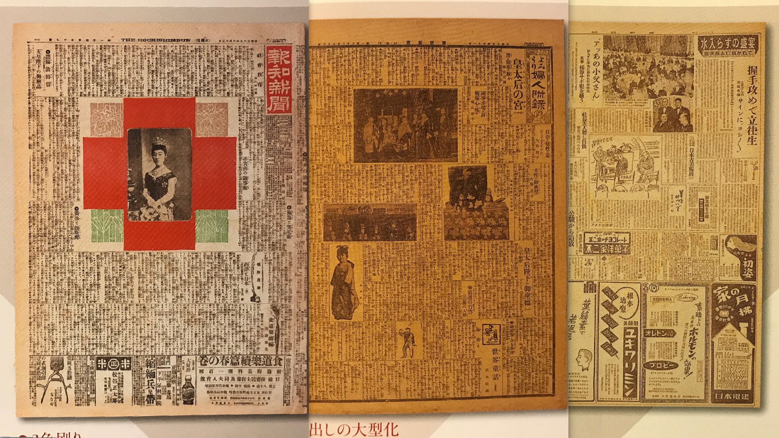
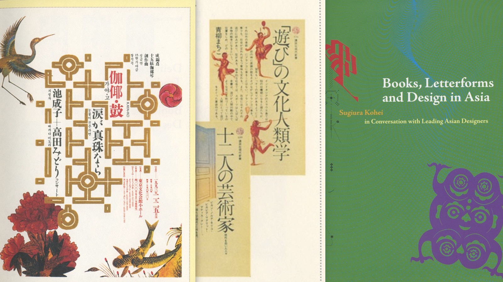
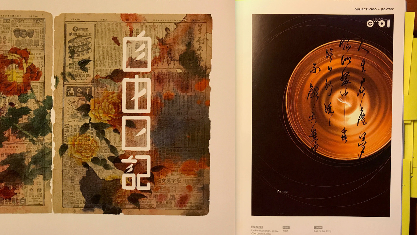
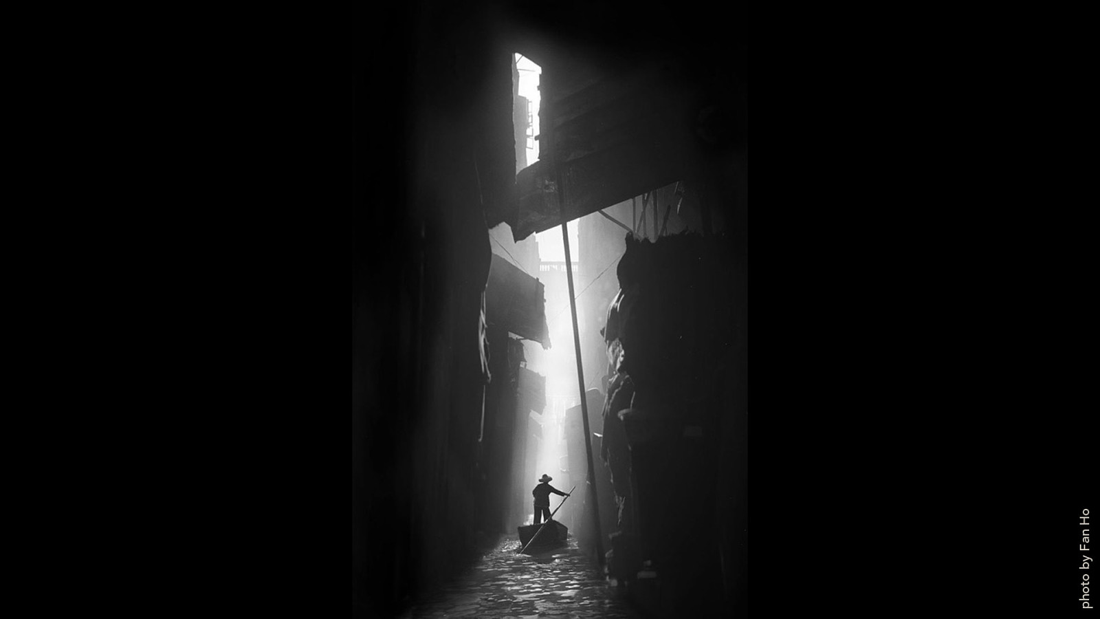
photo by Fan Ho
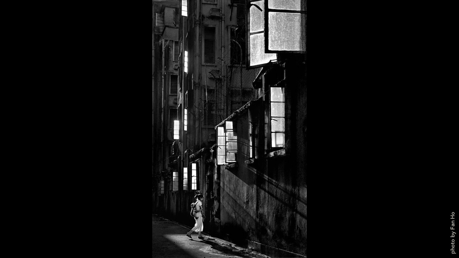
photo by Fan Ho
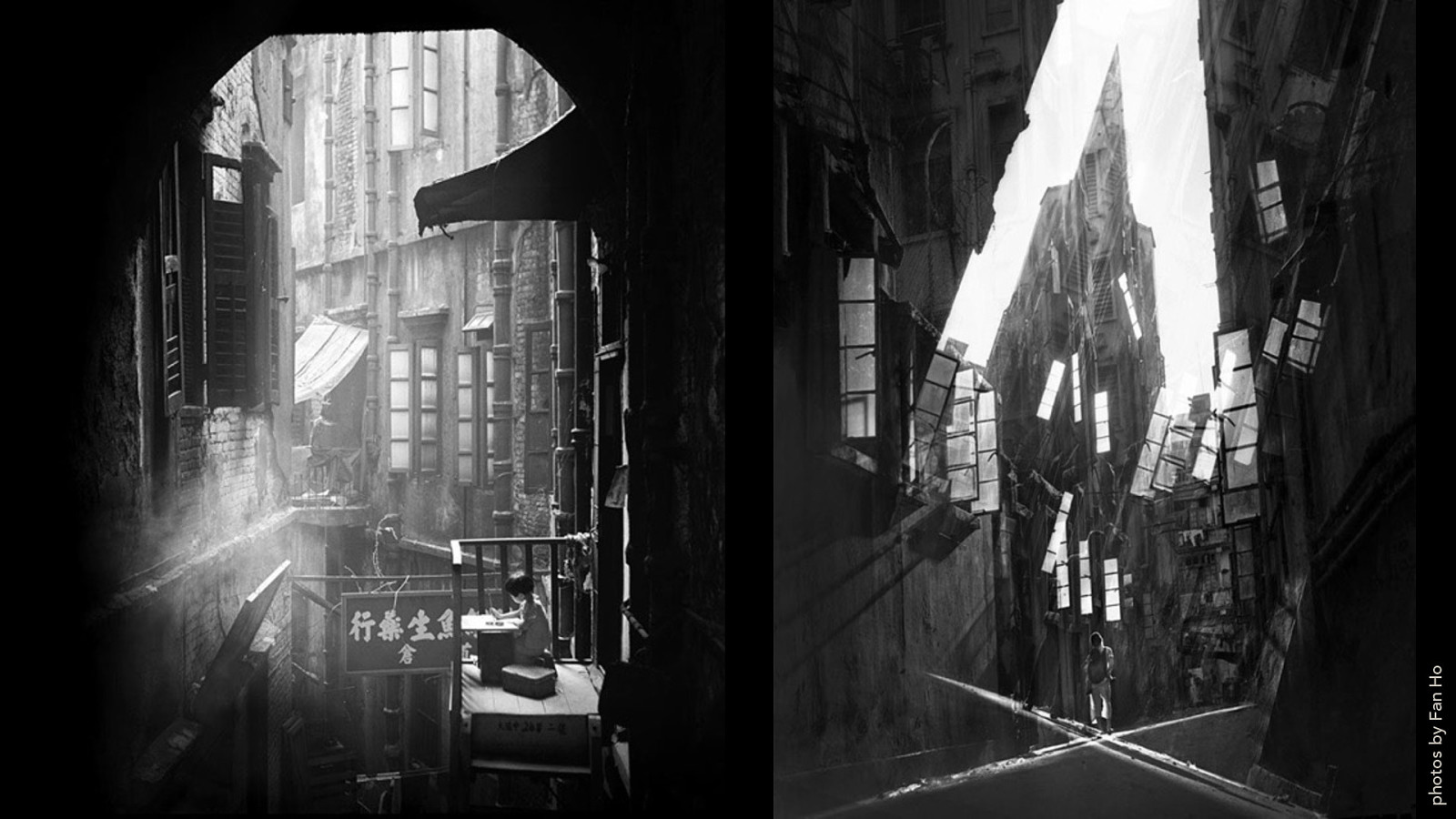
photos by Fan Ho
labs.jensimmons.com/2017/01-020.html
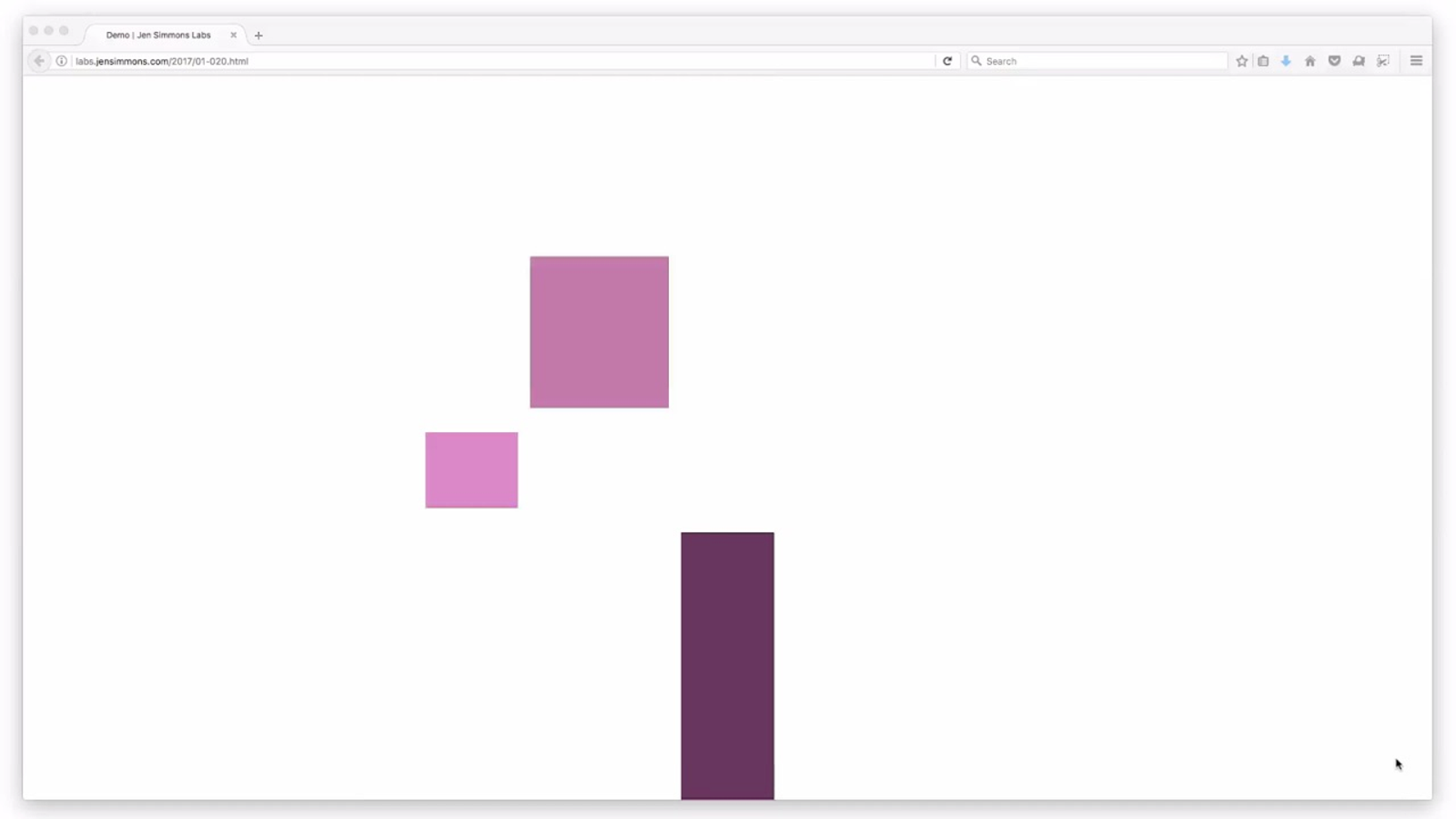
Verticality
- F l e x i b i l i t y
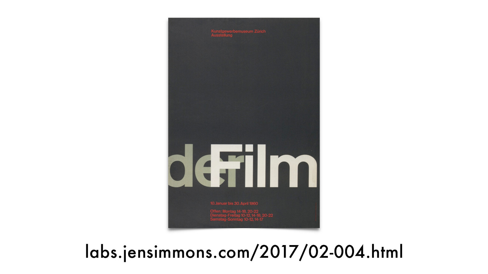
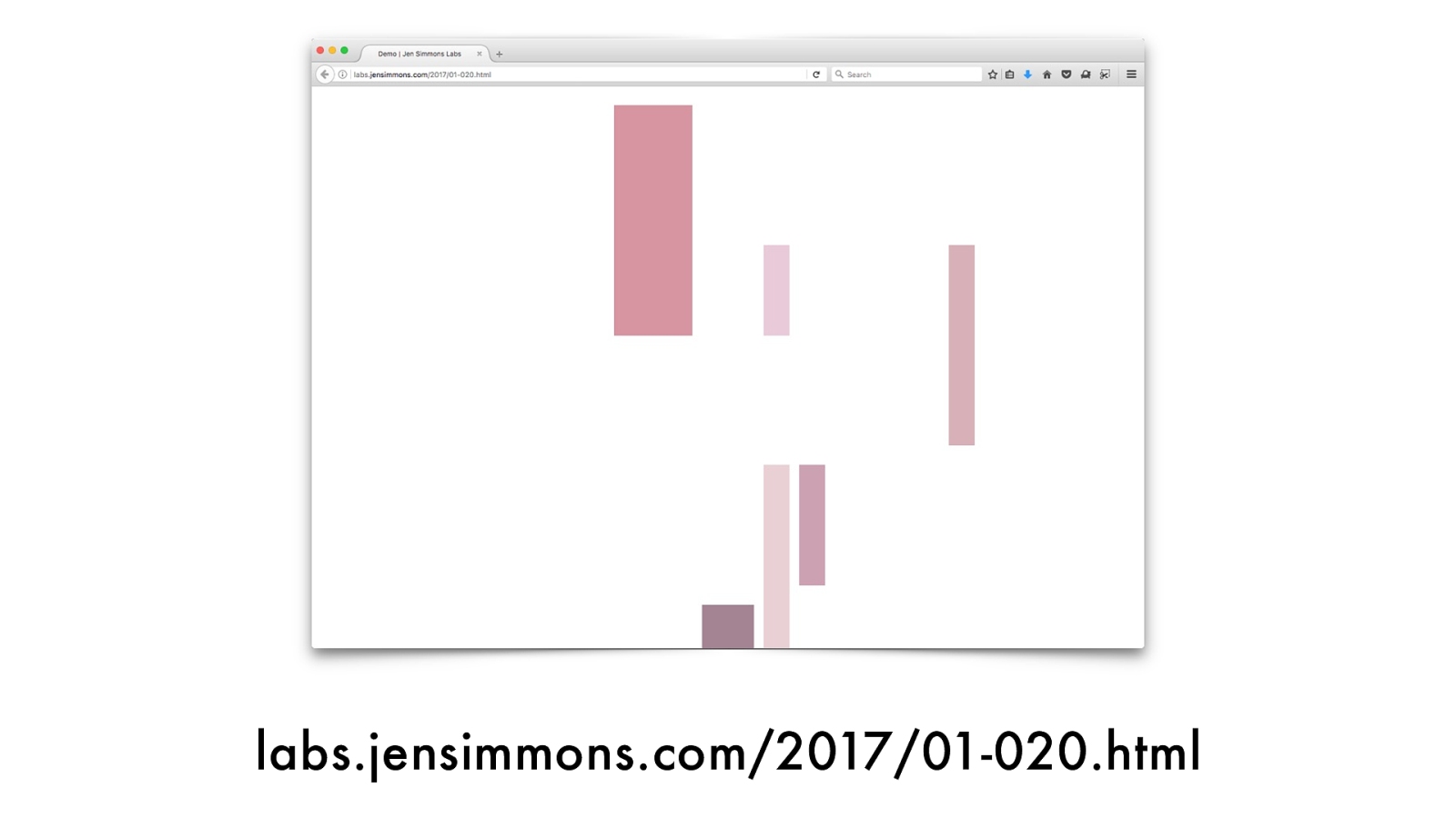
labs.jensimmons.com/2017/02-004.html
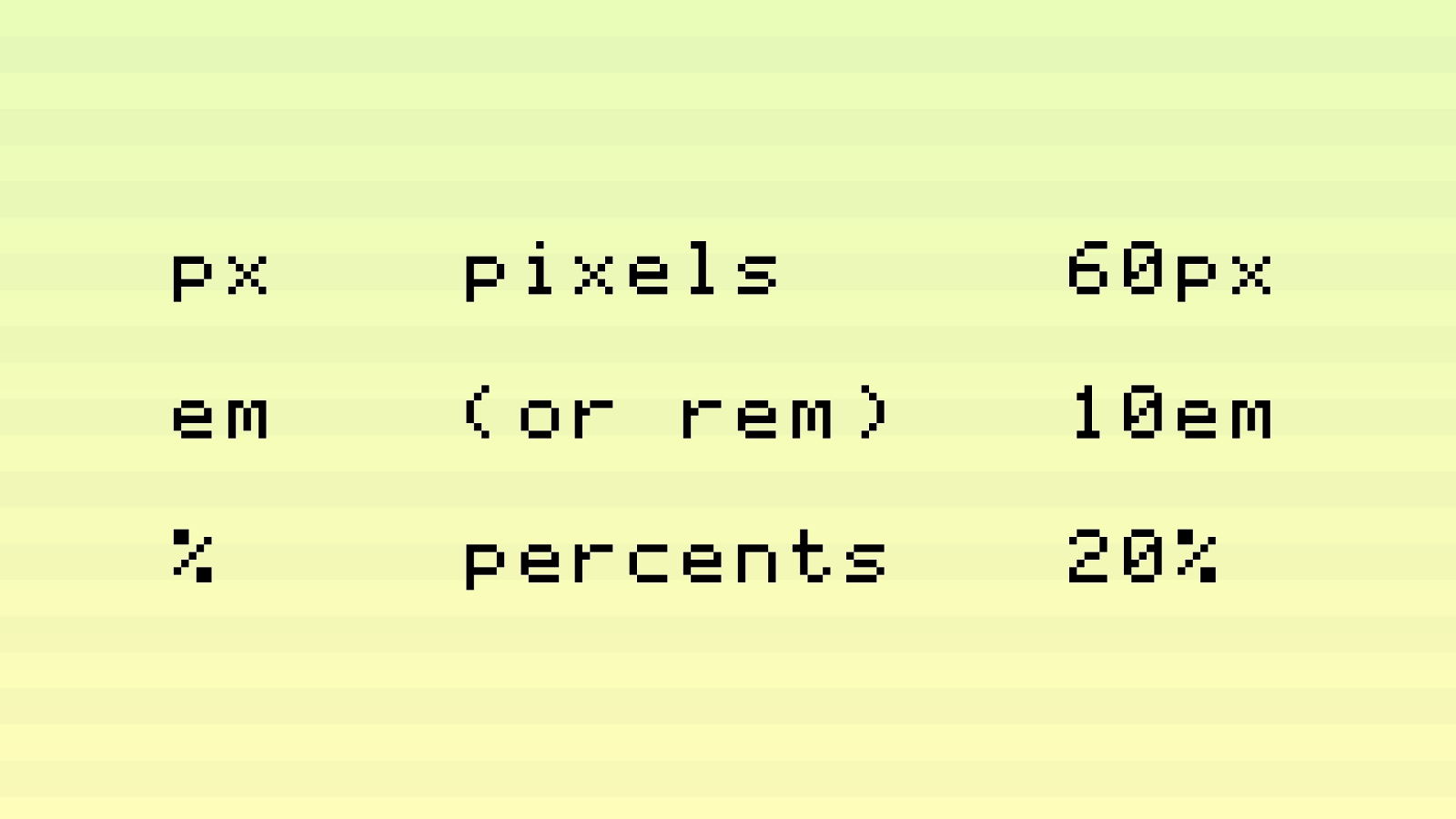
px em % pixels (or rem) percents 60px 10em 20%
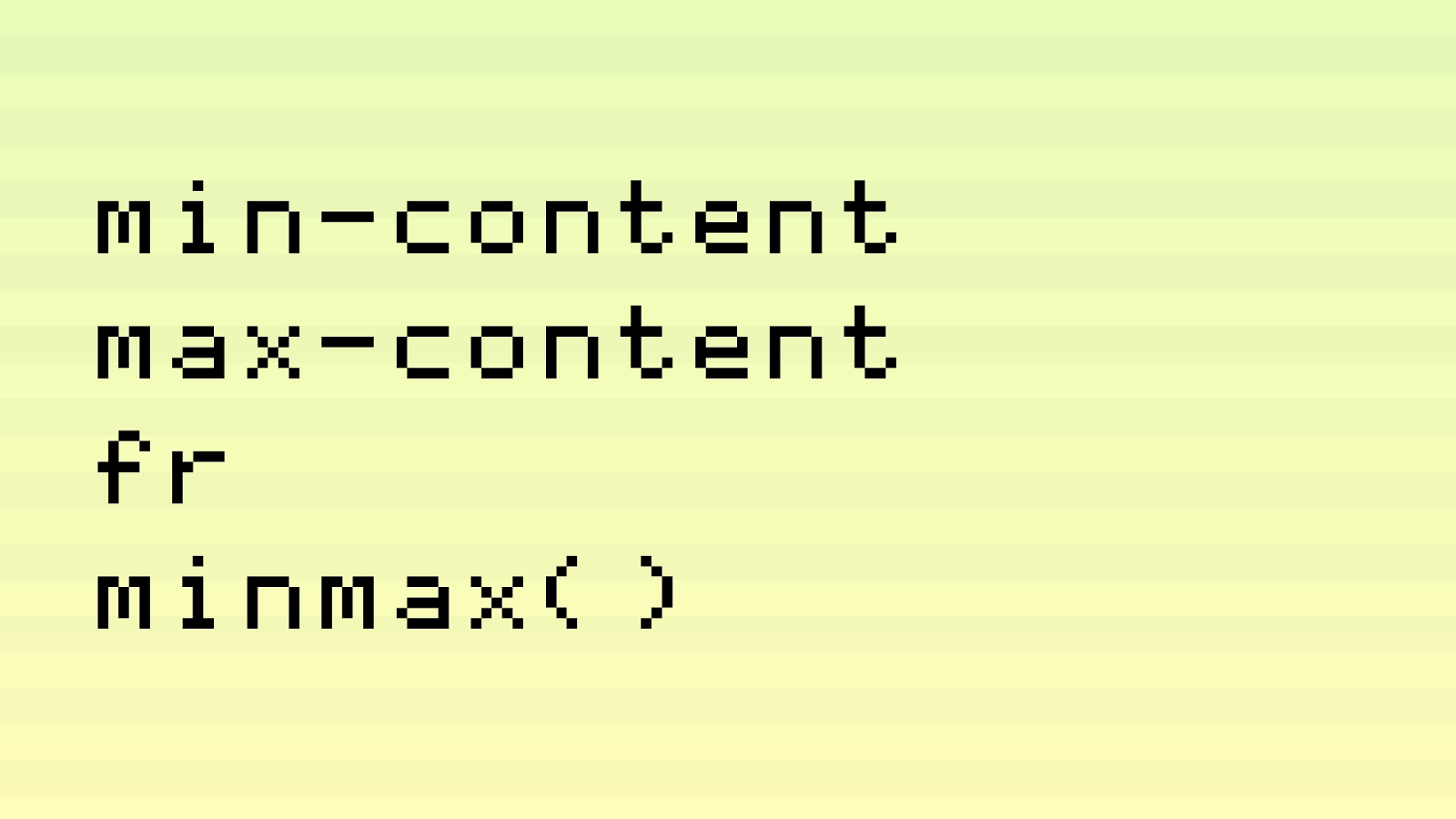
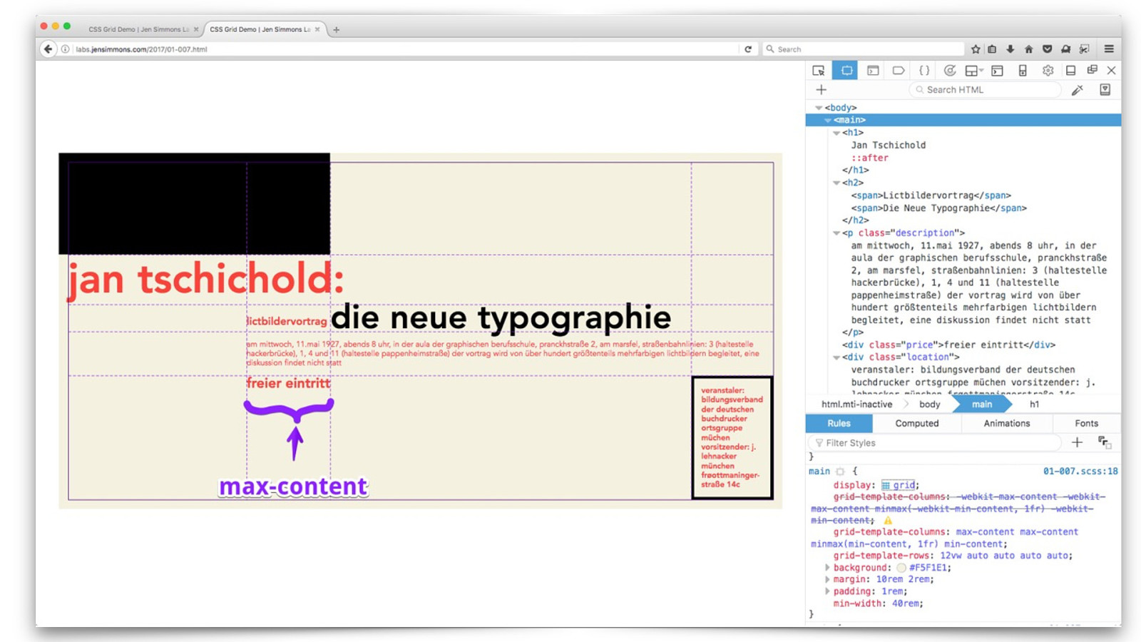
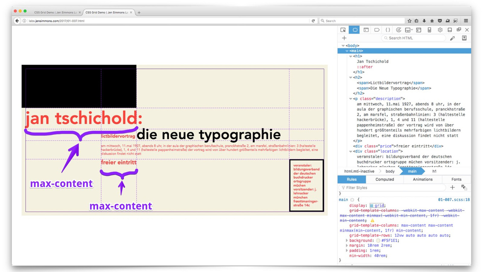
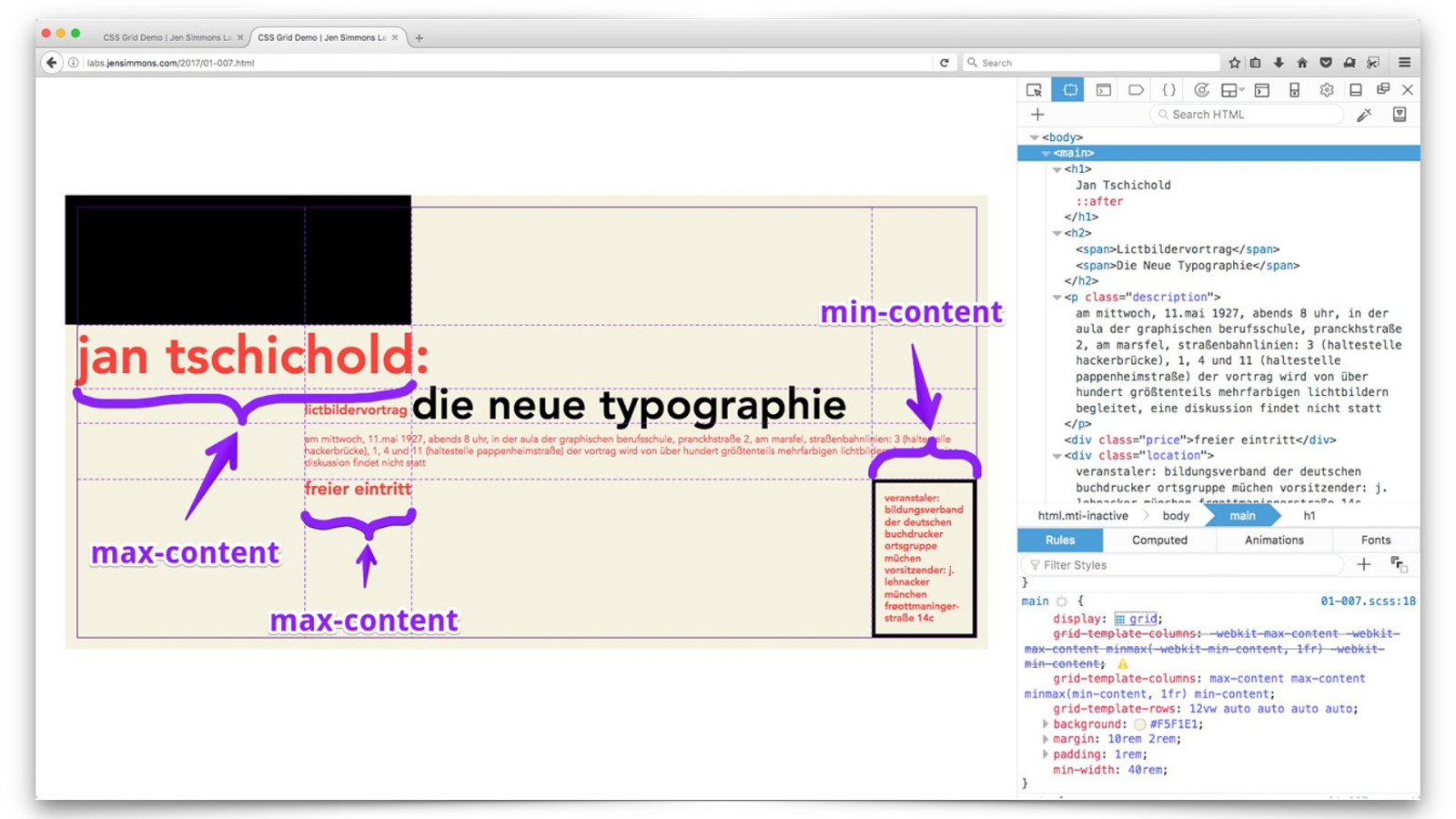
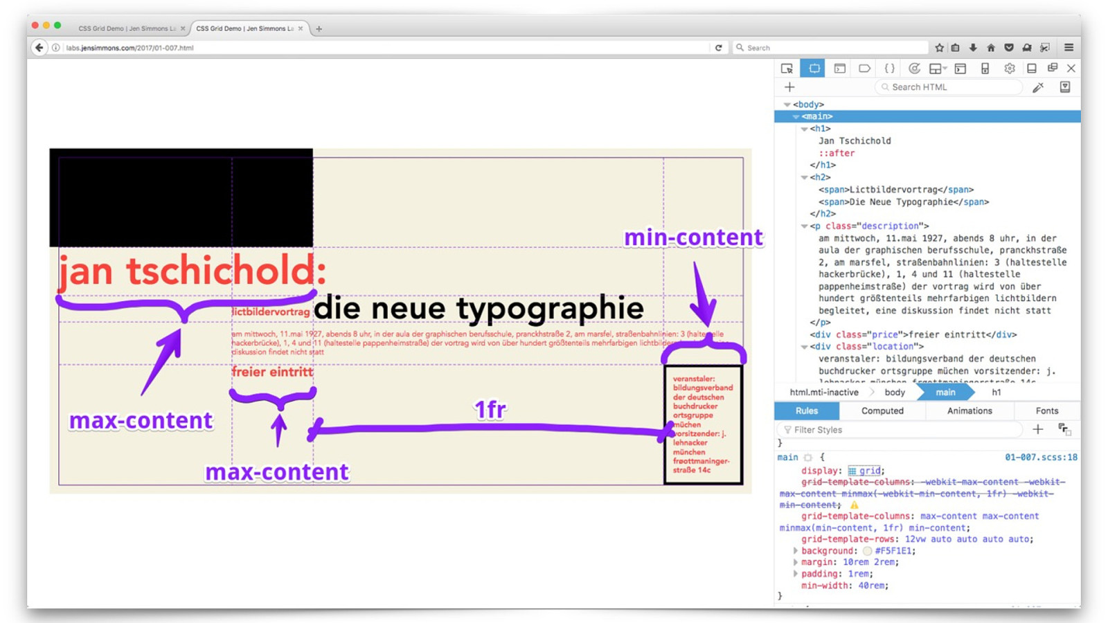
min-content max-content fr minmax()
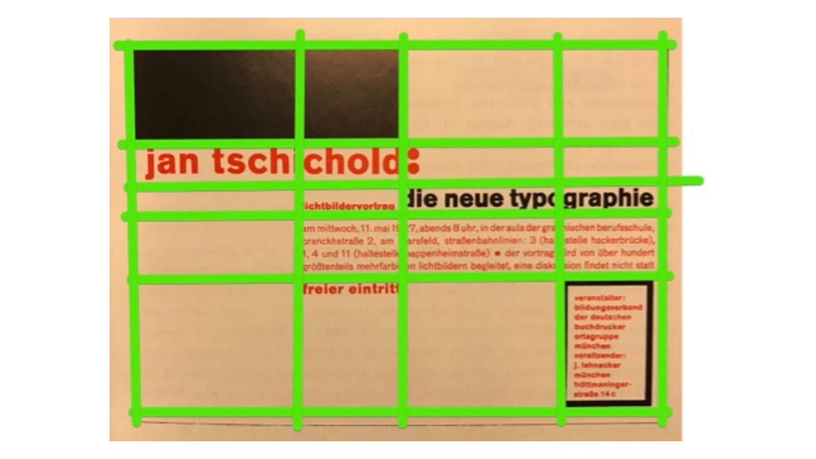
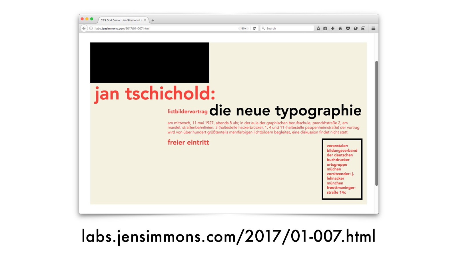
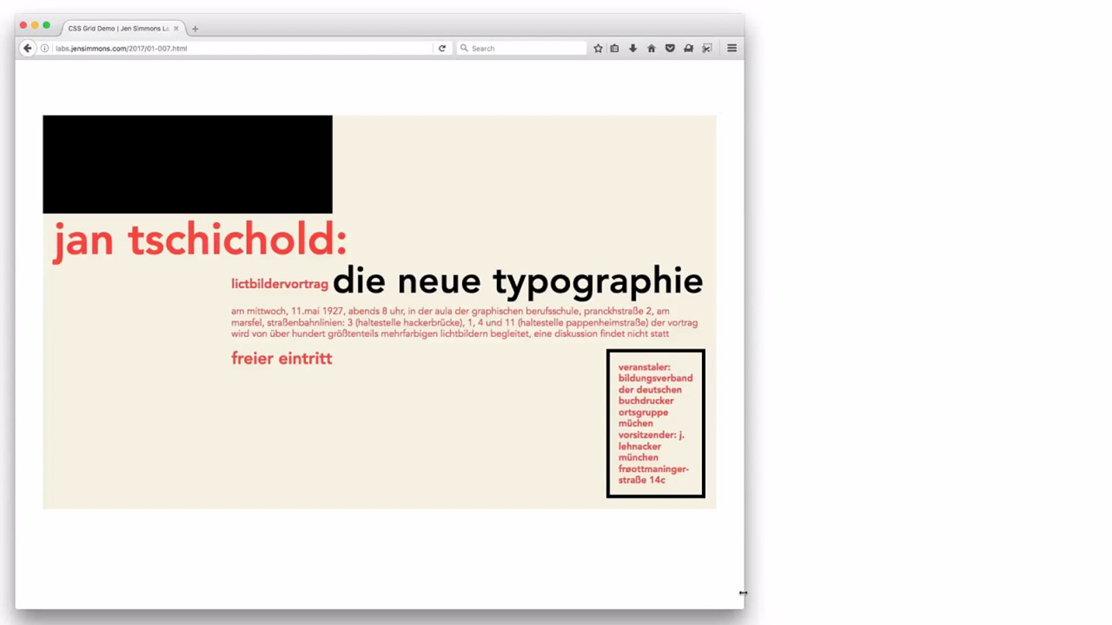
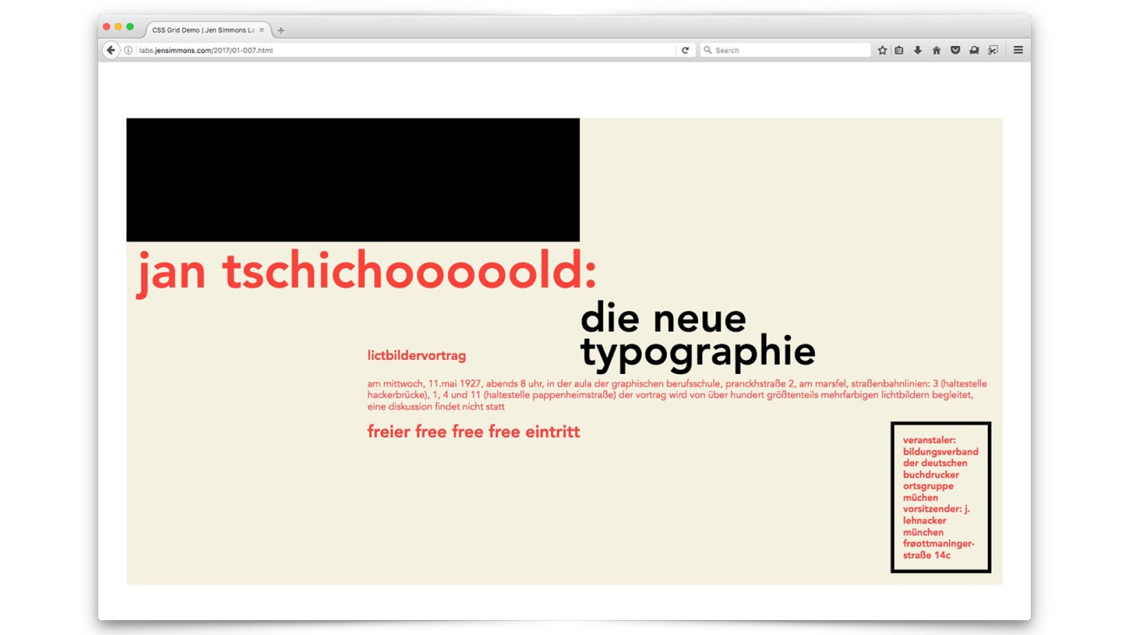
labs.jensimmons.com/2017/01-007 .html
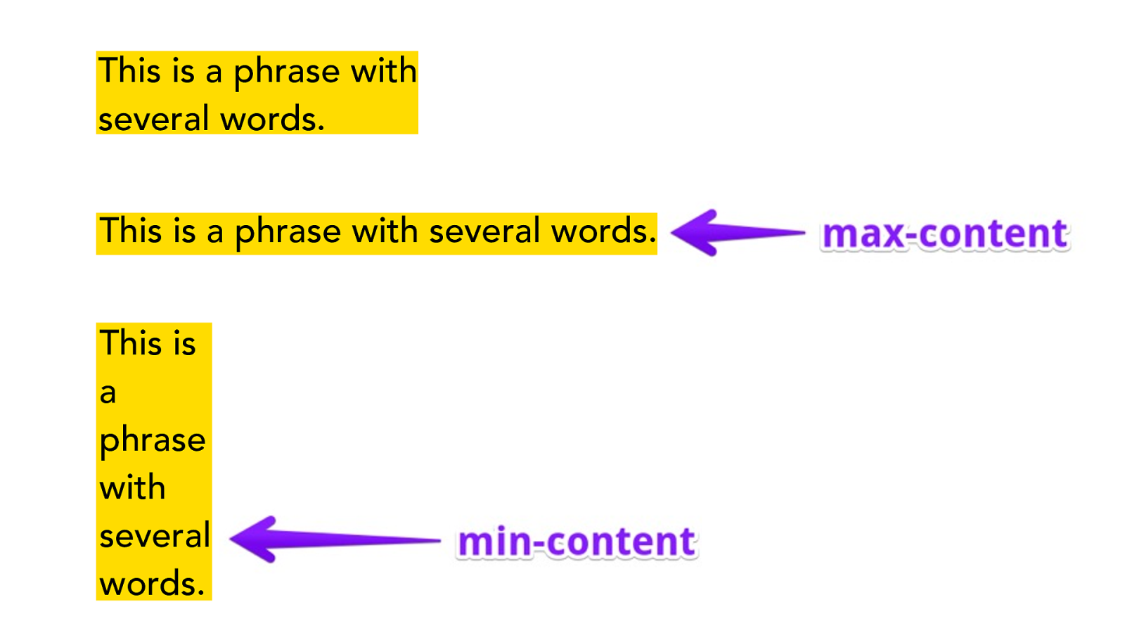
This is a phrase with
several words.
This is
a
phrase
with
several
words.
This is a phrase with several words.
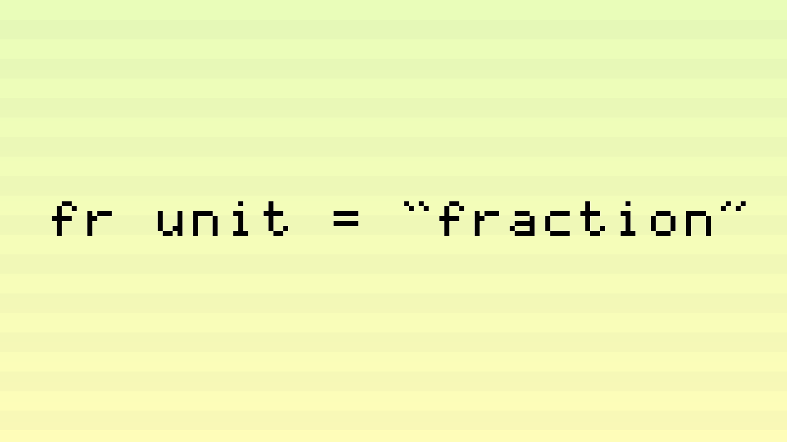
fr unit = “fraction”

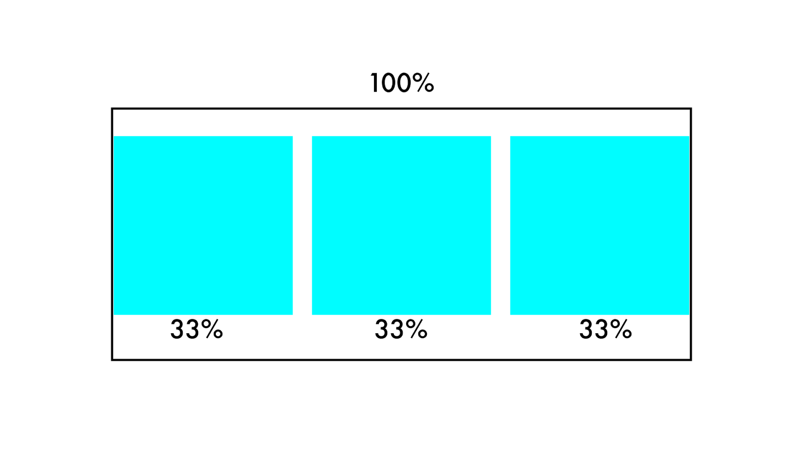
10 0 % 33% 33% 33%
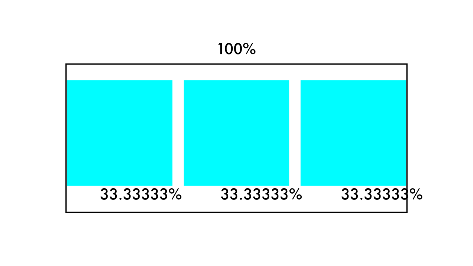
10 0 % 33.33333% 33.33333 % 33.33333 %
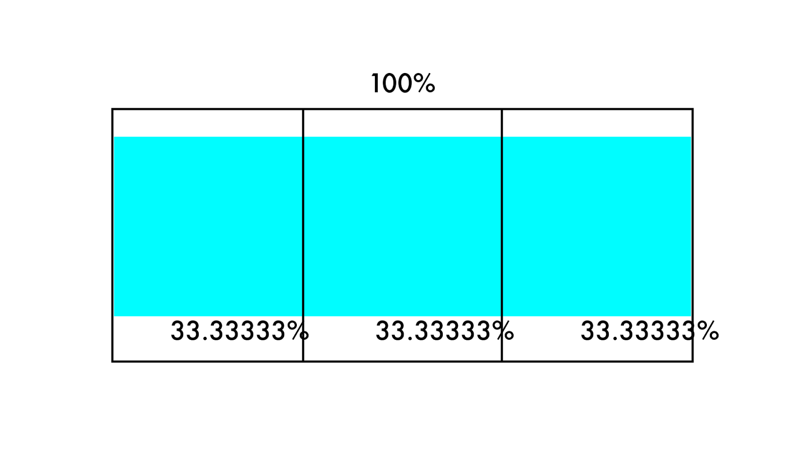
10 0 % 33.33333% 33.33333 % 33.33333 %
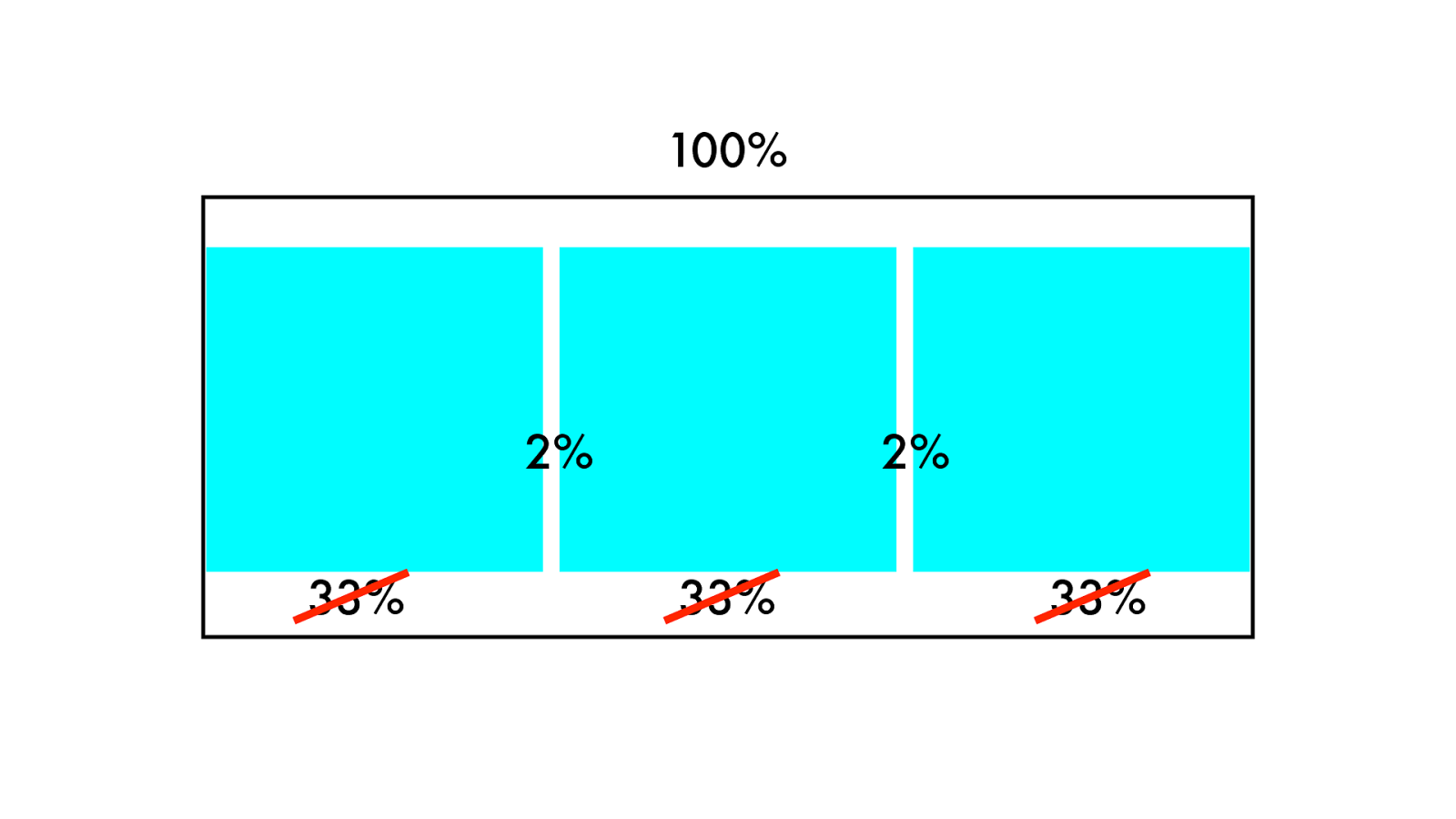
10 0 % 33% 33% 33% 2% 2%
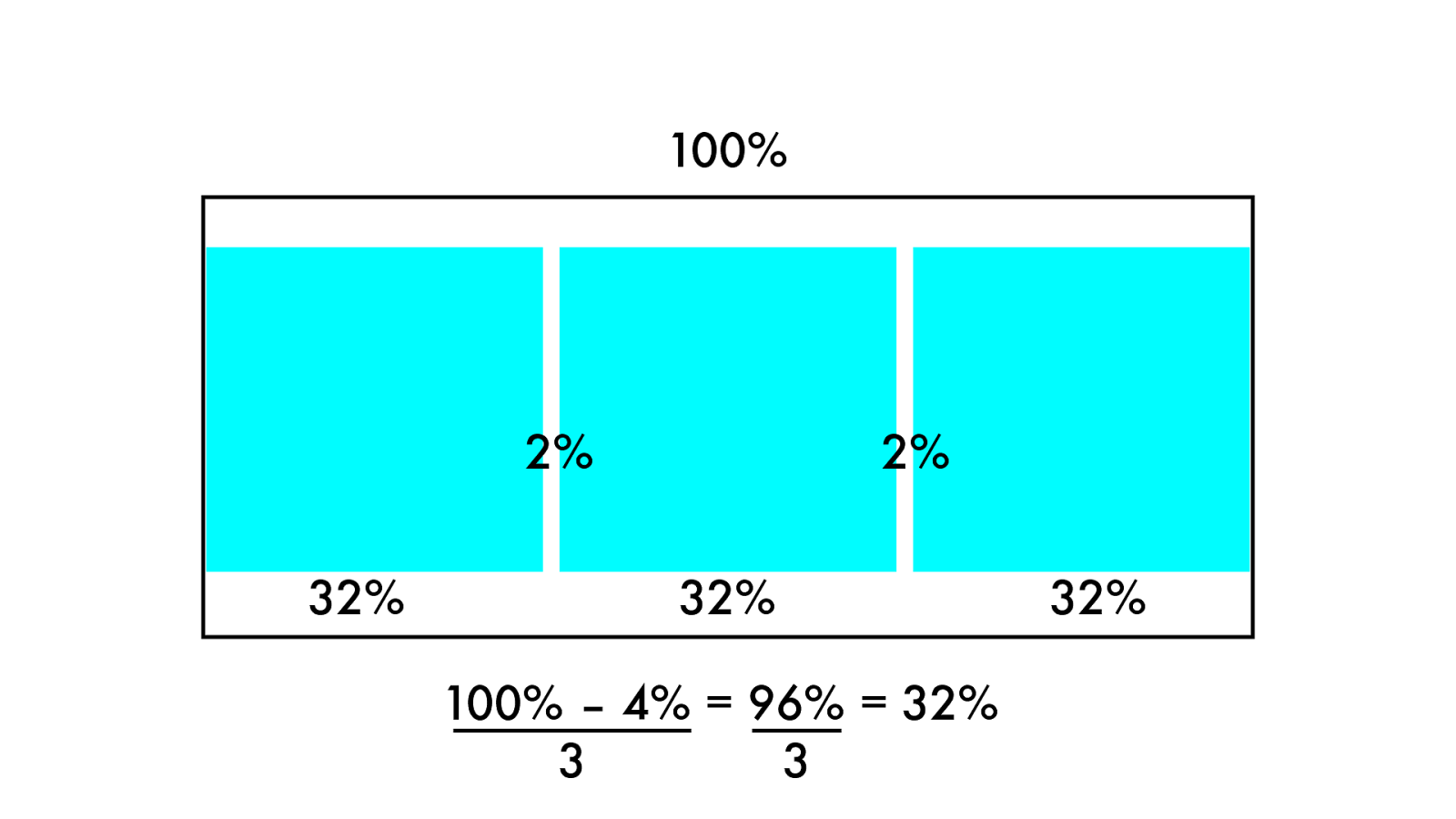
10 0 % 32% 32% 32% 2% 2% 100% – 4% = 96% = 32% 3 3
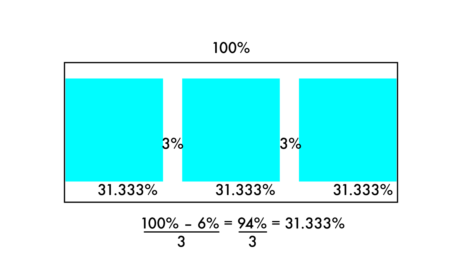
10 0 % 31. 3 3 3 % 31. 3 3 3 % 31. 3 3 3 % 3% 3% 100% – 6% = 94% = 31.333% 3 3
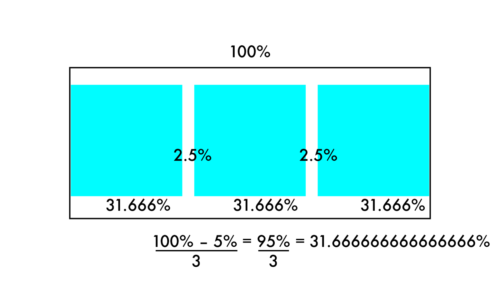
10 0 % 31. 6 6 6 % 31. 6 6 6 % 31. 6 6 6% 2.5% 2.5% 100% – 5% = 95% = 31.666666666666666% 3 3
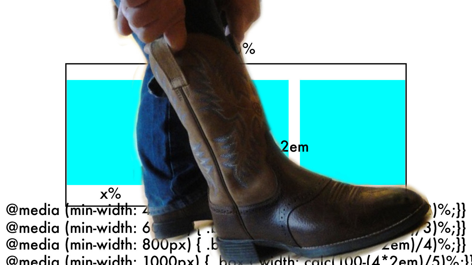
.box { width: calc(100-(22em)/3)%;} 10 0 % x% x% x% 2em 2em @media (min-width: 600px) { .box { width: calc(100-(22em)/3)%;}} @media (min-width: 800px) { .box { width: calc(100-(32em)/4)%;}} @media (min-width: 1000px) { .box { width: calc(100-(42em)/5)%;}} @media (min-width: 400px) { .box { width: calc(100-(1*2em)/2)%;}}
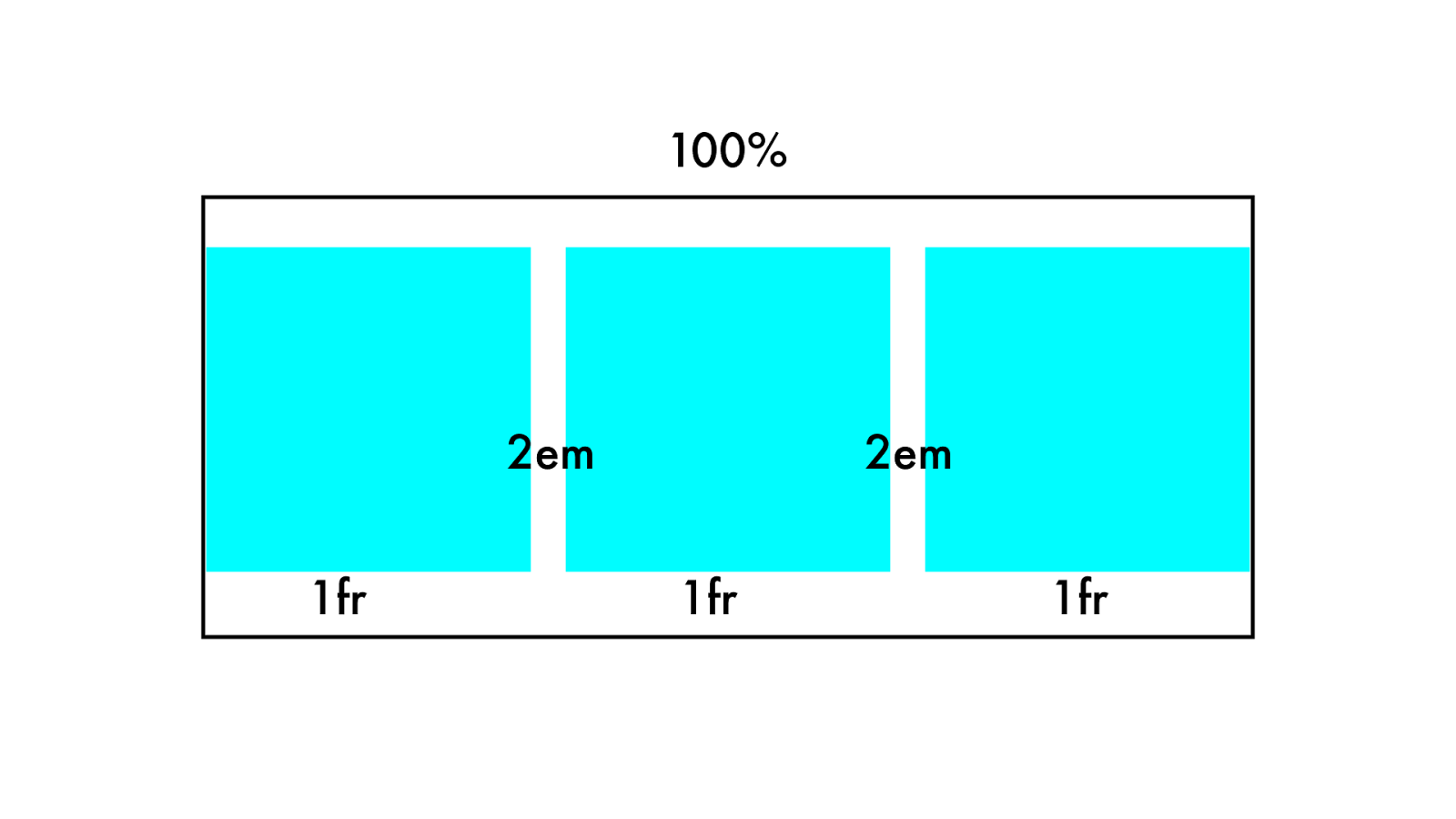
10 0 % 1fr 1fr 1fr 2em 2em
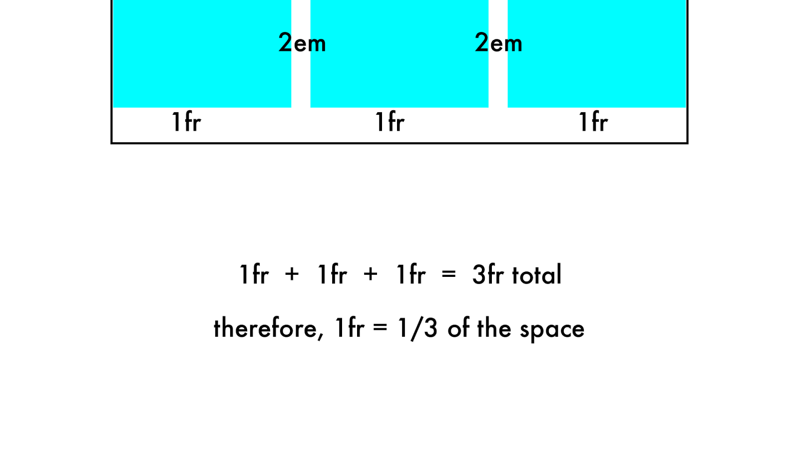
1fr 1fr 1fr 2em 2em 1fr + 1fr + 1fr = 3fr total therefore, 1fr = 1/3 of the space
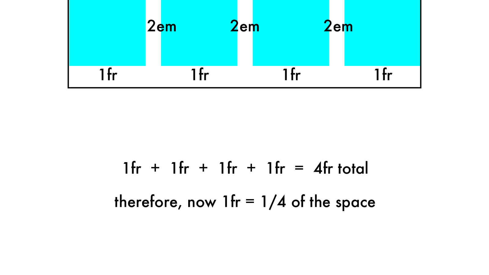
1fr 1fr 1fr 2em 2em 1fr + 1fr + 1fr + 1fr = 4fr total therefore, now 1fr = 1/4 of the space 1fr 2em
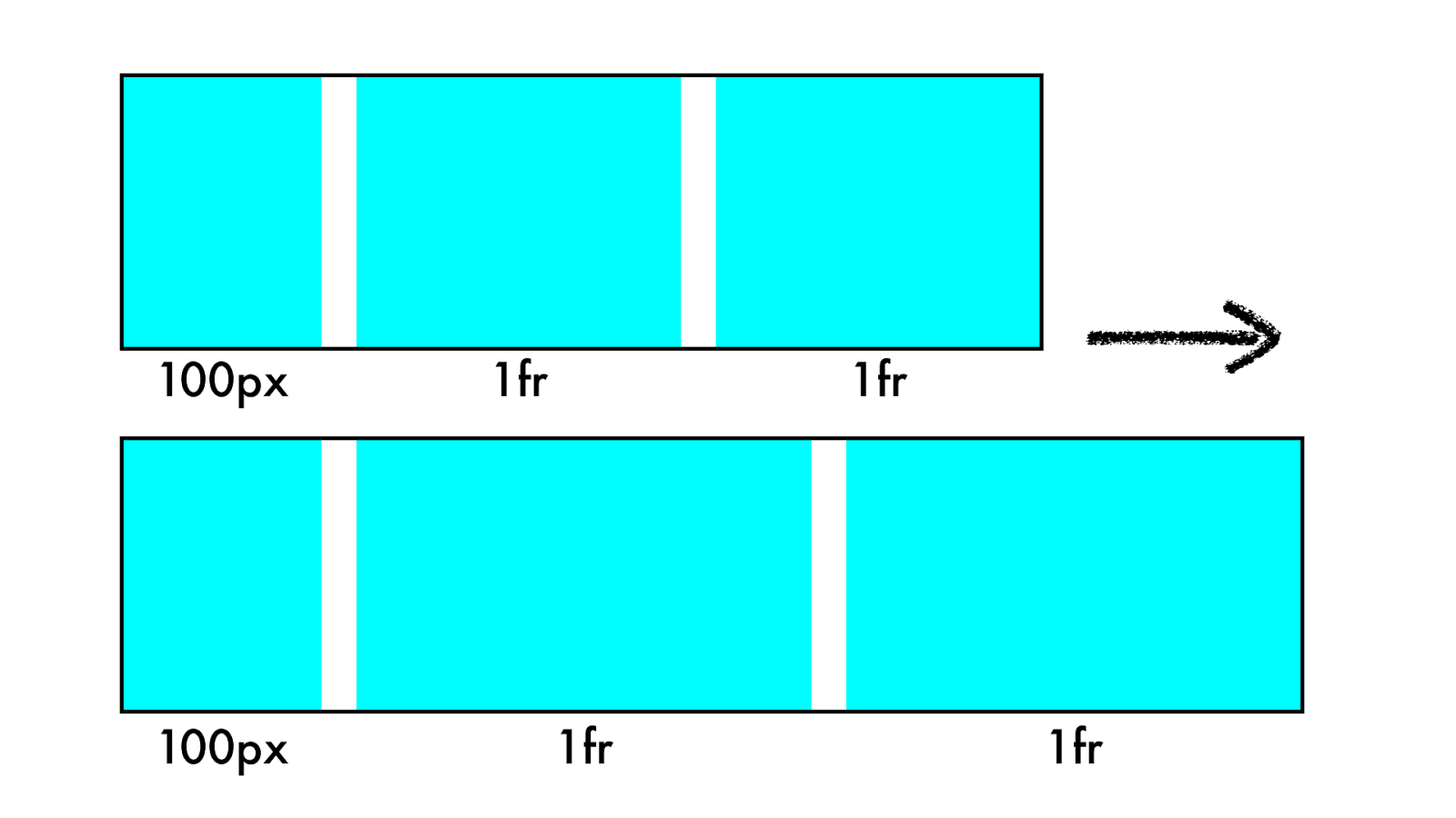
10 0 p x 1fr 1fr 1fr 1fr 10 0 p x
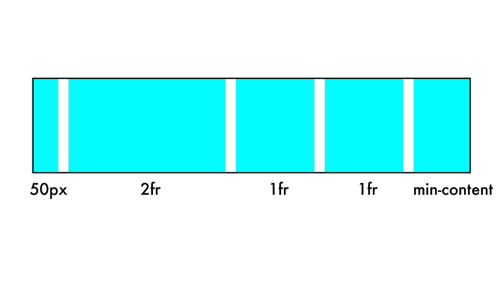
2fr 1fr 50px 1fr min-content
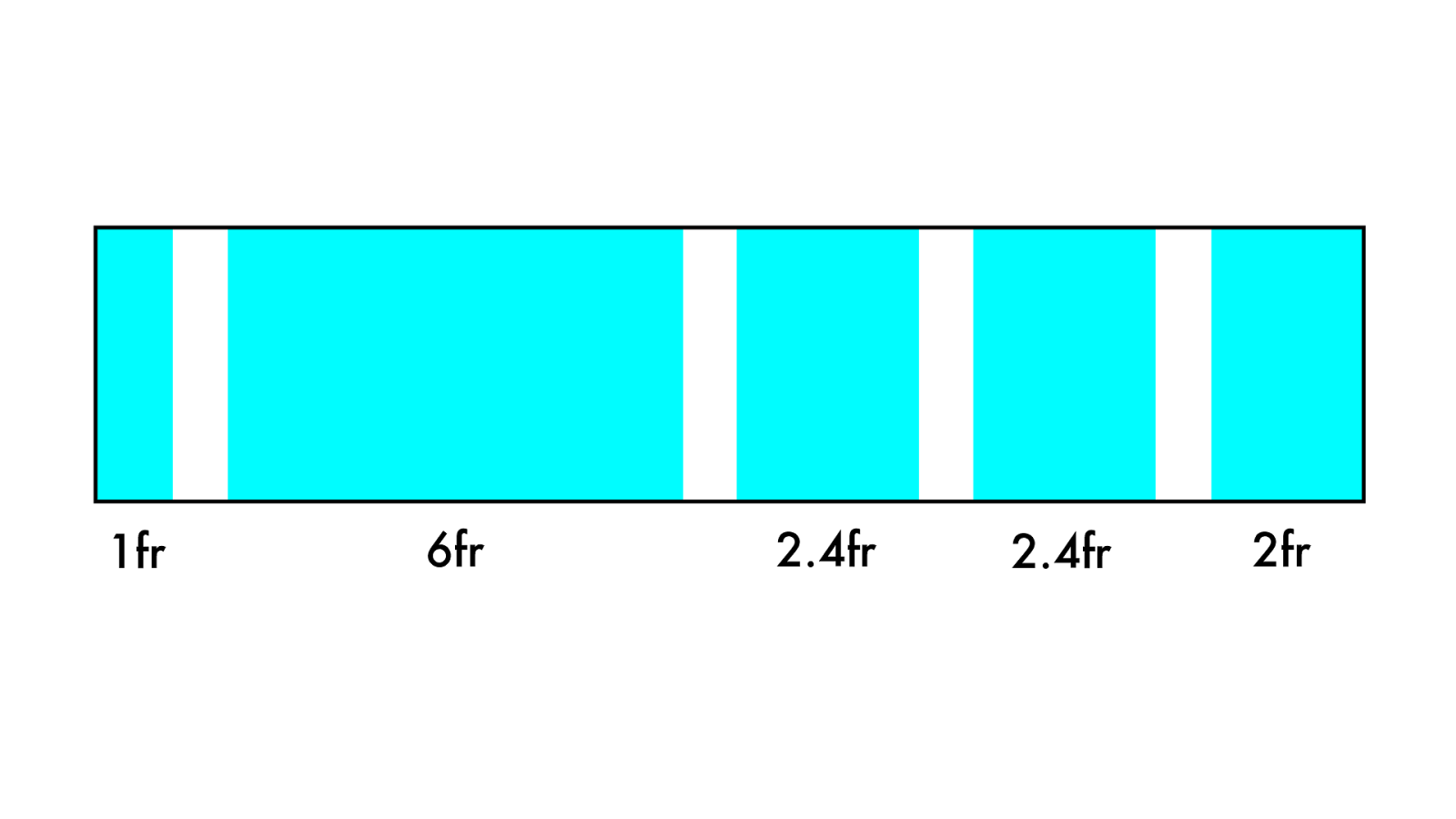
6fr 2.4fr 1fr 2.4fr 2fr
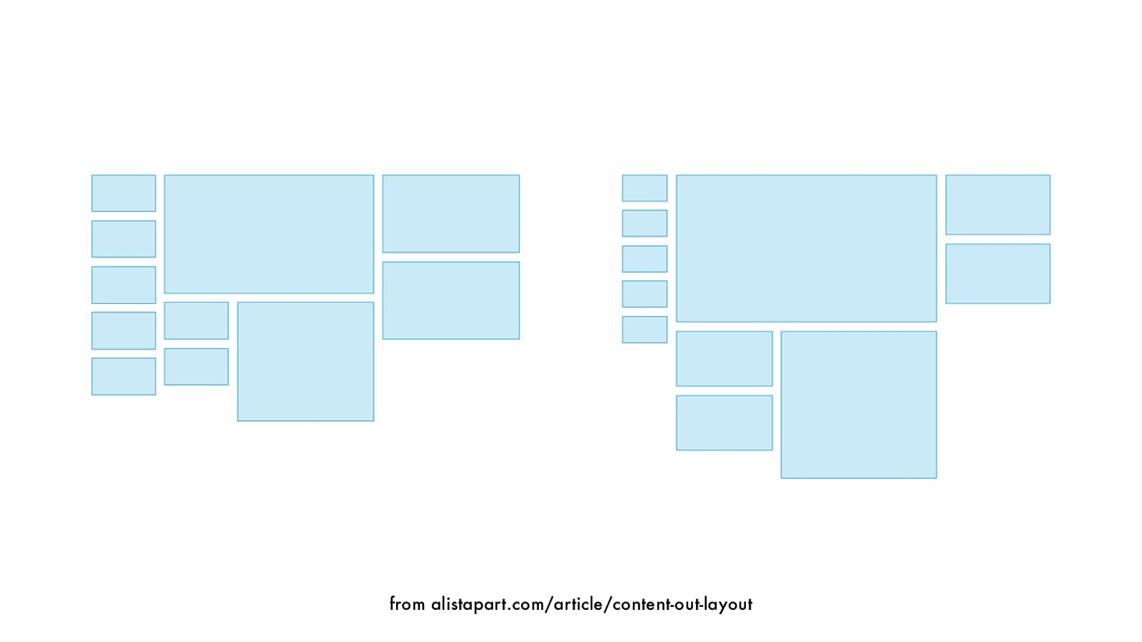
from alistapart.com/article/content-out-layout
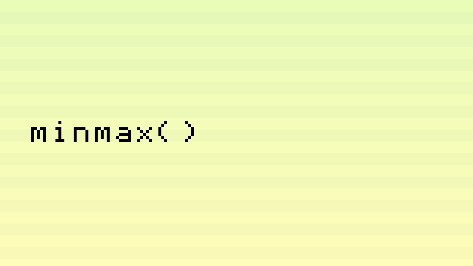
minmax()
labs.jensimmons.com/2017/01-003.html
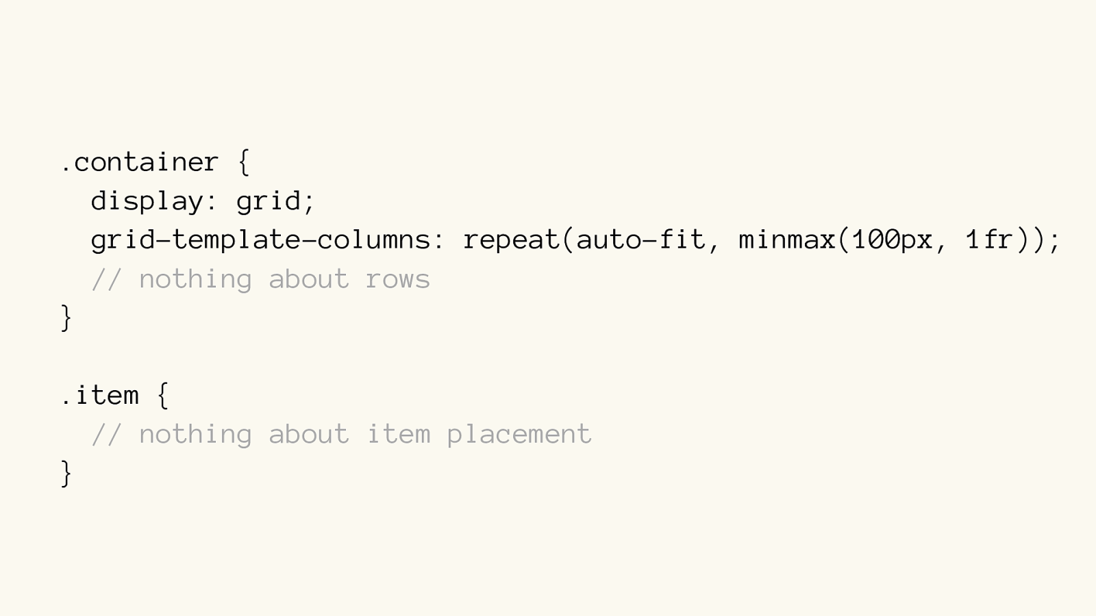
.container {
display: grid;
grid-template-columns: repeat(auto-fit, minmax(100px, 1fr));
// nothing about rows
}
.item {
// nothing about item placement
}
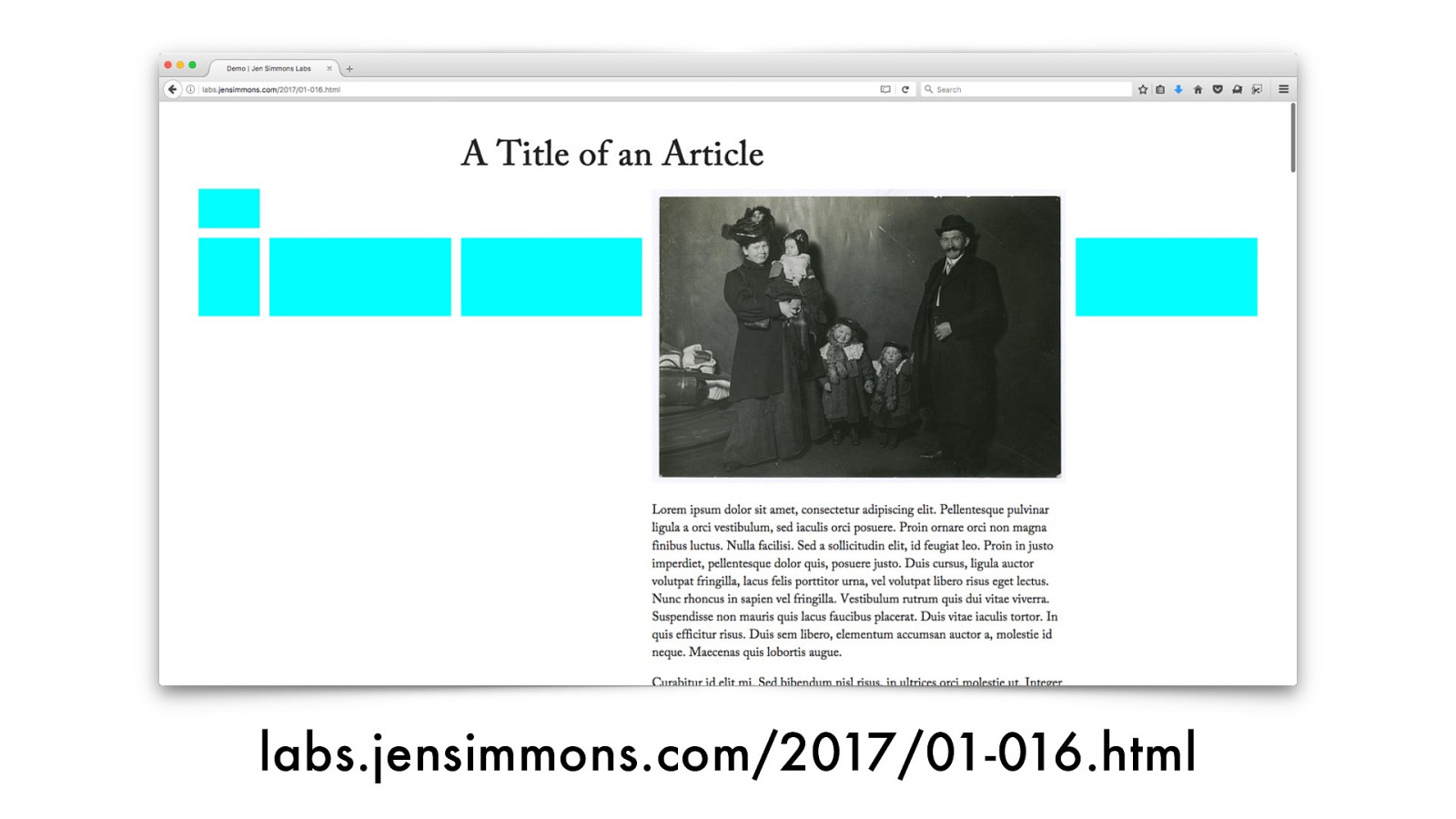
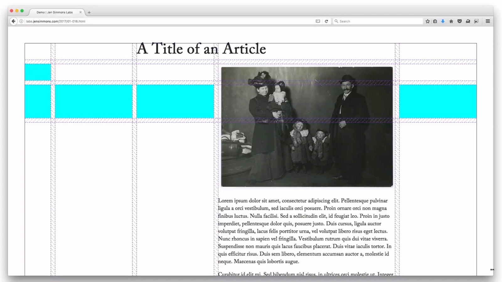
labs.jensimmons.com/2017/01-016.html
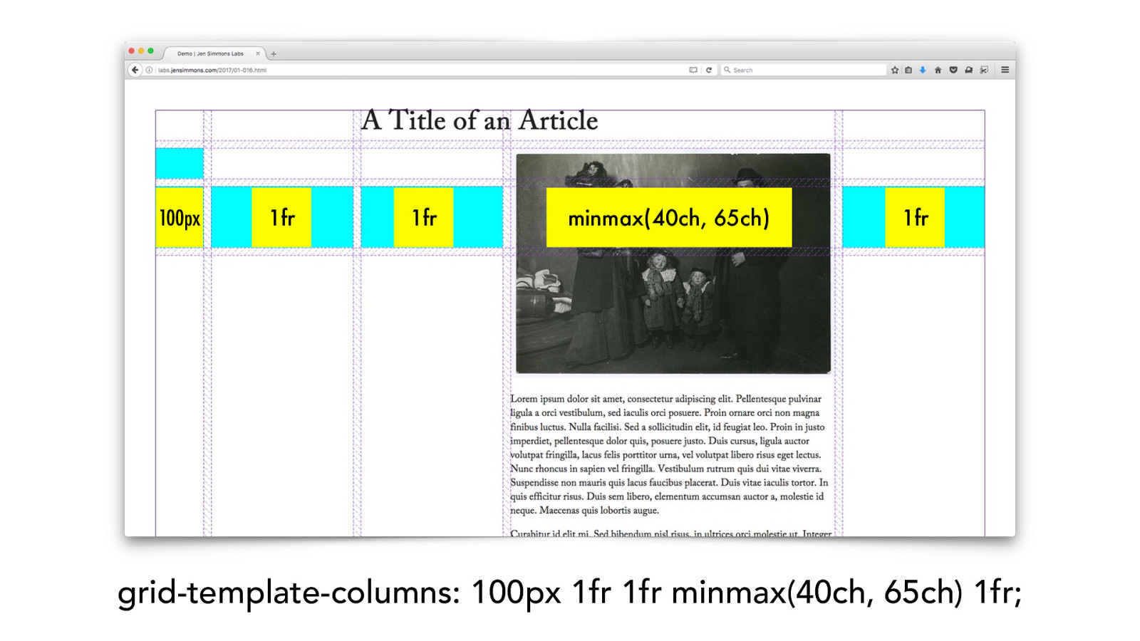
grid-template-columns: 100px 1fr 1fr minmax(40ch, 65ch) 1fr; 1fr 1fr 10 0 px 1fr minmax(40ch, 65ch)
“pi xel perfect ”
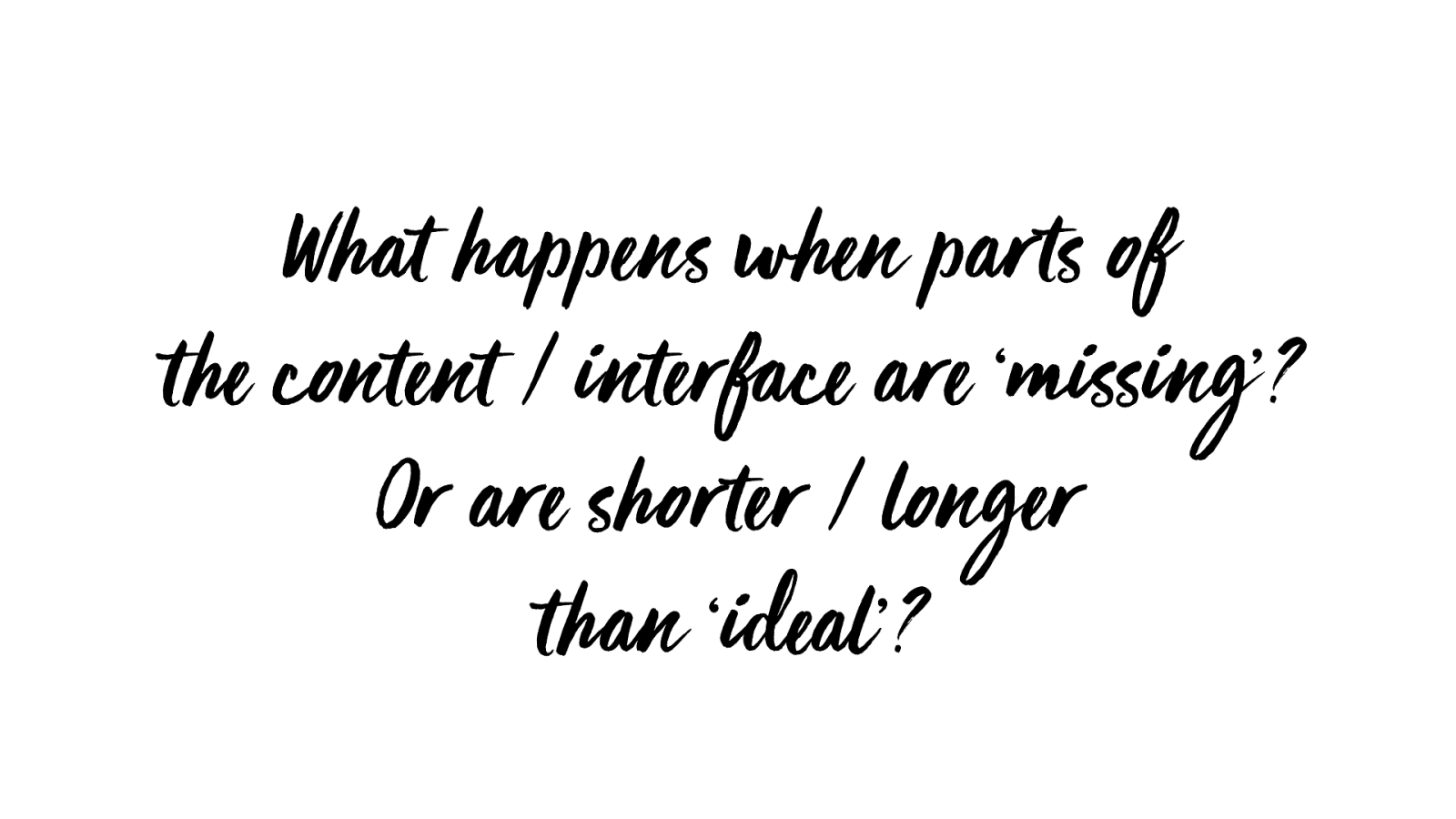
What happe ns whe n par ts of
the content / interface are ‘missing’?
Or are shorter / longer
than ‘ideal’?
Design the flexibility model.
Flexibility
- C r e a t i v i t y
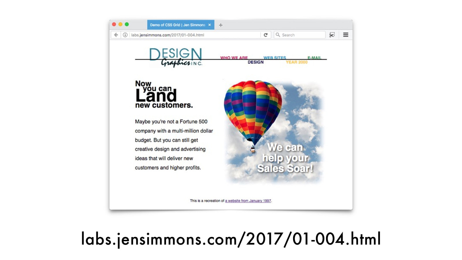
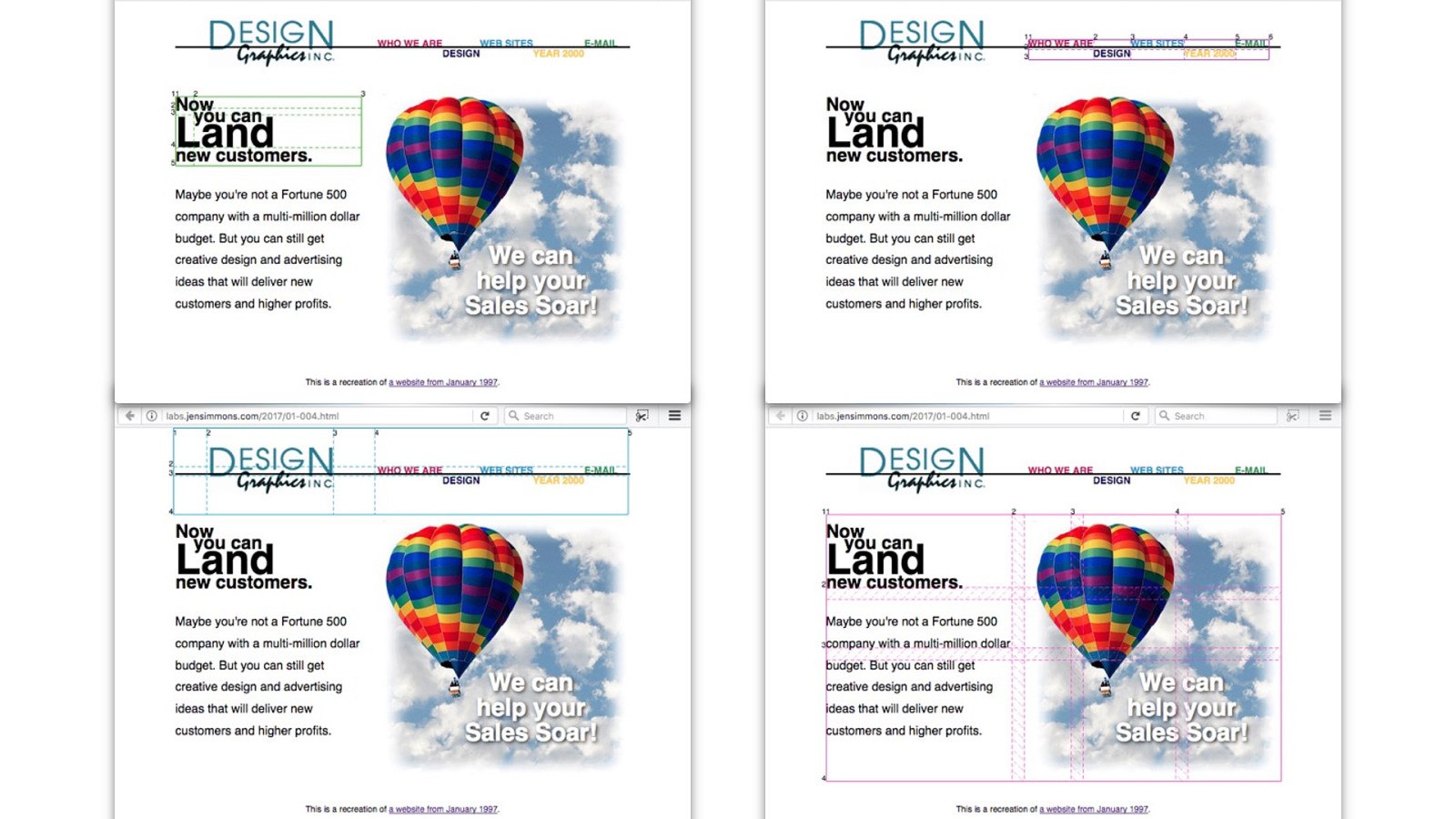
labs.jensimmons.com/2017/01-004.html
- O v e r l a p
- The Vie wpor t
- W h i t e S p a c e
- V e r t i c a l i t y
- F l e x i b i l i t y
- C r e a t i v i t y
Time to play. Time to learn.
www.layout.land

labs.jensimmons.com
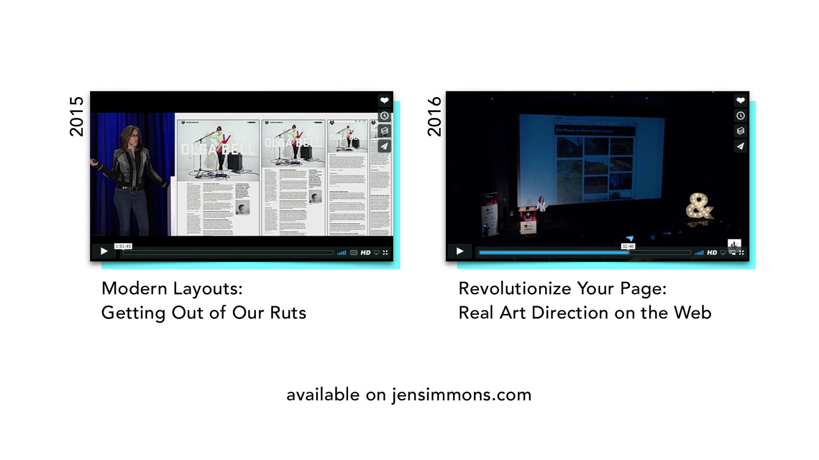
Modern Layouts: Getting Out of Our Ruts Revolutionize Your Page: Real Art Direction on the Web 2015 2016 available on jensimmons.com
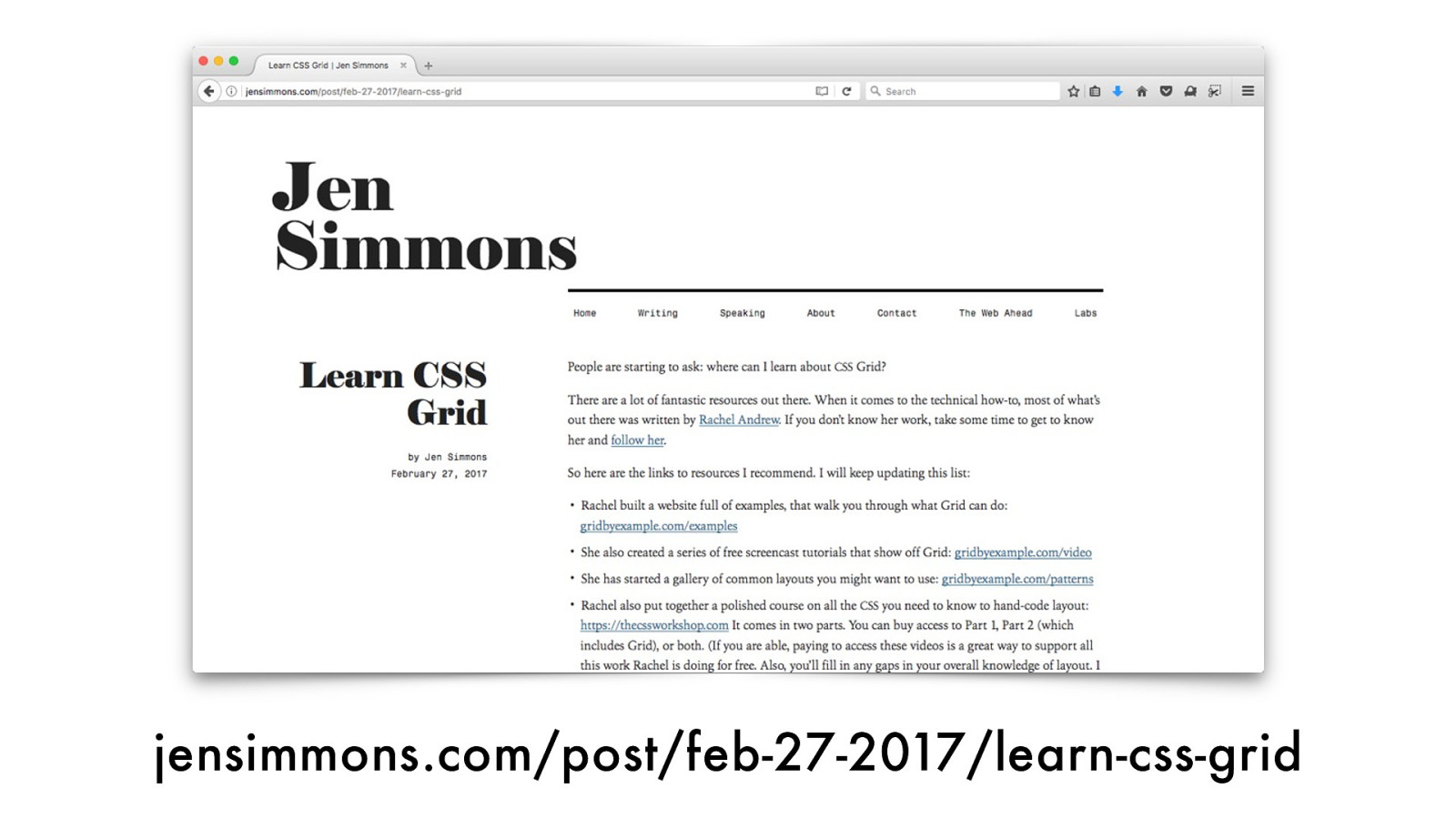
jensimmons.com/post/feb-27-2017/learn-css-grid
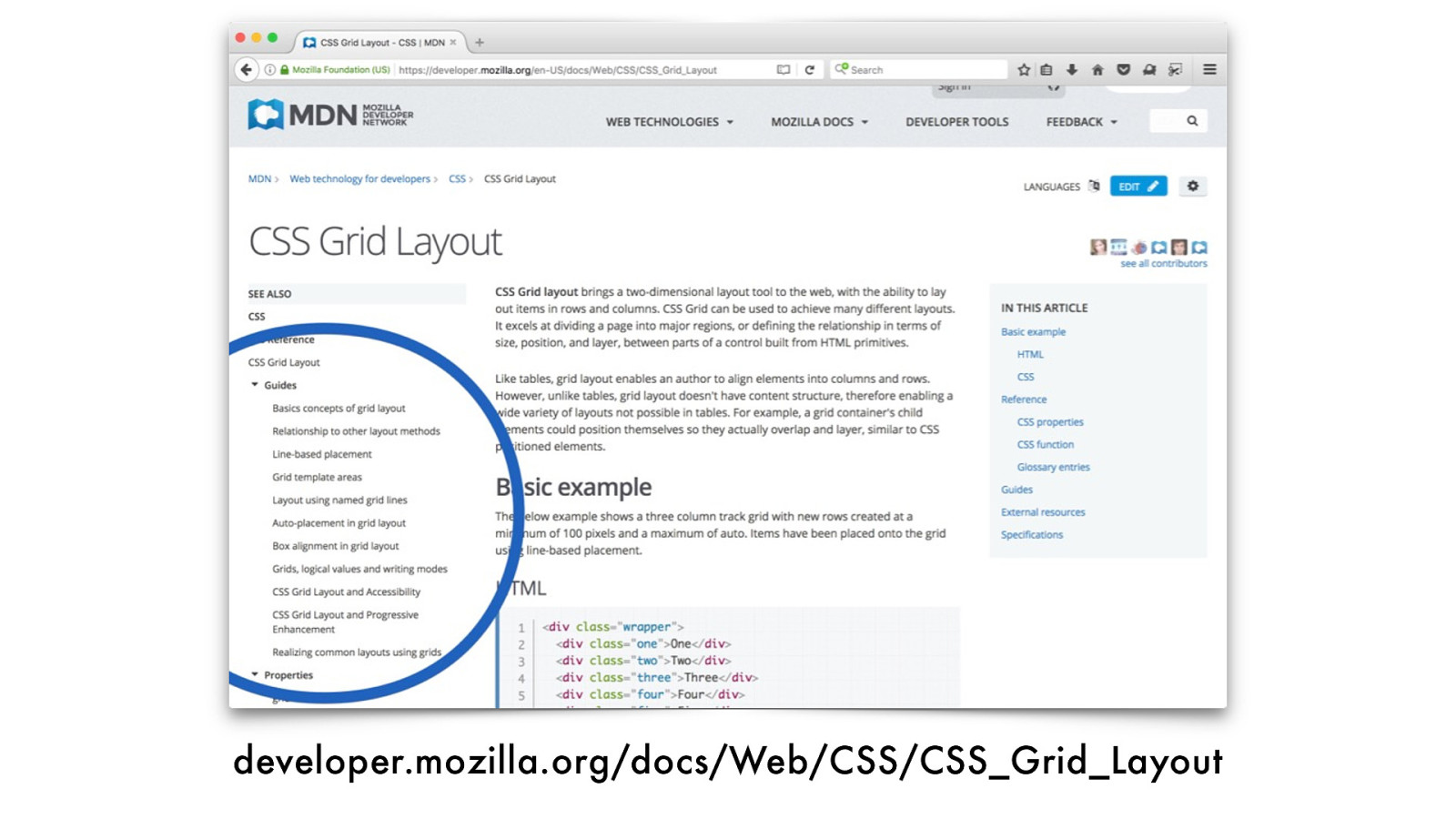
developer.mozilla.org/docs/Web/CSS/CSS_Grid_Layout

Time to explore.
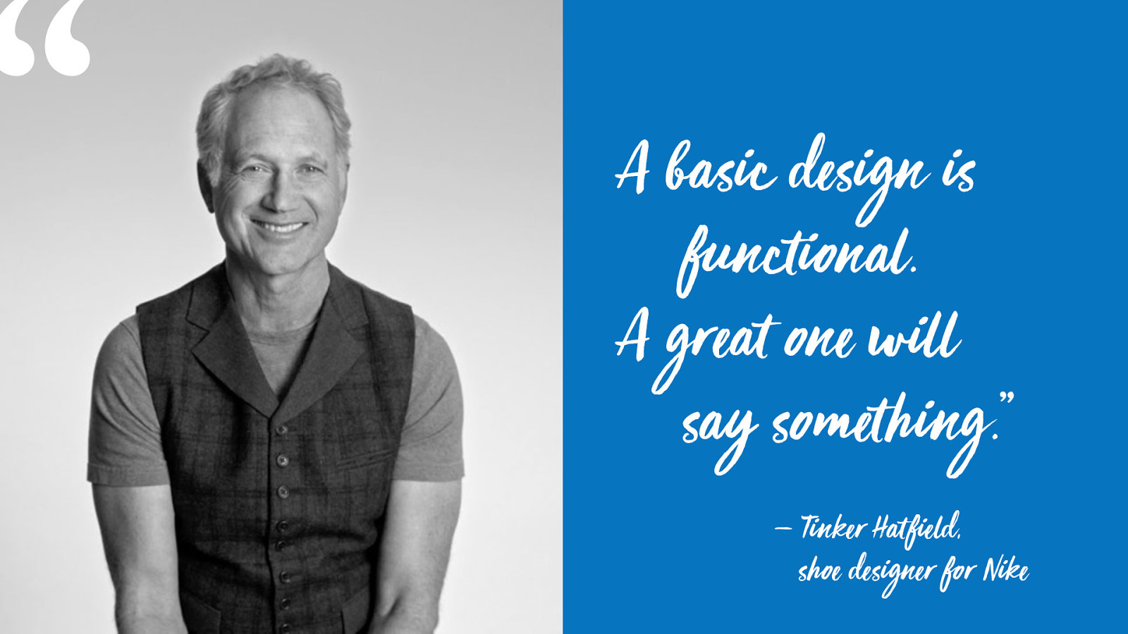
A
basic design is
functional.
A
great one will
say something.”
— Tinker Hat field,
shoe de signer for Nike
“
jensimmons.com
@jensimmons layout.land
labs.jensimmons.com Thanks!

Now that CSS Grid is here, what are we going to do with it? Sure, we can create page layouts very similar to the ones we’ve been using for the last decade, but Grid also opens up a world of new possibilities. Graphic designers of the 20th century fell in love with using grids for their layouts. How might we apply their ideas to the web, and what might have to change? What do we need to think about when designing for this new paradigm? In this far-ranging talk, Jen will explore the realities and possibilities of new layout technologies and how they will change our craft. You'll leave with exciting new techniques and ideas for your design and development toolkit—and, more importantly, with the inspiration to create bold, new, previously unimagined layouts for the 21st century.
 for free. You
can too.
for free. You
can too.